
Market Commentary - February 25, 2023
00:23 - Risk disclaimer -. 02:18 - Where we are in the grand scheme of things in this market. 05:50 - Where is the body of the candle in the chart?
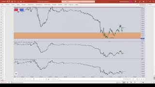
URL: https://www.youtube.com/live/kFIOp8Tprdc?si=Cken2NjXCVyuIBXi Watched Date: February 25, 2023
Outline
00:23 - Risk disclaimer -.
02:18 - Where we are in the grand scheme of things in this market.
05:50 - Where is the body of the candle in the chart?
11:12 - What forms of buy stops will be resting above this level?
16:27 - Daily and weekly charts help you keep your frame of reference -.
22:32 - What’s the next target?
27:19 - What’s going on in the candles chart.
31:56 - Why did the market consolidate inside this high?
34:21 - High resistance vs. low resistance -.
39:56 - When is this trend likely to continue?
45:40 - What’s happening in the market right now.
50:26 - What’s your bias going forward for the week?
56:32 - What’s this rally doing? What’s this wick split?
01:03:12 - Breaking the gap down into quadrants.
The marked high and low creates the current dealing range and the first premium SIBI above EQ of the range is marked.
👉
We’re looking for higher prices on Dollar and consequently lower prices for foreign currency and indices.
$ higher, stocks lower = RISK OFF!
It means it will be easier to capitalize short positions on any $ paired asset because they will enter sell programs where the dollar stays in a buy program.
Volume Imbalance (Inefficient) = two candles separated by only the wicks, no candle body overlaps.
If it’s only Wicks passing through, that is viewed by the algorithm as a gap so it’s going to reprice back to it.
There is no body overlaps this separation yet.
👉
Price is price whether it’s on hourly chart or seconds chart.
Well, I mainly use the daily chart as my higher-timeframe reference, focusing on key levels where price should eventually draw. The weekly chart helps me frame the overall range, but I haven’t included it here because everything I’m about to explain can be accomplished without pulling it up.
On weekends, I review the weekly chart and try to anticipate what the next weekly candle is likely to do—its probable magnitude, distance, and what levels it should reach for. Based on that, I form an expectation for expansion during the coming week.
That doesn’t mean the market will open Sunday night and immediately reach those levels. It could gap into them, or it could open with very little change compared to Friday’s close. Either way, the higher-timeframe context helps shape my expectations for where price is likely to expand during the week.
If you look at this high here and this high here, they’re relatively equal. In retail theory, traders who use support and resistance see that as significant. Price moves up to that level, moves lower, trades back higher again, but falls just short and then drops sharply away.
This leaves an area that many retail traders view as a ceiling or resistance. Above that, two kinds of buy stops are likely resting:
- Breakout buy stops – from traders who believe the level is resistance and plan to buy if price breaks above it.
- Protective buy stops – from large funds protecting short positions.
It’s predominantly the second type—large fund orders—that makes this area attractive. It’s not the small retail volume that moves the market; collectively we’re insignificant. But large funds placing substantial orders at these levels are a real factor, which is why price will often be drawn there.
The interesting thing is that retail orders often line up with where large funds place their stops. It’s simple—above old highs and below old lows. Anytime there’s a clean level, like here where the highs are relatively equal, both retail and institutional stops tend to cluster in the same area.
I use the dollar as a barometer to decide whether I should be a buyer or seller in the S&P, or in currencies other than the dollar. If the dollar is rallying, those other currencies will generally fall—that’s the relationship in the currency market.
Starting my analysis with the dollar gives me a macro view of risk-on or risk-off conditions. It clears away much of the uncertainty that newer traders—often stuck at breakeven or losing—struggle with. Without this, many get caught chasing small moves on tiny timeframes, sometimes over-leveraging, because they don’t understand where the market is likely headed. For a longer-term perspective, the dollar provides that anchor.
It helps you keep your frame of reference anchored in the macro view—the daily chart. The daily chart shows where we’re likely to go, how we might get there, and whether that move will unfold as a large candle or a small one. There’s a big advantage in using daily levels to form your bias.
Before the week begins—Friday, Saturday, or Sunday—I study the weekly chart to gauge the likely expansion of the coming weekly candle. Will it expand higher or lower? For example, if the weekly chart suggests a gravitation toward a certain level, I anticipate the next weekly candle will aim for that area. But I don’t need to display the weekly chart every time, because the daily chart already illustrates it clearly.
This perspective keeps you grounded and prevents confusion on lower timeframes. Most day traders and scalpers zoom in so tightly that they’re only watching 15 to 20 candles at a time, fixating on tiny intraday fluctuations. Without higher-timeframe context, those sudden moves catch them off guard. That’s why you’ll hear them say things like, “Whoa, where did that come from?” You’ll never hear me say that.
I'm expecting price to deliver exactly as my long-term analysis suggests. That means following where the weekly and daily charts indicate price is most likely to go. These higher timeframes reveal the areas with the greatest probability of being reached, and that should always be the primary focus of your analysis.
It’s not about how much you can risk on your next trade, how quickly you can hit a profit target, or how fast you can pass a funded account challenge. Thinking that way sets you up for failure.
The way to build consistency—and succeed in those challenges—is by aligning your trades with what the daily chart’s PD arrays are showing. Focus on where liquidity lies, where inefficiencies remain, and whether there are gaps from prior highs or lows that matter for the current move, especially in relation to where we closed on Friday.
Which takes your attention to what? An old high.
Before price reached this level, I pointed out three specific levels to watch—one being this candle’s closing price, which I teach as a rejection block. If I were bearish, I’d use that price to anticipate a potential displacement lower.
Now, I’m not saying I expect the dollar to drop here. But because this level is defined as a rejection block, the logic is the same: when price trades up into and through an old swing high—specifically its closing price—and then shows displacement (meaning a short-term one-minute or five-minute swing low is pierced, without needing a close below it), and if there’s a fair value gap above, I’d apply the 2022 model to short. That’s how I’d use the rejection block in a bearish context.
In this case, since I’m bullish on the dollar and expecting higher prices, the rejection block serves only as a target—an objective marker.
Once the dollar tags that level, you should be checking your Eurodollar, GBP/USD, other foreign currency trades, or even equity index shorts like the S&P, NASDAQ, Dow, or DAX. If the dollar reaches this point, it’s a good time to consider taking partial profits, because consolidation may follow.
Once we get through the rejection block, the next target is the consequent encouragement—the midpoint of this candle’s wick.
A wick represents a gap, an inefficiency. By design, the market tends to gravitate back toward the midpoint of that gap. That midpoint is consequential because it represents the balance between the high and low of the wick.
Right now, we’re just below that level. When we move down into the lower timeframes, we’ll look at it more specifically. For now, that midpoint remains our next clear objective.
I want to see it gap at, or just above, that level (consequent encouragement) on Sunday. Ideally, it gaps above, then comes back down to retouch it before pushing higher. That’s exactly what I’d like to see on Sunday.
I’m not being ambiguous—I’m telling you precisely what I want to see. If it doesn’t meet these conditions, then I’m doing nothing. Hands in my pockets, no trades. I’m not rushing into decisions, not confused, not lost in the price action. I know exactly what I’m waiting for, and exactly what I want to avoid.
If something doesn’t align with my concepts, I do nothing. That’s what you’re learning this year—how to sit on your hands until your setup is clear. And that’s exactly what I’m showing you here.
If you want to learn this the right way, you need all the details—the subtle nuances and the places you’re likely to fail. I’ve already taught you how to trade and how to spot setups.
You have to know why you’re doing it, and just as importantly, why you shouldn’t be doing other things. With that holistic understanding of price action, you’ll see the full picture—the tapestry of high-probability setups and the low-probability ones.
By taking all those factors together—and considering the ongoing talks about war and conflict in other nations—we can see how this creates concern in the market. When uncertainty rises, the market seeks yield in a safe haven. The dollar becomes that safe haven currency, which drives its price higher.
This rise makes investors even more nervous because they see the dollar pushing upward. I try to stay neutral in delivering this, but it’s difficult when it’s so clear: those relative equal highs are most likely holding a large pool of buy stops.
For anyone long on the dollar, it’s in their interest to see price reach that level. Why? Because they can sell their long positions into the market against higher-priced buying interest. That’s the buyside liquidity sitting up there.
That is where I believe we’re heading. There’s a small range between this candle’s low and this candle’s high, so it’s not just about one level. Several factors align here: the presence of relative equal highs, the absence of bodies in the volume imbalance, and that small separation between the candle’s low and high.
Any time during this week, if price trades into that shaded area, that’s where my attention will be focused.
We know what happens if price pushes above that level and gains momentum. The midpoint of this wick—the consequent encouragement—comes into play. Alongside that, there’s the implied fair value gap I introduced this week. You’d project the consequent portion of this wick across that range.
If price moves through it, we’re looking at strong bullish conditions for the dollar. That’s likely a bad sign overall, since it implies sharp declines across other markets. I’m showing you my longer-term outlook, but for now, I’m only focused on two levels and the volume imbalance.
My current bias is bullish on the dollar. Everything else—S&P, NASDAQ, Eurodollar, Pound—falls in line and moves lower. That’s been our stance through the entirety of February.
On Friday, price quickly ran up to the rejection block, nearly touching the consequent encouragement of that wick—remember that dotted red line? That’s what it represents. After reaching that point, it consolidated.
Why? Because inside this high, the S&P had already achieved its objective. Meanwhile, the dollar failed to confirm the lower low in the S&P. The dollar wasn’t aligned, creating a USDX or dollar SMT setup. I’ll teach you more about this, and you’ll see examples of it in this lecture.
Keep in mind, it was also a Friday. The market ran up strongly in the pre-market session, then slowed down and consolidated, leaving many traders frustrated. These are the kinds of situations where, if you don’t fully understand what’s happening, it’s easy to get angry, lose focus, and force trades—especially risky behavior on a Friday.
The market could have easily tapped the consequent encouragement, that red line at the midpoint of the daily wick. But the failure to confirm the higher high in S&P and the corresponding lower low in the dollar is what shaped the setup.
The dollar index did not confirm the lows with the S&P. It should have made a higher high, but it didn’t. That failure alone is a reason to exercise caution. Combined with the time of day, it set the stage for either a lunchtime consolidation or a potential reversal.
That is a low-resistance liquidity run. Compare that to something like this: price is moving up, but it’s met with high resistance.
This year, I’m teaching you to focus on recognizing the difference. I’ve taught both high resistance and low resistance in the past, but now the emphasis is on knowing what high resistance looks like — and when not to trade in it.
When do they form? Where do low-resistance liquidity runs exist and develop in price action? That’s what you’re learning now.
Think about it: which trade would you rather be in? If this were any market other than the dollar, would you want to be buying into constant back-and-forth, whipsawing price action that keeps threatening to stop you out? Or would you prefer buying into a clean, strong rally that just runs straight, no hesitation, no looking back?
Every trader wants the latter. That’s the type of move books don’t teach you — but I will. Over the course of this year, I’ll show you plenty of examples. You’ll hear me say at times, “the market is difficult right now.” I have no problem admitting that. Difficult means it’s not smoothly delivering where I want to see it go.
But once you understand what I’m teaching, you’ll know how to navigate both — and even trade effectively in difficult markets.
You’ll know when these movements are coming, and you’ll avoid trading on days full of chop. While everyone else on social media is eager to push the button, chase losses, and force trades, you’ll be sitting calmly on the sidelines — cool, collected, and unconcerned.
That’s exactly what you learn by listening to lectures like this. Trading should be done with very low emotions. You don’t want to be hyped up, chasing adrenaline rushes. Unfortunately, that’s what drives many traders today: the thrill of being in a trade, not the discipline of waiting for the right one.
For me, these markets are vehicles to make money. That’s it. And if you can’t anchor your purpose in that simple truth, you’re probably trading for all the wrong reasons.
All of this consolidation here is what drove traders crazy. This level is framed by this high and that low.
If we’re bullish, you’d take your Fibonacci tool, anchor it from this low to this high, and project the standard deviations. That gives you this level here — the consequent encouragement (the red dotted line just above price), either just below it or just above it.
When you do that, you land on the Fibonacci low-to-high, negative 1.5 standard deviation — right there.
When the dollar failed to confirm the low that formed in the S&P, once the S&P hit its objective here, it signaled that this was most likely an intraday high. That meant the market would either consolidate or retrace back into this wick. It could have easily dropped into this area if selling had accelerated during the Friday lunch hour into the afternoon session.
This is why I felt confident prompting you by saying, “Look at the time.” Going into New York lunch hours on Friday, the market is more likely to consolidate or retrace against stops. But since we were so close to running through higher timeframe objectives, it became more likely to simply consolidate and hold into the close rather than retrace deeply. And that’s exactly what happened.
It retraced across other assets as well — Euro, Pound, S&P, NASDAQ, and Dow. This is precision, but also experience: knowing when it’s truly likely to continue and when it isn’t. On Friday, much of the move had already happened before the 9:30 opening. All that pre-market movement took place earlier, so by the time 9:30 hit, much of the run was already done.
If you only trade at 9:30, you’re going to miss moves. If you don’t trade around 8:30, you’ll miss moves. If you don’t trade overnight or in the London session, you’ll miss moves too. I didn’t catch that London move — I was sleeping.
You have to accept that you can’t catch every move. Be content knowing your analysis was correct. Missing moves is part of the business, just like losing trades and losing money. Nobody can catch every swing — nobody.
IMPORTANT NOTE
As the dollar went down to our objective, it is reversed for EUR. That reversed means it traded lower: high, low, higher high — right into the level we were aiming for. Once it broke below that low here, the market structure shift confirmed.
🔥
If it had traded just one tick below and come back up, that would still count as a shift in market structure — bearish. But because it closed below a swing like that you treat it as a breaker. You don’t need to anticipate it coming back up into this imbalance.
That breaker gets touched right here. Does it respect it? Yes, it does. And since we’re bullish on the dollar, it trades right into a bearish breaker.
This candle, when it hits, acts as resistance — but not in the generic “support/resistance theory” sense. You can’t just draw lines on every swing high and swing low and assume they’ll hold. That’s not how it works.
You need a narrative explaining why that specific high or low should act as resistance. In this case, look at every instance where a pool of liquidity was raided and then rejected. Here, the low before that high was formed qualifies it as a bearish breaker. That’s the logic.
Most new traders lose their accounts within the first 90 days. But on the other side of those losing trades is always someone winning—doing the exact opposite of what those traders were doing.
That’s why you can’t just look at every high and low, draw lines, and expect riches. It doesn’t work like that. You need a clear reason why a level should act as resistance or support, and that reason is always rooted in liquidity.
Has the market damaged traders with existing orders above old highs or below old lows? If yes, that’s where the logic comes in. That’s why I call it a breaker. It breaks the backs of traders who entered short, saw it drop, and then got caught when price suddenly rallied higher, wiping out their profits.
That’s why I named it the breaker—because it breaks traders. It breaks their will, their courage, and their confidence. Once they’ve lost money, they freeze like deer in headlights. They stop trusting setups because they’re demoralized.
If they hadn’t placed their stops right there, they’d still be in profit. And plenty of retail traders tried that exact short—drawing lines on these highs and treating them as resistance. They entered short, set stops just above, and the market ran straight into those levels. But unlike them, I marked that area as buy-side liquidity. I expected price to run through it, not respect it.
The market then did the dirty work—running higher to clear those stops before dropping. Smart Money traders who missed the earlier short now get another chance: the breaker setup. Price comes back up, tags the breaker, offers resistance, and provides a clean short entry.
From there, focus shifts lower. Between this high and low, the midpoint marks equilibrium. Everything above that is premium, and the next draw on liquidity is the low resting below. That’s where real sell stops sit—orders waiting to be tripped.
Why would Smart Money want price to reach that low? Because they’ve already harvested buy stops above, and driving the market down triggers willing sellers at lower levels. Big money shorts benefit when those stops convert into liquidity, fueling the next leg lower.
Below this low, every sell stop becomes a market sell order. That’s a sudden rush of liquidity—an influx of sellers hitting the market at cheap prices.
Think of it like walking into a store and seeing a big sale. If you have the money, you buy. The same principle applies here: Smart Money, already short from higher prices, wants to cover those shorts. They’re not taking profit just because they’ve made 20 ticks, 500 points, or a few pips. They’re looking for logic—a high-probability level where the market will gravitate.
That logic resides where the majority holds a contrarian view. In this case, it’s sell stops protecting long positions sitting under that low. That’s the target. For us as speculators, it’s advantageous to trust price will reach it—because someone with deep pockets is already making money pushing it there.
The size of this drop confirms intent—it’s not random. It’s not drifting toward an arbitrary level. It’s driving to where liquidity is concentrated: the obvious sell stops below. Smart Money sold into buy stops at the highs, and now they’ll cover those shorts by buying back into sell stops at the lows.
And when you see price run up first, then sharply drop? That’s engineered liquidity—price action designed to trap one side of the market before delivering to the true target.
When does engineered liquidity form? Here’s an outline for your journal:
Between this point and all the way back here, a significant amount of time has passed. During that period, price pushes up toward a level but falls short, then drops lower. Traders react by going short, which leads them to place buy stops above these highs.
When price eventually trades back up into that area, multiple layers of orders are resting above those highs: retail buy stops, large fund orders positioned for longer-term moves, and the inefficiency represented by the shaded fair value gap. All of these factors align.
At that moment, Smart Money steps in. By understanding how to read price this way, you see the real market—not retail patterns, not random noise. You analyze it through the lens of market efficiency, recognizing that price delivery unfolds exactly as taught.
The market operates solely on time and price. It seeks out resting orders above old highs or below old lows, or it moves to rebalance areas of inefficiency in price—like the one highlighted in this box.
Our outlook remains the same: higher dollar, lower euro. We’ll be monitoring how price reacts at this low. As long as we stay below this breaker, I’m bearish on the euro and expecting that low to be taken out. Very simple. The bias for the week is lower prices on the euro-dollar and higher prices on the dollar.
That separation between those two candles with this one candle is a fair value gap, specifically a BISI — buy side imbalance, sell side inefficiency. Its equilibrium is here. So if price seeks a discount, that’s where my focus is.
I'm giving you my longer-term viewpoint, but right now my focus is on sell-side liquidity and how price trades into it. Do we just dip below it and retrace back into the range, or do we smash through and accelerate? That’s what I’m waiting to see. My full focus is on this level as the target, with the expectation of moving below it—aligned with my higher dollar bias. That’s not ambiguous.
What we do is look back at the delivery of price. Here, I have no annotations on these charts because I’m counseling you to do the same on yours. Right here, you have a fair value gap in the form of a SIBI—sell-side imbalance, buy-side inefficiency.
This is an institutional order flow entry drill, where the market only traces slightly into the fair value gap before dropping. It’s not a full closure, just a small retrace and then continuation lower. That’s why, when I pyramid my trade executions, I always look to enter right there. Every time I’ve tried to get fancy and aim for the midpoint—consequent encouragement—I rarely ever catch it.
All that means is you’re entering just slightly inside the fair value gap, with a narrative or directional bias, trusting that even if the gap fully closes, it doesn’t matter to your trade but you would like to see tap and leave with unfilled gap to show it’s strength.
Street money and retail traders are trying to find longs in this market, when your focus should be filtering them out and only looking for shorts. Every rally should be viewed as suspect. Why is it going up? There are only two reasons. Are you ready?
🔥
The only reason the market rallies in a bear market is to tag short-term highs for buy stops, or to return and reprice an inefficiency.
This high ran above the previous high. That one also ran above its prior high. Here, you see a small separation—it overshoots slightly, then breaks lower.
What’s this rally doing? Filling inefficiency right here. And this wick? Split it in half—boom. That’s inefficiency. Wicks are gaps.
Anytime you’re bearish, based on the weekly chart bias—whether it’s expanding higher or lower toward the objective visible on the weekly—you build your bias for the week. Not daily—for the week. And in this case, it means we are only looking for shorts.
You don’t care who’s on social media making money or showing things. No one’s going to influence you—you’re following your methodology. You’ll know when you’re wrong, and you won’t be confused about it. It just didn’t pan out, you did something wrong. Keep going, keep moving forward.
If you chase everyone else’s opinion, when you’re wrong and they’re wrong, it’s frustrating because you don’t know how to prevent it from happening again. But if you have a model, you know if it fails—no problem. Your money management took care of you. You can still take the next trade when it forms, and you won’t be afraid to, because these things work more times than they fail.
Then you get your daily chart and look for the next areas of interest—those key levels I’ve shared on the charts so far. Where is the market gravitating? Where is it moving toward? That’s your focus.
By doing that, you give yourself the advantage of following the higher-timeframe bias without fear, second-guessing, or trading against it.
Price trades into inefficiency here, drops, makes a small rally—what’s it doing? Rolling up into inefficiency to drop again. Another rally—into inefficiency, then drop.
See these highs? Clean rallies to take liquidity, then drop. When you’re in a sell program—bearish, expecting lower prices—price only rallies for one of two reasons: to rebalance inefficiencies (fair value gaps above price) or to run out a short-term high. That’s it. That’s all the algorithm does. It’s coded to just do that.
It's literally doing what I just said—all the time, every single day, every week, every month, every year. It’s never going to stop. That’s all it ever does. Once it does that, it will continuously reprice to what? There’s a level down here. What’s that level? That low.
1.04829 marked with a blue line.
When you're doing your analysis, you need to dress your charts correctly and have your levels marked. Otherwise, you’ll look at a chart with a skewed perspective, thinking, oh, it looks too low now. When I show a chart like this, you can clearly see the daily sell-side liquidity pool and the movement below those lows we’re expecting on the daily chart.
If you don’t have that on your chart while watching price, you’re completely clueless about what it’s gravitating toward, and you’ll be influenced by every small fluctuation. You must dress your charts properly with higher timeframe key levels. As price reaches for them, you cannot trade effectively if you’re only using ultra-small timeframes—five minutes, four minutes, three minutes, two minutes, one minute—zoomed in on just a handful of candlesticks.
That approach will leave you inefficient and overly emotional when you shouldn’t be. You have to set your charts up with the right levels.
I pointed out these relative equal highs earlier in February, noting we were going to trade into them—and we did. I explained that we were in this range, and once it left the range, we’d have more confidence about where price would go.
Why did I know we’d be in consolidation? Because there were two volume imbalances here, and the buy-side liquidity had already been taken. That left us with the expectation of a stronger dollar, which increases the likelihood for this market to go lower.
That’s labeled a negative OB, which should be your bullish order block. But since we’re now below it, it’s treated as a bearish order block. Don’t let that confuse you—there’s a lesson in that.
High-frequency trading algorithms will take that inefficiency and break it into quadrants. Let me show you how I was able to anticipate Thursday’s trading when the GDP number came out and I already knew where price was headed. I was studying this gap—the anatomy of the fair value gap.
You divide the entire range into quarters: from the high to the midpoint, then the lower third, and finally the low. Once those levels are defined, you add them to the hourly chart. On Thursday morning’s live stream, when you heard me talking about it…
The fair value gap here aligned with the lower end of the upper quadrant—high, midpoint, lower quadrant, and low. That daily fair value gap matched perfectly with the 60-minute gap at the lower quadrant. I only wanted to see it trade into that zone, not above the halfway point.
If it did, it would signal the market wasn’t as bearish as I expected. The best short opportunity was at the midpoint of that daily gap—the dashed line—down to the low. Price moved into the lower quadrant, tapped the 60-minute fair value gap, and then high-frequency trading algorithms took over, driving the market lower. Combine this with what I’ve taught: when price fails to reach a specific level, it often signals extreme bearishness or bullishness. I’ll expand more on that later.
Look at that—the S&P pushed to higher highs into the area I highlighted, the lower quadrant of that daily fair value gap. At the same time, the dollar index refused to make a lower low. That’s SMT with the USDX. It should have dipped lower, but it didn’t. When this happens, it’s like a flashing beacon: smart money is preparing to go short. Why? Because buy stops were taken above that level. If they sold into those buy stops, the next logical exit is at sell stops resting below. And where did the market go? Straight there. Then it rebounded right back up into the daily fair value gap, tagged that level, and hit the new week opening gap.
You can see we made a lower low in the S&P, but not in the Dow, while the NASDAQ did make a lower low. That completes the daily range. From here, it will reprice and target buy-side liquidity.
Keep learning with us.
Get new ICT lessons, study notes and updates as we build V2.