
ICT Chain Of Custody Of Price
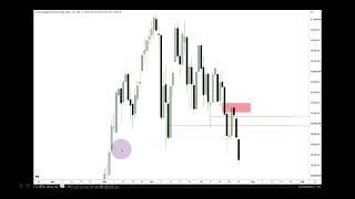
We’re looking at the daily chart here for Nasdaq.
Date: 2026-07-24
URL: https://youtu.be/dYQSUCSbYn8?si=gPAfNZ6i8JlH6E4p
Loading post from X…
A preserved copy is ready if the original cannot load.
Loading post from X…
A preserved copy is ready if the original cannot load.
Loading post from X…
A preserved copy is ready if the original cannot load.
Loading post from X…
A preserved copy is ready if the original cannot load.
Loading post from X…
A preserved copy is ready if the original cannot load.
Loading post from X…
A preserved copy is ready if the original cannot load.
We’re looking at the daily chart here for Nasdaq.
This is the September 2026 delivery contract.
It is the E-mini, not the Micro.
All right, so there’s nothing on the chart.
It’s completely naked.
And I want to remind you of a few things before we get started.
If you haven’t been keeping up with the commentaries or the posts I put on X, the impact of this lecture won’t be as potent as it will be for those who have stayed engaged, watched the content, and listened to the commentary.
I want to preface this by saying that if you’re relatively new to my work, this is going to feel like advanced teaching.
In many ways, it is.
Because it requires you to have at least some experience and familiarity with most of my PD Arrays.
I’ve said many times in the past that regardless of what you’re going to trade with from my repertoire, if there’s a specific PD Array you use as the basis for entering a trade or timing your entry, that specific PD Array is going to become your strength.
That’s going to be the cornerstone, if you will, of your model.
But knowing all the other PD Arrays, even at a casual level—not as though you’re trying to use every one of them every time, but simply being aware of them—that’s what this lecture really focuses on.
Because, as you’ll see, it helps build your understanding and your ongoing interpretation of price within a specific narrative.
In other words, if you’re bullish or bearish, how do you know what to anticipate?
You’ve all watched me call out candlesticks before they happen, as they happen, before they even appear on your chart, and then the market seems to do exactly what I said it should do.
That has happened many times.
And for about two months now, we’ve been putting on an amazing clinic in price action, anticipating where price is going to go in very difficult market conditions.
I haven’t exaggerated at all when I’ve said the market is difficult to navigate for someone who is inexperienced.
Now, obviously, there are people out there who have been trading longer than me, or longer than some of the newer people here, and they may not feel like it’s that difficult to trade.
Maybe that’s true.
But as an educator, I want to be upfront and let you know that if you’re beginning to learn how to trade in these environments, you’re actually doing yourself a great service.
Because if you can learn how to do it while conditions are this difficult, then when the markets smooth out a little, volatility slows down, and cleaner price action returns, it will be easier for you to navigate price action.
Let’s put it that way.
Notice I didn’t say profitable, because I can’t promise you profitability.
That’s something you have to work out as a trader, whether you use my concepts, somebody else’s, or create your own approach.
Okay, so over the past few weeks, we’ve been watching several things on this Nasdaq daily chart.
I mentioned this suspension block.
I mentioned this suspension block.
I mentioned this wick.
And I explained how we wanted to see price trade below it and close beneath it.
We got that on Friday.
The next item of business was watching this wick.
Now, why am I selecting those two wicks?
This is the lowest stretched-out candlestick wick in all of this price action.
Then price trades through it here on Friday of last week.
This midpoint here is consequent encroachment.
That alone is not enough to determine whether price may or may not go lower.
But when price traded down through it here and closed there on Friday, remember, I had already said while we were up here that we were going lower.
Go back and watch it.
You’ll see it in Wednesday night’s commentary going into Thursday of last week.
That’s here.
I said we were going lower.
Okay, you can’t escape that.
So the market showed its willingness to trade below consequent encroachment of this wick and consequent encroachment of this wick.
So we have that and that.
In addition to those, we have this sell-side imbalance, buy-side inefficiency.
We’re looking from wick to wick, and then the market trades up into its consequent encroachment here.
And look where the bodies are coming to right there.
We open directly at consequent encroachment and then break lower.
The next day, we open, trade up into that fair value gap, and then move lower.
Then on Friday, we open with a small gap here.
Price tries to trade up and touch the previous close, but it can’t.
Then it moves lower, working toward a more meaningful run beneath these relative equal lows with the bodies.
We already had a wick trade through them over here, but we want to see the market put a body below those relative equal lows.
Okay, so this is a little too insignificant of a price run because it’s only a wick.
We want to see a more pronounced or protracted delivery in price action with the body, and we got that today, on Friday.
Now look below this low to the left.
What PD Arrays do we have?
We already traded down to this low here on this particular day.
Go to the left, and price has traded through most of this area, but we still have a small volume imbalance right there.
So, moving from Thursday’s daily SIBI through Wednesday, Thursday, and Friday, how far can we anticipate price moving lower?
Looking inside the smaller-timeframe charts, you’ll see these Fibonacci levels.
They’ll be salient at that moment.
Using them here, as price reaches up into it, how far can it trade below that low?
Well, the PD Arrays help guide you in that regard.
The portion above this wick is the premium-sensitive side of it.
If the market is bearish, we want to see the bodies remain heavy in the lower half.
But if price trades into the upper half, it needs to show strong rejection from there.
We got that.
In addition to that, we also have the upper portion of this wick.
So this is where premium sensitivity will manifest.
And again, price trades up into that area as well.
How does it behave?
An aggressive move lower.
But again, how far can this price run?
How far can it reach?
That volume imbalance is a target.
And as you saw yesterday and today from the charts being shared, that volume imbalance in purple was a draw on liquidity.
But look to the left of it.
We have all of this buy-side imbalance, sell-side inefficiency.
So we essentially have an entire suspension block.
That is a PD Array in and of itself.
And if price wants to go lower, what sits below that volume imbalance?
Consequent encroachment of the buy-side imbalance, sell-side inefficiency—or suspension block.
That’s this point right here.
So with these levels, if the market is bullish, price would trade down to at least the midpoint.
If it’s bearish, it would trade down to at least the midpoint and then continue lower.
So when we’re trading and looking for lower prices, you blend the two premises together:
If it’s bullish, it will use the upper half.
If it’s bearish, it will trade into the lower half of the inefficiency or wick.
So we have deep, deep discount here—below last Friday’s low and below these relative equal lows with the bodies.
So think of it like this:
Premium array down to discount array.
If price trades below here, it’s going to move toward the halfway point—or at least try to gravitate toward consequent encroachment—of this buy-side imbalance, sell-side inefficiency.
That is a suspension block with a volume imbalance at the high end and another volume imbalance at the low end.
All right, so let’s move into the lower timeframes now.
We’re on a 1-minute chart.
This is what you’re supposed to be doing each day.
You’re collecting information.
You’re collecting data.
Okay, and when we have large Regular Trading Hours Opening Range Gaps like we have here, we annotate them and identify the midpoint, or consequent encroachment.
So this area shaded in purple is the Regular Trading Hours Opening Range Gap.
This is the 9:30 opening price, Eastern Time, and this is the previous day’s settlement price.
This level is consequent encroachment.
Extending that level into the future, you can see how price eventually worked its way down into it.
Look at the bodies respecting it there.
Then price moves higher.
We’re collecting all of the consequent encroachment levels from the Opening Range Gaps and extending them into the future.
Okay, so you saw this on the previous slide before we moved forward.
Price trades up a little bit and then starts to come back down.
These are those two respective discount wicks from the daily chart.
I graded them and showed you the halfway point.
This is the higher one, and this is the lower one.
Okay, so we can see that the market worked its way above consequent encroachment of Monday’s Regular Trading Hours Opening Range Gap.
We worked up into this area here and then moved lower.
Now direct your attention over here.
See that volume imbalance wick low?
This is Monday’s first presented fair value gap.
Monday’s first presented fair value gap is crucial information.
You want to carry it through the entirety of the week.
Just extend it to the right in the settings.
You can see how it’s being utilized here.
Coloring outside the lines is okay.
Right into the high over here, into consequent encroachment here, and then price falls out of bed.
It trades down to the lower discount wick’s consequent encroachment here.
Extending that level over, here’s the drop.
Price trades down into it here.
Then a SIBI forms and price breaks lower.
We work around the midpoint of that discount wick—consequent encroachment—that red level.
Then price trades down to Monday’s Regular Trading Hours Opening Range Gap consequent encroachment again.
Once we trade through it, it’s going to act as a premium array.
It’s having a hard time getting back above it, so we create displacement here.
Sell-side imbalance, buy-side inefficiency.
Price trades up into it, breaks down, and consolidates a little.
Moving over here, price trades back above that lower daily wick’s consequent encroachment level.
And you’re going to need to move back and forth between the timeframes.
Either print out the slides as I’m showing them so you don’t have to keep going back and rewinding.
But as I move forward, I’m showing a little more data from each day on the 1-minute chart.
You can see it being utilized here.
Price fails to move higher, drops lower, and works around consequent encroachment of Monday’s Regular Trading Hours Opening Range Gap.
Then price trades lower here, settles during Regular Trading Hours, and the very next day at 9:30, we open all the way up here.
That pink area is the daily fair value gap from last Thursday.
That’s the SIBI.
This is the SIBI low.
So price opened directly at it.
Then it traded right back down into Monday’s first presented fair value gap.
After that, it used consequent encroachment of the higher daily discount wick.
This is the lower daily discount wick.
Here’s the Regular Trading Hours Opening Range Gap and its consequent encroachment.
So we have Monday’s here and Tuesday’s here.
Moving a little farther to the right, price trades down into Monday’s first presented fair value gap, rallies, and then starts digging into that daily SIBI from last Thursday.
Look at how it’s using all of these levels here.
See that?
Then price moves higher and consolidates in this area.
Finally, we get a small, sharp break lower in the last few minutes of trading, followed by another gap lower.
Opening right here, we have Wednesday’s Regular Trading Hours Opening Range Gap.
Measuring from the previous close to the opening price, this is consequent encroachment.
So that’s Wednesday.
Moving forward, price trades up into the daily SIBI from the previous Thursday.
Then it trades back down into consequent encroachment of Wednesday’s Regular Trading Hours Opening Range Gap here.
After that, price starts moving higher.
Why?
Because a small portion of the gap remains unfilled until we reach this area.
Then price moves around and gyrates around consequent encroachment—the midpoint of last Thursday’s sell-side imbalance, buy-side inefficiency.
So you can see that it acts as a natural support and resistance level when you grade these specific inefficiencies.
It removes all the ambiguity about which high or which low you should use for support or resistance.
Okay, so if you view price action through the lens of ceilings and floors—support and resistance—the way I teach you to grade specific inefficiencies or particular ranges will help you with that elementary perspective of price action.
It removes any doubt about which level you should be looking for, and I’m going to reinforce that opinion even further.
Okay, so price is moving sideways here, holding between 29,330 and 29,310.
We’re up here doing this, then price breaks a little lower and trades right back up to the octant immediately above consequent encroachment.
Again, the shaded pink area is last Thursday’s daily SIBI—sell-side imbalance, buy-side inefficiency.
We’re in the premium side of it, so we should see strong displacement lower.
And we get that here.
It’s occurring in the afternoon session.
So here’s a PM session sell-off.
Price trades just below the low of last Thursday’s daily SIBI, then moves back up inside that range.
We end up closing here, and the next Regular Trading Hours session opens down here.
That creates Thursday’s Regular Trading Hours Opening Range Gap, with consequent encroachment at the midpoint of the gap.
We’ve had some very large gaps this week.
Right away, you should notice that Monday’s, Tuesday’s, and Thursday’s Regular Trading Hours Opening Range Gap consequent encroachment levels are creating a great deal of convergence.
There’s an overlap of several very important levels while we’re trading within a very large daily range.
So when we’re in trading-range environments, it’s normal to see these types of things occur.
What’s the benefit of knowing that?
When these levels start getting close together and come into close proximity—not necessarily close in terms of the number of handles, but close relative to areas like this, where we opened versus where we settled the previous day—that’s meaningful.
Up here and down there, there’s a much wider disparity.
But in this area, these levels are relatively close together, considering where we are on the daily chart.
It gives us a basis for identifying the highest level and the lowest level.
There’s your range.
So if price is above this range, the market is more likely to sell off.
When price is below it, the market is more likely to rally.
But as I told you last week, we’re likely to look for lower prices because the market is moving lower.
So anything above Thursday’s, Tuesday’s, and Monday’s levels—Monday’s first presented fair value gap, the upper half of that higher discount wick, and Wednesday’s Regular Trading Hours Opening Range Gap consequent encroachment—places us in a premium market.
That’s what I’m getting at.
If price is trading in these areas or higher, we’re in premium.
And we’re also trading inside last Thursday’s daily SIBI.
Moving forward, here’s that large gap.
Price drifts sideways, then starts moving lower and trades directly into that daily volume imbalance—the purple one.
It rallies a little here, then trades lower.
Look at the bodies.
Isn’t that crazy?
Then price rallies and drops right back into it.
The bodies are indicating that price wants to move higher because it cannot put a body through consequent encroachment.
We start to rally, slowly drifting toward this grouping of Opening Range Gap consequent encroachment levels.
We have minor buy-side liquidity here at 28,883.
Notice how price turns right there inside the volume imbalance.
Remember, this volume imbalance is the upper volume imbalance of a daily buy-side imbalance, sell-side inefficiency suspension block.
So why couldn’t price just continue lower into the single candle?
For the people who say my fair value gaps are merely single prints or low-volume nodes, why did price stop right here?
Why didn’t it trade through the rest of the inefficiency?
Why did it turn here?
Why did it do this?
Why is it beginning to drift away from this area?
Is it buying pressure?
Is it a lack of selling pressure?
No.
It’s algorithmic.
So the market moves higher from this level, consolidates after that run, and then drifts around.
This kind of price action is difficult for a new trader to operate in.
All of this here is very difficult because it’s hard to trust where price is going to go.
So you have to wait for the market to give you something very strong and heavily weighted because we’re trading with a bearish bias.
So the market trades down into the volume imbalance one more time.
We have a buy-side imbalance, sell-side inefficiency here.
Price trades down into it, rallies, and then settles into Thursday’s Regular Trading Hours close.
Thursday’s session ends, and then Friday’s Regular Trading Hours opens down here at 9:30.
So we have Friday’s Regular Trading Hours Opening Range Gap and its consequent encroachment.
Once again, we’re close to the daily volume imbalance.
These are the lines grading the buy-side imbalance, sell-side inefficiency—or suspension block—that this purple area is part of.
This is the low.
This is the higher of the two volume imbalances.
The lower volume imbalance is obviously beyond the scope of what I have shown on this chart.
Price moved a little lower during the morning session, but eventually turned at 10:45 and started climbing higher.
It just failed to reach the consequent encroachment level.
Notice that.
Now, is that bullish or bearish?
If price cannot reach it and then starts to fall out of bed, that’s bearish.
So that’s this point right here.
Price trades right back down into the higher daily volume imbalance of the suspension block.
Then it tries to run outside of it again.
Price is quickly snatched back inside, hits the high of the daily volume imbalance, and begins displacing lower from the lower quadrant.
Then it finally settles down here after reaching consequent encroachment of the daily buy-side imbalance, sell-side inefficiency in the form of that suspension block.
So all of these levels are things I was writing down on my notepad each day and keeping as reference points.
Then there were the fair value gaps I was calling out, referring to, or using in the executions, along with the draws on liquidity, the sell-side liquidity, and the buy-side liquidity—those types of things.
And this morning, admittedly, I wanted to see price move higher and take out a little more buy-side liquidity before dropping.
That’s why I said I preferred it to take the buy side first, because it’s Friday.
If price were to move higher, take out the buy side, and then break aggressively lower, that would cancel out TGIF because we’re part of a larger higher-timeframe decline, or sell program.
Let me take you right back to Monday.
I mentioned this as well.
This is a little too smooth.
When you see price action like this, this is not how markets bottom.
They’re going to come back later in the week for that.
So we see consolidation, price rallies, and then we look for a Wednesday or Thursday change in direction with an aggressive move lower because we were bearish.
We were told in no uncertain terms from last Wednesday into Thursday that price was going lower.
Any premium array, any range trading in premium, or any market structure shift lower after trading in premium should deliver lower prices.
Here’s the market trading below Monday’s first presented fair value gap.
On Thursday, price trades up into the lower quadrant here, breaks lower, and moves into a macro—the 7:50 to 8:10 macro in this area.
Now, this is where I’m teaching the chain of custody for price.
When you’re anticipating price moving to a very specific level—Monday’s relative equal lows, which are Tuesday’s Electronic Trading Hours sell-side liquidity—that’s what I showed on the previous slide.
It was too smooth.
I said markets do not bottom like that.
The market is going to want to come back to it.
So here we are on Thursday.
Right up here, what’s the first thing we see?
We’re at consequent encroachment of a daily wick.
Something can happen around that because it’s a key level from the daily chart.
Here, we’re crossing that level with this premium wick.
So watch what happens.
I’m going to grade the entirety of this high.
Why am I selecting that?
I can’t use the high of the wick because that’s allowed to do the damage.
The bodies tell you the real narrative, and this is a sell-side imbalance, buy-side inefficiency.
So anchoring to this candlestick’s high is more significant when defining a range that has yet to be delivered.
This creates an implied dealing range from this candlestick’s high down to Monday’s relative equal low.
When price runs up into this wick, the wick acts as a gap.
So this is a gap, and this is a gap.
But when we’re working with unrealized dealing ranges—implied dealing ranges—if price has not yet delivered there, we’re simply looking at a target or a draw on liquidity.
But if you know where the move begins—where the inception of the price run starts—you have to be able to define that.
You only learn that through backtesting and collecting information like I’m showing you here.
Why use that candlestick?
Because it’s the SIBI, and we’re anchoring to the body rather than this wick.
The purpose of this wick is that its upper half represents premium sensitivity.
We don’t want to see any bodies left in the upper half, do we?
Since this formed, have we had a body close above it?
No.
But the bodies are staying inside this SIBI.
Interesting, isn’t it?
There are several factors in play here.
Price runs above with this wick, completely gives up the ghost, trades lower, and closes below consequent encroachment of this sell-side imbalance, buy-side inefficiency.
You have to take good notes.
Don’t assume that just because you’re watching this, you now know how to do it.
You have to practice.
You have to study.
You have to go through your old data, take screenshots, and mark up your charts.
I’m going to show you what I was doing in a live trade, and after this portion of the lecture, I’ll let that trade play without any commentary so you can watch everything I’m outlining here.
You’ll see why I was able to stick with the idea and which areas were problematic for me.
All of that will be discussed here so you understand what I was doing, why I was doing it, and, more specifically, when.
So we have a sell-side imbalance, buy-side inefficiency.
The body tells you the narrative.
It’s accurate for defining a range, projecting it down toward a pool of liquidity, and anchoring from that candle’s high to this red line here at 28,701.
That’s a finite level.
We know price is likely to trade below it for sell-side liquidity.
But when you’re grading an unrealized dealing range—or an implied dealing range—where price has not yet delivered there, but you anticipate it moving from up here down to this line, you have to anchor it to a very specific higher-timeframe PD Array where it makes sense.
That’s this level here—the red line.
That is consequent encroachment of a wick I talked about ad nauseam last week.
So you should already have that level on your chart.
You were told as much.
Okay, then we have the SIBI.
Price trades up and creates a wick.
Do we project from the wick?
No, because the wick is a gap that’s allowed to do the damage.
You have to use the bodies because they reflect the real volume of the move.
So we’re going to frame the range from this high down to this low.
I’ve taught this before in brief discussions on Spaces, and I’ve also highlighted it in a few short lessons covering price runs I participated in or called beforehand.
But if you want to learn how to call each individual candlestick and watch price walk out the narrative—whether you’re bullish or bearish—toward a very high-probability draw on liquidity, this is what you should be doing.
Okay, look at these levels here.
You have the high of the down-close candle—the SIBI.
Then the next line is here, the next one is here, followed by this one, this one, this one, this one, this one, and finally the level that acts as the draw on liquidity at 28,701.
So what am I getting at?
These are your gradient levels.
You’re anticipating—listen, folks—you’re going to anticipate my PD Arrays.
So what we’re going to focus on is this level that price moved away from before trading into this one.
This entire sell-side imbalance, buy-side inefficiency is resting on the upper octant.
That tells you this SIBI is important.
You know that as soon as this candlestick closes.
Then this candle closes here, which confirms the SIBI.
So as soon as the next candle opens right there, you know the draw is Monday’s relative equal lows.
And you’re going to anchor from this candlestick’s high down to that liquidity.
I’m looking for my algorithm to speak to me in no uncertain terms that this is exactly what price should be doing.
And yes, I said exactly.
Okay, we’re going to look at this candlestick right here.
What is the high of that candlestick?
28,941—even, to the tick.
It’s occurring on a PD Array that forms directly on the upper octant.
That’s why this fair value gap is going to be perfect.
You like that?
Oh, it gets better.
Watch.
When price moves lower, comes right back up, and hits this level, you’re watching price action and expecting it to react there and move lower.
If price trades back up into this fair value gap, it cannot leave a body in the upper half.
That’s what you watched me do.
That’s what you watched me call out.
We move lower, and then we get this candlestick here.
It opens, trades up, and falls short. It doesn’t touch the level above.
So what makes this a bearish order block?
It doesn’t touch this up here.
So how is that a bearish order block?
I don’t get it.
What’s going on?
We’re at this level here—the upper quadrant.
See how the candle is resting directly on it?
It has to touch or rest on that level to validate this PD Array as perfect.
So when you’re bearish, focus on the open of the up-close candle.
As soon as the next candlestick trades down through that opening price, it does not need to close below it.
The moment it trades through the opening price, that validates the change in the state of delivery.
Any movement back up, like it does right there, is where you can sell short, add to the position, and pyramid premium entries for a larger position anticipating lower prices.
So you can see that there.
Okay, now we’re seeing the chain of custody and control of price.
It’s not buying and selling pressure.
This is my algorithm doing exactly what it’s coded to do.
Every little fluctuation has a purpose.
There’s a rhyme and reason for everything.
The market breaks lower after trading up into the bearish order block.
We break lower, and now what else do we have here?
This wick.
It’s resting on consequent encroachment of Monday’s Regular Trading Hours Opening Range Gap.
That is a key level.
You have to know what these levels are.
So if we’re bearish and price trades below this wick, the upper half—from the close to the midpoint—should not book any bodies.
The bodies are not trading above it.
They’re respecting the wick.
Why is that wick being used?
Why is it important?
Why isn’t this one important?
Because it’s not touching this line.
It’s not touching that line.
We already have this one here as the relevant wick.
First utilization.
If there’s already a wick on that level, don’t use any of the other wicks.
This would be considered a candle with a wick.
This is also a candle with a wick.
Don’t use those, because we already have the relevant wick here.
See that?
This line is your next order of business.
Price trades lower, and then we get this candlestick’s low, this candlestick, and the volume imbalance right there.
Extend that forward in time.
Look where the bodies are.
Look at that.
They’re staying inside the range between the candlestick low and the low of the volume imbalance.
And look at the wick right here.
Price trades up into it, falls out of bed, and drives lower.
Then we get into—what is this line right here?
That’s the 50 level.
That’s half of the range defined by the high of my bearish order block down to the draw at 28,701.
Now, if that’s half of the range, wouldn’t it be interesting if a fair value gap formed right there and acted as a measuring gap?
Let me remind you right away: I’m not saying I invented the measuring gap.
I’m telling you I’m the only guy on the planet who tells you exactly where they’re going to form before they form.
How about that?
And wouldn’t you know it, a fair value gap forms here and does not close in.
What?
Isn’t that interesting?
That means we should begin to see price accelerate.
It should speed up without much of a retracement.
It can consolidate, but in an ideal situation, we should not see meaningful retracements.
Price should simply drop lower and accelerate—or drop, consolidate, and then drop harder.
So we have a measuring gap right at the midpoint, and then price drops aggressively.
This candlestick is resting directly on the lower octant at 0.375.
Now think about that.
This is being scientifically measured.
You just have to know the correct range.
So price trades down into this lower octant and gives us this sell-side imbalance, buy-side inefficiency.
We’re bearish.
Do we want to see bodies in the upper half of a sell-side imbalance, buy-side inefficiency?
No.
What happens if the wick cannot even touch consequent encroachment?
Is that bullish or bearish?
According to ICT, it’s bearish because price cannot even deliver to the midpoint of the inefficiency.
This inefficiency is valid because it’s touching an octant of an unrealized dealing range—an implied dealing range that has not yet been delivered.
Oh yes, yes, yes, yes.
Bearishness.
We break lower, extend this level over here, and begin consolidating.
That’s allowed.
We’re simply not anticipating any wild retracements.
Why?
Because price is below the halfway point.
It should either consolidate and drop hard, or continue lower without any meaningful retracement.
So price is just hanging around in here.
We get a small retracement up, and it touches the low of that inefficiency.
We have a buy-side imbalance, sell-side inefficiency right here.
If price can trade down through it, then what should it do?
It should act as a point of reversal, hold price lower, and continue acting as resistance.
Inside this candle, price opens, trades up a little, and then sells off aggressively.
Then it tries to trade back up into this area, where it creates a tiny Mohawk inside this range right here.
Wait a minute.
How is this a valid fair value gap?
Because it’s part of this price run resting on the lower quadrant level.
Price rallies, fails to touch the inversion fair value gap, and according to the old man’s logic, is that bullish or bearish?
It’s bearish.
And what happens?
Price falls out of bed into this lower octant.
Look at what forms directly on that line—another bearish fair value gap.
If we’re in a bearish market, inside this sell program, and the draw is down here at Monday’s relative equal lows after price has been held in premium all week, now it’s Thursday.
No bodies are allowed in the upper half.
Is that true here?
So you’re telling me the sellers were in control and the buyers couldn’t even leave a body above the midpoint?
That’s what you’re telling me on every one of these PD Arrays?
The logic is holding up here.
The bodies are staying outside of this area, so that bodes well for the level holding.
Don’t get scared.
It’s consolidating, consolidating, consolidating.
It’s going to trade down there.
We can’t get a body in the upper half, and we can’t even leave the bodies inside the fair value gap.
So wait.
Submit yourself to time.
If you get scared or nervous and you can take partials, take one off.
Satisfy that urge, and it will be easier for you to hold the rest.
The market then eventually trades down into our target here.
By taking this same gap, once it was filled, swept here, and price moved right back above it, I carry it forward.
Now it becomes an inversion fair value gap.
And where is it smooth?
Right here.
So I use the order block and the inversion fair value gap.
Price rallies up into this area.
Price moves all the way back up into a short-term premium.
Then it gives us this messy price action until we move into the PM session.
You heard me talking about this last week and again this week, and you saw it on my charts as well.
It’s last Wednesday’s 60-minute—or 1-hour—buy-side imbalance, sell-side inefficiency, formed at noon Eastern Time.
That’s this one right here.
What was so important about it?
Why did I select that one?
What’s the big deal about this?
Let’s briefly go over it.
If we’re bearish, and last week price traded below this low here, a classic support-and-resistance idea would be this:
If price is down here and starts moving up, it should return to this low and stop at that invisible line.
But it doesn’t.
See that?
Okay, maybe it will move up to this low right here and stop because price created a small turning point there.
No.
Not there either.
Okay, then we’ll use this one.
Price should trade right up to that line and stop.
But it doesn’t.
It keeps moving higher.
And some of you want to trade with a 2-point—or 2-handle—stop loss.
You’re not going to do that using this as a resistance level.
You’re getting smoked here and then smoked again here.
Or what about this line drawn from that low?
That has to be support broken and turned resistance, right?
Price never even reaches it.
See how subjective that is?
So now let’s strip it down to an actual dealing range.
Okay, I’m going to direct your attention to this candlestick’s high.
Drop a Fibonacci retracement from that high all the way down to this candlestick’s low right here.
See that 50 level?
Now follow that 50 level over to the left.
What PD Array lines up directly with that level?
This one.
Hello.
So if I’m anticipating a retracement, I want to focus on this buy-side imbalance, sell-side inefficiency that previously offered bullishness here.
That validates it as a bullish fair value gap that can potentially become an inversion fair value gap.
Its first utilization—how it was presented when it initially formed—was buy-side delivery.
That means if the market is bullish and price returns to it, it should act as you see here and send price higher.
But if we’re bearish and price trades down through it, then when it retraces back up into it here, it should ideally show premium sensitivity.
Price is not likely to trade above it.
Now, price can flirt with the level and color outside the lines a little because this is an hourly chart.
When you view these levels on a 4-hour chart, you’re just going to see tiny little Mohawks.
Okay?
An 8-hour chart, a 4-hour chart—those types of timeframes.
So if you use multiples of four between timeframes, you can blend them appropriately.
For instance, the 15-minute timeframe is a really useful bellwether timeframe.
Four 15-minute intervals form one 60-minute candle—one hour.
Four 60-minute candles form one 4-hour candle.
Four 4-hour candles form an 8-hour candle.
Do you see what I’m saying?
By using these little quirky rules, you’ll be able to blend timeframes appropriately and move to the next higher key-level timeframe.
Here, don’t look at these candlestick bodies and say, “Oh, but there’s a body outside of that.”
Yes, you have to refine it a little.
You have to view it from different perspectives.
Just understand that the bulk of the turn will occur inside that area, and the bodies are essentially illustrating that.
Look at what price does right here.
Isn’t it interesting how it behaves directly at that level?
Right there.
The bodies cannot even leave an open or close above consequent encroachment of that gap from last Wednesday.
This one is important because it was used as a buy-side imbalance, sell-side inefficiency here, then failed later last week, and price was returning to it.
That’s why it remained important this week.
That’s why you saw price behave the way it did.
Price utilized it here and then finally sent us lower, creating a lower low than last Friday.
There are many more things I could discuss here, but that would obviously turn this into a six-to-eight-hour video.
I’m not going to do that.
I just wanted to give you the main talking points so you know what to do in your backtesting.
Start collecting this information.
It may not look as perfect as what I’m showing you here because you don’t yet have the experience.
You’re going to be a little off with where you anchor your reference points.
So when I’m showing you things throughout the week or sharing executions, get on your charts and try to make these measurements yourself because I’m not always going to include them.
I have all of this written down on a notepad, okay?
I use these little pads, and the data I have written on them is essentially what you see here.
This is the PD Array matrix.
The market trades up into this area, and I’m anticipating it trading down to that daily volume imbalance.
If price trades through that, the next draw is consequent encroachment of the daily buy-side imbalance, sell-side inefficiency—or suspension block.
And you can see that price delivered there.
So in my mind, we’re trading up here to go down there.
Again, the weekly range was called in advance.
Earlier in the week, when we were trading toward the relative equal highs, I told you I was looking for one more small pool of buy-side liquidity.
And that was it.
I called nothing higher than that.
Go back and listen to the commentary.
Those are the things you’re supposed to write down and keep track of.
That’s how you keep me honest.
That’s how you know you’re listening to someone you can trust—because I’m calling out very specific characteristics:
What price should do.
What it should not do.
What I’m comfortable with it doing.
And the precise level beyond which I’m no longer interested.
That’s important.
Very, very important.
Even though this was very difficult price action, it was something you could follow along with me throughout the week, and it delivered rather handsomely.
So hopefully this was helpful to you.
I’m going to build on this because it’s a very dense subject matter.
A few chapters in a book would not easily satisfy someone reading about it.
If I only showed static charts with annotations, it would never be communicated as effectively as I’ve done here.
So what we’re studying is the chain of custody from one PD Array to the next.
We’re not studying buying and selling pressure.
We’re not studying how many orders are coming in, how volume is increasing or decreasing at a specific price, or what’s happening inside some specifically defined range of candles.
Okay?
We don’t care about that.
None of it means anything.
The other schools of thought do not have these central tenets of precision that I’m illustrating, calling out before they happen, and executing on.
This is not market replay.
I’m executing from levels you were aware of beforehand, with a bias and an interpretation of where the market should draw next before it gets there.
Isn’t that fun?
Isn’t it fun?
Now here’s the heartbreaker.
This coming week, I’m giving you nothing in advance.
You have to do all of that on your own.
We’re going to focus strictly on hindsight because I want to strengthen you in that area using what I’m showing you here.
Okay, so each day I’m going to give you a review of how what I just showed you repeats every single day.
If the market were not rigged—if it were not run by an algorithm—these things would not appear.
It would be impossible for them to keep repeating if this logic were not the actual source code that determines where price goes, when it goes there, and how it is delivered.
That is the chain of custody of price action:
How one PD Array, one specific candlestick, how it forms, and the time and price at which it forms, all contribute to what price does next.
It lends itself to causing price not to move any higher.
No, you shall not pass.
Yes, you should go through.
See that?
That’s how I know what’s going on beforehand.
That’s why I’m confident when I execute and share my interpretation of where I believe price is going.
And I have a high degree of accuracy.
I’m leaving it in your hands to decide whether you see this as something noteworthy.
Even if you don’t apply it immediately, once you learn how to do it yourself, it’s fascinating to study.
Over time, studying this as a hobby and becoming fascinated by how precise these things can be—even if you’re only looking at them in hindsight—teaches you to see them before they happen without you realizing it.
That repetition builds familiarity.
It’s like a hunter teaching his son or daughter how to hunt.
You start by showing them tracks in the snow and asking, “What animal made this?”
This is a raccoon.
This is a fox.
This is a deer.
This is an elk.
This is a human footprint.
Through recognition and repetition, they learn how to track.
And tracking is done through backtesting.
You have to know what you’re hunting and how it leaves tracks.
The chain of custody that price uses within very specific dealing ranges—whether those ranges are already present in price action or have yet to be delivered—always operates through the same mechanism.
Hopefully you found this insightful.
I hope you learned something.
I hope it inspires you to dig deeper with me this coming week.
Lord willing, I’ll be back with you all on Monday.
Until then, enjoy your weekend and be safe.
Loading post from X…
A preserved copy is ready if the original cannot load.
Keep learning with us.
Get new ICT lessons, study notes and updates as we build V2.