
Thursday June 15, 2023 \ ICT Price Action Workshop ⭐
You’ll learn about fair value gaps. You’ll learn about price delivery. You’ll learn about time-of-day bias, daily bias, session bias, stops, where you should look for stops. So you don’t need a Bookmap or any kind of gimmick out there that requires you to subscribe to something.
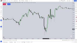
Date: 2023-06-15
URL: https://www.youtube.com/live/rx15_eN9sxI?si=-xcsHPy40ZDj-Z68 Watched Date: June 15, 2023
I promise we’re going to be doing a lot of teaching today. Okay, so if you’re here to learn, I promise you, you will learn a lot today.
You’ll learn about fair value gaps. You’ll learn about price delivery. You’ll learn about time-of-day bias, daily bias, session bias, stops, where you should look for stops. So you don’t need a Bookmap or any kind of gimmick out there that requires you to subscribe to something.
I’m placing insight in your hands so that way you don’t have to have any kind of service whatsoever. All you need is the open, high, low, close, how to work within the timeframes.
I’m going to work from the higher timeframes down to lower timeframes. I’m going to teach you how to back-test today. We’re going to be here for a while, okay? I’m not going to be able to promise you a rant won’t come in and out throughout this session.
So I’ve allowed 8 o’clock to 11. It might go longer. I don’t know, but everything will be recorded.
Today, we’re going to cover a lot of stuff. I’m going to cover Forex. I’m going to cover index futures. I’m going to cover a lot of things that would otherwise be kind of like the first day when, in the mid-90s, I did one-on-one teachings.
And every time I would have a schedule or an appointment with someone, I would tell them what would happen the previous week. So that way, when we would meet on our first session together, I would have everything already in the charts that I already told them the week prior.
So everything that I do and have taught for years has always been on the premise of me telling you before it happens, explaining what it’s going to do, then we wait for price to do it. And then I can go in and teach more amplified approaches to what it is I’ve already taught you conceptually on this YouTube video, or YouTube series, channel, whatever you want to call it, and in my mentorship, all those lectures and lessons.
If you are looking for that real quick, “Watch, give me something, and start studying,” if you’re new, you don’t know where to begin, I kind of want to place this in the beginning. So give me like 10 minutes of your time. And if you are seasoned, and you’ve been around me for a while, the next 10 minutes is not necessary.
Don’t think you can watch it real quick and try to trade with real money, okay? It’s important that you understand you have to slow down your impulsiveness to want to make money.
I know it’s exciting seeing the things I’m sharing, and my students sharing, and all these people that are claiming that they found success with my stuff. And it’s wonderful. I’m honored. I’m in such a position of privilege to be considered your mentor and having so many people around the world being profitable now. But it’s not a rush to get to that point.
Every single one of my failed students—and I have them. I don’t have just winners. I don’t have just success stories. Like anything in life, there’s going to be folks that just simply can’t do it, or can’t do it yet, and eventually they get there.
See, how much effort and time you put into this is going to decide how fast—not that that should be a factor—but how long is it going to take you to find your setup? What is your setup? How do you determine what that is? Because I teach a lot of ways to get into a market. We’re going to teach that today too.
ICT content is really focused on where you should be in your pursuit of learning, what you should be focusing on, and how to determine your path through all this content.
Because I teach a lot of things, a lot of ways to trade, different timeframes to trade, different setups, different entry mechanisms, different ways to take profits, where to take partials, how to take partials. We’re going to cover all that stuff today.
If you simply watch my videos, or wait for my next video to come out, and you’re just a viewer, and you don’t go into your own charts looking for this information—not trying to demo real time, but going back and looking at old price moves—and we’re going to do that today. I’m going to show you exactly what you’re supposed to be doing.
It’s not hard. It’s a little bit tedious in the beginning because it feels like it’s counterproductive. You’re looking at something that’s already happened. But everything technical, everything worth doing, is always based on studying something as a case study that’s happened in the past. How else can you determine your foundation to something? You have to have a good foundation in observing repeating phenomena at specific times of the day with repeating characteristics. That’s what I teach.
So those hallmark signatures in price action, that’s the whole basis of what I do as a mentor. I’m teaching you how to observe and find that. I don’t and I can’t promise you profitability. That’s something that you’re going to determine based on how much time and effort and organization you bring into this.
Last point, and then we get into it. If you are lazy, you will fail here. If you have an entitlement mindset where I owe you something, I have to do everything for you, or “I can’t learn this unless it’s one-on-one,” or it has to be done live.
Every single day, I went through exercises of drawdown, came out of drawdown just to teach students there’s nothing to be afraid of. There’s no fear of losing. You should respect risk. You will lose trades.
Everybody that trades, every single method, every single teacher, educator, everybody, if you’re going to put risk in the marketplace, invariably, you’re going to incur a loss. And you have to accept the fact that’s going to happen.
How you handle yourself, how you handle your perception about your ability to work through that and stick to the model that you have trusted, that it doesn’t have to be perfect. A 100% strike rate is not possible. It’s not realistic for you, okay?
But you don’t need a high rate of return or success rate in terms of trades to be profitable. I’m not promising you get rich. I’m not promising you millions. But the things that I teach, and money management, and all those things factored together, can you become wealthy? Absolutely. Can you quit your job? Absolutely. Can you have a secondary income and still keep your job and just treat this as another side hustle? Sure. It’s completely scalable to you.
You’re going to be impulsive. Everything you’re doing is trying to get ahead of somebody else, when it should be just about making sure you don’t lose money and that you’re working towards learning how to be consistently profitable.
And consistently profitable doesn’t equate to everyday trading. Day trading is not everyday trading. I promise you, if you try to do it every single day, especially in the first two years or so, you’re going to have a whole lot more losses than is necessary.
Which is the reason why I teach with a lot of lectures. And in the dry parts of my discussions, those are the parts that you’re going to come back to after you tried to do this, you made a little bit of money, or you found some success in it, you’re hooked. Now you want to keep doing it and have more of that experience.
And then you have a losing trade, and you want to fix it. “I’m going to close the day with fixing that loss.” Then you make it bigger. And then you start that routine of chasing breakeven on the day, and all that generally does is make a larger drawdown.
So you want to avoid those periods and be content with, okay, you did something wrong. It doesn’t mean everything’s broken. But you can derail yourself in your learning. Or if you’re trying to trade with live funds before you’re supposed to, you won’t do well, and it makes it harder.
So when I teach, I give you 30 years of experience. The things that I’m talking about, I went through it. I lost lots of money, lots of accounts. I did it to myself. Nobody else was to blame. I did it every single time. I caused all that. And you have to be responsible with your own actions as well.
So if you make money using what I teach you, well done. I am not responsible for that. If you lose money, well, you did that. Own it.
So I’m giving you my experience on proving that I can tell you what’s going to happen in the marketplace with a great deal of precision. And you can learn that precision. You can grow into having a very clean understanding about price, what to anticipate, and more importantly, when not to try to trade. That is an important lesson, and not too many people are really aware that that’s an important factor in trading.
And that sometimes is the boring conversation. But I promise you, once you go into drawdown, you’re going to want to listen to those parts in the videos again. And then you’re going to wish that you listened and followed the advice I gave you.
I want you to do well. I really, really want to see you succeed, more so than you do. But there’s got to be rules that you have to follow, and you have to give yourself time to grow into it.
Okay, so with that mindset and that, I guess, goal in mind, let’s begin.
On the 13th, I covered my opinion about what I thought was going to happen this week. And when I was doing one-on-one mentorships back in the mid-90s, folks would learn about me by me advertising. And it was a high-end advertisement, so it was people that had a lot of money and wanted to come to me and learn how to do something with that money on their own, and had either already been in the marketplace or was looking to do something to get into it.
So one of the greatest selling points I had was, I would tell them, much like I did on the 13th of June 2023—it’s on my YouTube, it was live-streamed, it wasn’t a prerecorded thing, everybody watched me out on it—and we talked about the CPI number, and I walked you through CPI real time. And I walked you through a 15-second candlestick chart.
So every single candlestick represented fluctuation of the highest high and the lowest low, and open and close, of every 15-second increment. Now, you don’t see that in books. You don’t see anybody teaching with that type of timeframe. But everything that I teach is fractal because it’s the same price, whether you’re looking at it from a weekly chart, monthly chart, three-quarter, or three-month chart, a yearly chart, it doesn’t matter. Price is price.
What I’m going to teach you today is a secret of breaking down price and looking for that price delivery continuum. So how to go in, like if you’ve ever watched me do a presentation where I’m recording my trades.
Most important thing is understanding where price is going to go.
What I gave you on the 13th of this week in a live stream, I talked about very specific points of reference in price for the Dollar, EUR/USD, Pound Dollar, gold, Nasdaq, ES, and Dow futures.
So I’m going to go through those individually, and kind of like, it’ll be somewhat of a review. But I’m going to teach also the main takeaways and what you’re supposed to do with this information.
You don’t know what you’re doing. So I’m trying to protect you from yourself, because I was my worst enemy. And you’re your worst enemy right now, and you don’t realize it. But you are.
So if you listen to me, I’m talking. I’m trying my best to give you everything in the perfect, proper order for how you’re going to develop, because I’ve done this for a long time.
All right, so let’s go over to the Dollar Index, right. And this is a weekly chart. And I shared all this business on the 13th. I added this little area in here. This is a fair value gap, weekly BISI.
That is considered, by my definition, what I call a fair value gap. Its classification is a buy-side imbalance, sell-side inefficiency, meaning that the delivery of price was on the upside.
So think about a paint roller, okay? And I’ve used this analogy before. If you wanted to paint a wall in your home, and you apply the paint to the roller, and you apply that roller to the wall, okay, you’re getting that delivery up. If you keep doing that from the bottom of the wall to the top, eventually paint will run out, and you’ll see these little pockets, these little pits on the wall where paint didn’t make its way to the wall.
So you already know, what do you have to do? You got to roll back down over top of that to fill in those little pockets of gaps where paint was not distributed. Think about price the same way.
Between these two reference points, that being this candle’s high and this candle’s low, that one candle right here, in that shaded area that’s purple, there’s going to be small inefficiencies in that range that’s shaded in purple. The easiest way to simplify it is, we don’t need to know yet where those small little pockets are on a lower timeframe, because this is a weekly candlestick.
So inside that range, that range I’m highlighting here with my cursor, somewhere along the line in that very week of data, there are gaps, inefficiencies. We don’t need to know exactly where they are. But we can identify that range right here as soon as that candle closes and we begin a new week. That gap that’s shaded in purple, we know that there’s a likelihood that the market will want to, at some future time, reprice to that. That is not balanced.
All it means is that shaded area that’s purple, it’s buy-side imbalance. So the market’s shown an imbalance, meaning it wants to go up. It did go up. So what is it inefficient in? It’s inefficient in the sense that it hasn’t had a sell-side delivery. Sell-side is when price is being offered downward. For that purple-shaded area here to be repriced to and offset the inefficiency of sell-side, because it’s buy-side imbalance, it’s imbalanced. It has to be balanced later on.
And I’ll tell you how it becomes balanced. But right now, what is it lacking? It’s lacking sell-side delivery. That means a candle must trade down in between the high and low that purple range is defined by, the two candles I mentioned here.
So in our mind, in my mind as an analyst, I’m looking at this and thinking, okay, well, we’ve seen a lot of back-and-forth price action all through here.
Where is there a break in all that back-and-forth movement? It’s in that shaded purple area here. So up and down, back and forth. Think about that paint analogy all inside this pink area. If price was paint and the canvas, that is the background of my chart, is the wall, in that shaded area, price has done a very good job of moving back and forth inside that pink-shaded area.
But it didn’t do a very good job of efficiently offering sell-side delivery in that little area right there. So what the algorithm does, it seeks those areas there because it’s easily defined by arrays, old highs and lows that are separated across a spectrum of 24-hour periods.
Any separation between this timeframe or any other timeframe, I’m going to teach you that price delivery continuum today. So we can see from one timeframe down to the smaller timeframe.
How did you pick that fair value gap and not this fair value gap? You’re going to know all that today, okay? But you won’t retain it unless you’re paying attention and probably watch this video a few times.
So we know that there is a strong tendency for the market to want to come back and reprice into these areas. Now let’s take us into what I was mentioning on the 13th.
https://www.youtube.com/live/_YTK5uXBe4o?si=38BH1Zg9ot9j5rvw&t=240
For those that want to just simply go right to the points for the Dollar Index on June 13, 2023, price action lecture and market review, I was teaching on CPI. At the minute marker, four minutes, you’ll hear me talk about a price level of 102.705.
I want you to think about what I just covered here on the weekly chart, okay? I’m going to keep this just as it is here and drop down to a daily chart.
So when I’m looking at price, I have all of this higher-timeframe weekly perspective in mind. So if I were asked, which timeframe do I spend the most time on? It’s the weekly chart.
Now, why do I spend the most time on the weekly chart?
I look at the weekly chart in reference to a monthly chart, a three-month chart, a yearly chart, and I’m looking at it the same way I’m doing here, okay?
And I’m trying not to steal too much thunder from future lessons, but just know that what I’m doing here, I’ve done that with a monthly chart. I do it with a three-month chart.
Right away, you can see things that you may not have noticed before.
I have a one-month chart here. That thing used the volume imbalance right there, the separation between these bodies. That monthly candle went right up into it there and then went lower all month. So I’m looking at those types of relationships.
You can look at three months, 3M, it’ll give you three months of data. You can see how we’re drawing down into this BISI, which is the same thing I just highlighted in purple on the weekly chart.
In my mind, I like to look for inefficiencies first. And if there is no inefficiency, then I’m looking for liquidity.
When I sit down on the weekends, whatever time I’m going to be doing my analysis, the market is not trading. All of my analysis is done when the market is not trading.
What I’m trying to predict, to anticipate, not react to, what I’m trying to predict and/or anticipate is where is the present weekly candle reaching for? Higher or lower prices?
If I see an inefficiency like this right here, that purple-shaded area, I’m expecting price to try to draw down into that. If this inefficiency wasn’t there,
I would look for that low because that’s where sell-side would reside, or consequent encroachment, which is the midpoint of this candle’s tail.
If there was no inefficiency that’s shaded in purple, if that wasn’t there, I would be expecting price to draw down.
Now, why would I expect that? What makes me say that? Because we already hit our targets that I covered in the previous weeks.
For those that weren’t here, I was talking about how Dollar was going to go higher, and we were going to use this shaded area here as an inversion fair value gap and treat it as something bullish to trade up into the weekly order block, which is this opening price of this candle here.
This candle’s opening price, that’s the weekly bearish order block. It was acting as a target. Then I said the mean threshold of that candle, which is the midpoint of its body in here, that’s the bearish order block mean threshold. That was also a target.
So once it hit that, we want to see what’s going to happen. Once a target’s met, whether for the week or a day, you have to get comfortable, grow real comfortable with simply sitting still and waiting.
Move very, very slowly when you’re trying to make money. Move slow when you’re trying to make money. Move fast when you’re trying to preserve it, protect it.
If you want something paying out that you have done analysis on and you’ve been successful with it, don’t be in a rush to get another dopamine hit because that feels good. That’s a neophyte, that’s a brand-new trader’s trap.
Once you see something pan out, meditate on that. There’ll be a period of time between where you’re seeing something pan out, you’re successful, and then really record how that felt for you. Because in the future, you’re going to have periods where you do something wrong, and it may be a week long of that, a series of doing things incorrectly.
And if you don’t journal the times that you’ve done it right, not just when you’ve done it wrong, but when you do it right, and you encourage yourself and you remind yourself that you followed the rules, the market panned out like you were hoping it would, and you anticipated that, you’re conditioning your subconscious to hold on to that as a positive experience.
But when you’re journaling, you’re not recording your negative results in a manner that is condemning. You don’t use language or terms like, “Oh, I was stupid,” or “This stuff is never going to work for me.” Never, ever, ever in your journal, ever record anything negative.
You can still highlight the fact that you did something incorrect, but how you describe it, how you encapsulate that in your journal, your subconscious is going to remember that. Because if you write down that you were an idiot in that trade, “I should have did this, I knew better, but I did this or that,” you’re actually creating scar tissue.
And there’s no elasticity in scar tissue. You can’t grow without a whole lot of tearing and pain. So to remove that growth of scar tissue on your subconscious, in the psyche that’s required to do this as an industry, you have to make sure that you’re conscious of what you’re doing in your garden, your mind.
Social media is a very big factor in why people are not successful. So you think social media is going to encourage you, and it might initially, but what you’ll find is, it’s very toxic. And you don’t want to bring that toxicity into your journal. Because if you put it in your journal, what you’re doing is you’re making a ledger of every single time that you have an engagement with your expectations, your model, and price.
And what price does ultimately is outside your control, but how you perceive what you are expecting and how you record that, that is paramount in how you will walk forward. By recording your negative experiences in a light that is devoid of any kind of judgment, no kind of condemnation, no kind of ridicule or criticism that is harsh.
What you want to do is record in your journal, if you’ve done something wrong, say, “I’m happy that I can see that this is where I can improve on. This is my area of study that I need to work on.” Versus, “I got stopped out here, and I didn’t listen to what the market was telling me, and I kept trading against it, and I went into serious drawdown, or I blew my account.”
All that stuff that you’re putting in your journal, they’re memories, but they’re happening at a level that’s way deeper than just short-term memory. You’re charging it with emotion and energy that you will tap into subconsciously.
The effect happens when you’re like a child and you saw a scary movie. You think every time the lights go off, that event, what scared you in the movie, you think that’s what’s under your bed, it’s in your closet, okay? You’re conditioning. It’s called priming.
So when you’re journaling, you’re priming yourself for future success. It’s brainwashing yourself. It’s really what it is. You are tricking your brain to only see the silver lining, which is critical. It’s critical because it’s easy to talk yourself out of this because it’s highly technical. And nobody is going to cheerlead you. Nobody’s going to coddle you. You have to be able to find your own cheerleader inside you to keep yourself going.
Because in the beginning stage of this stuff, it’s very, very challenging because you don’t know where you’re going to go as a trader.
You take all this information from a higher timeframe. I do this, and I look at where price is likely to go. It’s only going to go up for one of two reasons, okay?
Price delivery continuum is the movement from where price is right now to future delivery. So where it’s going to be five minutes from now, a week from now, two days from now, two sessions from now.
It’s going up to take out buy stops, or it’s going up to trade into some kind of inefficiency, like a fair value gap. That is it. That’s the only two reasons why price goes up. Period.
Price goes up to seek liquidity. If it’s going up, what liquidity is that? Buy-side liquidity, buy stops, okay?
If it doesn’t run for liquidity on that particular timeframe, it’s going up for an inefficiency. That means a gap. A gap would be like that purple-shaded area here (Weekly BISI).
When price is moving back and forth in a defined range, what’s the defined range here? Where your eye looks at price, just like I have it shaded here in pink, price has moved rather efficiently inside that pink area, up and down.
Okay, when price entered the low end of this pink-shaded area—now, we don’t know that pink-shaded area is the range. What I’m saying is, when I’m looking at price, I’m looking at how price was delivered during a period of time in whatever timeframe I’m looking at.
So this is applicable to whatever timeframe you’re looking at, whether it be a weekly chart, a daily chart, four-hour chart, six-hour chart, 15-minute chart, second chart, it doesn’t matter. Okay, it does not matter.
What matters is where are the inefficiencies, and where are the stops? Above old highs is buy-side, or buy stops. Below old lows is sell stops, or sell-side liquidity. Those are the two things I’m looking for after my eye goes through the chart.
And I’m looking for the inefficiencies. The first thing I’m looking for is inefficiencies. That’s the first thing I’m looking for, because that’s the array that the algorithm reaches for first. It pans for any inefficiency. If there’s no inefficiency, and we’re in a premium, and we’d like to go lower, then it’s going to be looking for sell-side.
Reverse that. If we are ranging, we’re in a discount, and there is no inefficiency above price, but there’s a short-term high, it’s going to run for the buy-side. That’s what I’m doing on the weekly chart.
You see this pink-shaded area, how the market entered, it went up to this candle’s high. The next week, we opened up here, then we traded higher, up to this point here. Then the next candle, or next week, we open, we trade down, and overlap all the way into the previous high.
So there is no fair value gap formation whatsoever in the candle I’m highlighting right now. Notice that the candle to the left of its high and the candle to the right of its low, there is no separation like you see in that purple-shaded range. That’s a fair value gap.
There is no fair value gap between the candle I’m highlighting here with my cursor, using the candle to the left and the candle to the right. So what is actually happening there? Price is going up and down, up and down. That’s like that wall being painted very efficiently.
Is there any inefficiency there? No. So at that time, when we start on this week, we open, we rally up, make the high, and then we close after making a low here.
So there’s been a lot of delivery up and down in between the range high of this week. And the close of this candle here. Now, why am I picking that close? It’s because I’m showing you how price has reacted in here and why I was telling you on the 13th in a live stream.
I spend the majority of my time on the weekly chart. I’m looking at how price delivered. Think about what I’m showing you here and how that relates to this area right over here.
Think about that range here, that same idea. We can apply it to over here.
I’m taking you somewhere, even though if you think you don’t know what you’re understanding, and confusion is probably peaking right now. Just keep staying with it. I promise it’ll make sense as I’m going.
Same thing here: price opens up, trades higher, back-and-forth delivery, all that to the high, back and forth. And then we leave it.
So before this broke down, is there any inefficiency over here below this pink-shaded area? Is there any inefficiency?
Does that occur or form anywhere underneath this pink-shaded area in all this? Do you see that?
So we have an inefficiency here. So when the market leaves this range, it’s in a premium relative to the low and where it traded to. It’s in this range, consolidating. It leaves it. Where’s it going to go?
Well, there’s several things. You can use the consequent encroachment of this wick, midpoint of that. Then you have a gap here that this traded down into but left the majority of the gap still untouched, right? So when it drops here, price is going to want to trade into this area here. Does it do so? Yes.
And again, that would be bias. That would be bias for that particular week for the Dollar. What do you think that would mean for you Forex traders that want to trade Pound Dollar? What would you anticipate that week, this week I’m highlighting right here?
How would you use that information? You would go into your charts and back-test any long positions during the London Open between 2 o’clock and 5 o’clock in the morning, New York local time. You would look at your AM session kill zone, the New York kill zone, between 7 o’clock in the morning and 9 o’clock New York local time.
You would look for the 2022 model. You would look for optimal trade entries. You could look for Silver Bullets, because Silver Bullets form in the kill zones between 7 o’clock and 9 o’clock.
It’s not limited to just index futures and 10 o’clock to 11, or 2 o’clock to 3 o’clock in the afternoon for index futures. If you’re a Forex trader, everything that I teach is applicable, even though you see me predominantly teaching it in E-mini S&P and futures contracts. It’s applicable to Forex.
There are just subtle little rules that you have to worry about, and time is the factor that’s got to be considered. Because yes, there are Silver Bullets between 10 o’clock and 11 o’clock in Forex, yes. But there are really good ones between 7 o’clock and 9 o’clock in the New York Open kill zone, and between 3 o’clock and 5 o’clock in London open kill zone.
They’re there every day. Every single day, you have a reason for you to find a setup.
That is not an invitation for you to go in and try to trade every single day.
I want you to think about how the market moves in these ranges. This is a balanced price range.
Why is that a balanced price range? Because the market has moved up and down within it, and then it left the range.
So if we’re going to leave the range, what is the algorithm going to do? It will seek inefficiencies or liquidity.
Everything I’m doing on the weekend, when the markets are not trading, I’m trying to determine what’s the strongest directional bias that can be derived by looking at the weekly chart. What is it likely to be reaching for on a weekly candlestick chart?
It’s going to either be reaching up for buy stops, or it’s going to be reaching up for a fair value gap above where the market is right now. If it’s likely to go lower, then I believe it’s going down to a fair value gap below current market price, or it’s going to go down to reach for sell-side liquidity below some old low.
That is not complicated, folks. These things on your chart, they’re not hiding from you. They’ve been in plain sight. You’ve just never been told to look at it this way, because you’re trying to apply indicators and all these things. And frankly, when you look at it like this, you should be able to see it really quick.
When I’m looking at the chart like this, my eye jumps real quick to inefficiencies. My eye jumps to that. My eye jumps to that.
Every weekly candlestick high and low is a factor as well. They’re going to be used again. They don’t just get used one time and they expire, okay?
So I teach there’s a 60-day lookback, and the highest form of precision or highest form of accuracy in terms of my key levels, I do find within that 60-day range. And it’s 60 market days, not 60 calendar days, obviously. But it’s looking back 60 days.
So what I’m looking for is the highest high and the lowest low in the last 60 days. I’m looking for inefficiencies in the last 60 days, whether it be premium or discount. That means a fair value gap, like that purple one here.
Before we traded down here, in the beginning of the week, the Dollar Index was up here. And on the 13th, I explained that I felt like we would draw down. I’m teaching the part that was not made available to you on the 13th live stream, okay? So I’m filling in that gap of insight that wasn’t made available in that presentation, but this is the logic that went behind it.
So let me take this off, and we’ll drop down finally into a daily chart.
So here’s the daily chart. This inversion fair value gap was an old gap. Notice that it does not look like a gap on a daily chart, where it did look like it on a weekly.
The price delivery continuum is when you have these higher-timeframe inefficiencies, regardless of whatever timeframe it is. When you drop down to a lower timeframe, you cannot ignore or forget the impact that those higher-timeframe inefficiencies will have on the lower timeframe.
The lower timeframes you can use for precision, like refining risk and making it much smaller, so larger positions can be assumed.
That’s not to say that you take on larger risk. But let’s just say, for sake of argument, that you want to use a 1% risk model. That means whatever your equity is in your account, multiply that by 1%. Whatever that amount is, you can look at a range from where you think you’re going to get into the entry point and where you want to define your stop loss.
And whatever that amount is, you divide that by the 1% equity that you defined as your maximum risk that you want to incur. Having that, the math will tell you how many contracts or lots that you can trade and still be within that 1%.
Using lower-timeframe charts helps you define that risk rather small.
You watched me do this week where I was using less than one handle on index futures. You cannot do that consistently in Forex. I promise you, I promise you, you cannot do that consistently in Forex.
The reason why is because Forex brokers, many times, you’re trading inside their specific pool of liquidity, and they have the benefit of being able to open the spread on you.
When you’re trading index futures, you’re seeing the same price everybody sees. Everybody’s high is the same. Everybody’s low is the same. That’s why it’s a gentleman’s market.
These inefficiencies, these gaps for the higher timeframe, you have to have them annotated on your chart.
Now, in the future, you’ll probably graduate to a point where I have it just on a piece of paper. Like, I have a small little yellow pad that I work with all the time. And whatever market I’m following, I have those levels.
Notice what levels I’m talking about: the highest highs and the lowest lows, and the midpoint of every inefficiency on a higher timeframe for that particular market.
So we’re looking at the Dollar Index. Obviously, it’s taking me more time to tell you what you’re dealing with on this chart, what you’re supposed to focus on, and what you’re supposed to utilize. But once you understand it, it’s like riding a bike. You’ll go through the motions, and it won’t take this long to get through it.
But the majority of the time that your analysis will be done on the higher-timeframe weekly chart, you’ll be doing these things, looking at where is it likely to gravitate to now?
Rewind back to the 13th of June 2023. Earlier in the week, in the live stream, I talked about how I felt that this shaded area here, the weekly inversion fair value gap, would now act as an inversion fair value gap for the downside.
In other words, it would act as resistance. We want to see signatures in price showing the willingness of the Dollar Index to go up to it, treat it like a ceiling, reject it, and send it lower.
When I refer to that shaded area, that pale orange range, I’m looking at the highest point of it, the midpoint, and the low. There are three specific levels.
What I’m telling you is that the algorithm itself will refer to one of those three price levels. Which price level do I use? Which one is it hitting at the time of the day that I tell you to look at it? That’s where time comes in.
So when I’m teaching you, I’m teaching you how the algorithm works, how it delivers price. It operates on time delivery. That means every price run is scheduled.
It is there. It’s running. It’s delivering price all the time. It’s completely manipulated. It’s absolutely controlled, always.
And you shouldn’t be fearful of that. You shouldn’t be upset about that. You should be thankful that that is an advantage, because once you understand how it operates, you can exploit that.
They’re not going to change it, because the way that price is offered and how markets are traded isn’t going to change. That’s never going to change.
So there’s no reason for you to worry about, “Oh, this is a fad. It’s going to stop working because everybody likes to use ICT concepts.”
Folks, this is the market. And until they do away with the markets entirely, this is going to continue to work.
So on the 13th of June, I said that I want to look for and anticipate, rather, the market’s going to go up into that shaded area. That’s the weekly inversion fair value gap, and treat that as a form of resistance, and then gravitate down to, I said, this very candle right there.
That down-close candle? I told you it was a bullish order block. It’s a change in the state of delivery. That’s what an order block is. It’s not every down-close candle or every up-close candle.
That candle’s opening price was the only marker where price can be measured in this timeframe, where price was offered down. Where was the next down-close candle? Right there.
So between those two down-close candles, if we’re looking for a sell model to begin, which is what I was outlining on the 13th of June, where could we expect that to form? The fair value gap that I’ve shaded and I told you on the 13th, it’s an old weekly imbalance.
So if we leave an imbalance, what was I teaching you on the weekly chart? The market can be efficiently traded back and forth, up and down. Think about that paint analogy. When you paint your wall, are you going to paint up the wall, and when the paint runs out, the supply of paint on that roller, you’re going to leave the areas where the paint didn’t make it and just go somewhere else on the other part of the wall? No, you’re going to roll right back over top of it.
Why? Because you want your wall to be efficiently painted, right? Well, when I look at price, I’m looking at where price has been, where it went to recently, and is there any pockets of inefficiency in there?
And because I start my analysis on the weekly chart. Why am I starting on the weekly chart? Because the whole weekly range is going to be predicated by what we anticipate on that weekly candlestick.
What’s it going to do? Is it going to go higher or is it going to go lower? And you only need to determine one of two things.
It’s going to go up for buy stops above an old high, or it’s going to go up to an inefficiency, which is a fair value gap above market price. If it’s going to go lower, it’s reaching for some inefficiency, which is a fair value gap below price, which is what was being shown here on the weekly chart, but I did not talk about on the 13th.
But I told you this candle is the order block I thought it was going to reach down to, and I highlighted that range right there. And I mentioned that there was a likelihood that we would draw down into that after we treat this shaded area up here as resistance.
So we can take this idea and dig into the lower timeframes and see if there is any signal.
Here’s that. We can look at a lower timeframe. We’ll look at an hourly chart now.
Right away, look at that. So if you look at what we’ve done, here’s the 13th.
Right now we're looking at daily chart, I’m articulating that in the live stream of June 13, 2023. So because I have this range now shaded, when we drop down to the 60-minute chart inside this area here and scrub that little rectangle over to the 13th,
that would be the perspective..
13th live stream for the Dollar Index, I believe that we will likely draw down into this order block, which is that level right there, 102.705.
Did price use this shaded area as a means to dig into, go up into, and then repel it lower? I mean, I think there’s sufficient evidence to suggest that what I was outlining and anticipating price doing, it did. Is it not? It did it here.
What time of day is that? Look at the bottom chart. That’s Wednesday, June 14, 2 a.m. What time of day is that in terms of ICT kill zones? That is the London Open kill zone. That’s 2 o’clock in the morning to 5 o’clock in the morning New York local time.
In your TradingView setup here, you can see it’s always set to New York time. If you do that, you’ll know when to anticipate. When do these moves form? When do they begin? Where do the highs and the lows of the sessions begin and end within those time windows I’ve given you?
Now, by itself, just knowing that the highs or lows of the market in Forex form in the London session between 2 o’clock and 5 o’clock in the morning, that in itself is a huge advantage.
Because if you can have a weekly bias determining that, okay, if we suspect that the Dollar Index is going to be bearish for the week to come—and forget the economic calendar for a moment because we’re going to get into that too—if we think that price is likely to draw down into these levels here.
A daily bullish order block doesn’t always mean it’s an entry to go long. It’s a draw on liquidity, okay? It’s really a PD array that the market will want to reach into.
Obviously, you can see that that order block did, in fact, cause a nice little run up. Where did it go up into? Look closely. Where did it go into? That same shaded area, that old weekly fair value gap, the inversion fair value gap, mentioning of it being used as what? Resistance.
Well, all of these are inside of this fair value gap, that shaded area, which is an old weekly fair value gap. If they’re consecutive like this, and they’re inside that range, I’m going to use the entirety of all of that.
Because the beginning of this opening on this candle here, and the next candle, the next candle, that’s all one price delivery for buy-side. It’s delivering buy-side delivery. So that means there’s movement up.
So I want to refer back to that opening price right there, because that starts the order block. And the mean threshold will be the middle of the low of this candle to the high of that one. (103.324)
So we allow for price to trade to and through, but not close—listen—not close above mean threshold.
So the wicks did damage. The bodies tell you the story. Look what’s going on over here.
I tell you in the analysis where I think price is going to gravitate to, and then you, as the student, go back through price action, and you look for what PD array you like.
What does that mean? What do you use for your setup? What’s your model? Is it the optimal trade entry? Is that what you use to get into a trade? Do you use a fair value gap now? Do you use the 2022 model as your trade? Do you use breakers?
That depends on what you feel comfortable trading. There is no—listen—there is no better PD array than another one, because not every single price run will have every single one of my PD arrays in it. Not every single price move that I’m trading has a breaker in it. Not every single one of the trades I’m entering is using a fair value gap. Not all of them are an order block entry. Not all of them.
When’s the last time you saw me talk about optimal trade entry? But you probably still trade them, right?
I’m teaching you a wide spectrum of opportunities for you as the trader to gravitate to whichever one makes the most sense to you. All of them are equally profitable. All of them are equally capable of blowing your account if you misuse them.
So I’m a realist. I have 81 ways to get into a marketplace. You don’t need but just one. You just need one, and whatever that one is, you stick with it until you get really, really good with it. And once you find consistency with it, if you want to graduate into something else and dabble into trying to build another model in addition to that one, you find consistency and profitability, and you have at it.
But don’t try to apply all of them. That’s what everybody does wrong when they come to my content. They try to apply everything to every single market condition, and that’s not what I’m teaching you to do.
These consecutive up-close candles are one order block, meaning that inside this shaded area, right before this market changed and went lower, my eye goes right to that opening price.
Because I’m using all three of these candlesticks, because it’s inside of a range I’ve already told you on the 13th we want to treat as an inversion fair value gap. In other words, it’s an area where the algorithm will go up, spend some time in here, allowing smart money traders that will see what I’m teaching you that isn’t in books. They’re using this frame of reference because they want to sell short here and buy at a lower price down where the order block is here.
An order block is not orders. You can’t see an order block. The way I’m telling you, you can’t see that on Level 2 data.
It’s where the market changes its data delivery, meaning that inside this shaded area, we want to see the price go up into it. Does it do it? Yes.
And then once this candle’s opening price, that is the beginning of these three consecutive candles—and I’m using all three because it’s inside the area I told you to define as the reason to anticipate price going lower from the beginning, right? On the 13th of June, I said we want to see signatures. That means evidence in price delivery, in price action itself.
Does price show a willingness to treat this shaded area as resistance? Does it want to send price lower when it enters into it, whether the low, midpoint, consequent encroachment, and the high?
Listen, we don’t want to see the high end of the old fair value gap if it’s being treated as an inversion fair value gap. The better setups form if the high, if you’re looking at it as resistance, we’re using it as the beginning point or inception of sell-side delivery or a sell program. We don’t want to see the high traded to.
Treat that like the same thing I treat a breakaway gap, which is a fair value gap that won’t completely fill in. If it gives you that signature, which is what we’re seeing here, as soon as price breaks below the opening price here and leaves the shaded area, that’s like a pale orange. Once it does that, that qualifies that right there as a bearish order block.
Why? Because the state of delivery changes from buy-side delivery, then it crosses over the opening price there.
Just because it crossed below an opening price of a series of up-close candles doesn’t make it an order block. The narrative behind where that order block resides, that is the imperative point that everybody is missing.
We look for signatures inside that range. What does that mean? Well, you have an order block here. You also have a breaker. There’s a breaker there: high, low, higher high, consecutive down-close candles.
Same thing we’re applying here. All these ranges here, push it forward in time, you’re getting the same entry here. Stop above here.
We’re not trading the Dollar Index, but I’m trying to tell you that you can pick your own model, and every one of you can be trading differently using what I’ve taught, and you’re all going to find profitability. You don’t need the same entries. The entries are the least important thing.
I’m going to say it again: where you enter is the least important factor in consistency. It is the least most important thing. You have to know this: where is it going? Because if you can determine where it’s likely to go to, and what is what I’ve outlined here in the beginning of this presentation today, you can find a myriad of entry points.
When price returns back up into this low here, right there, you can be short. What would you anticipate? This rejection block, which is the lowest down-close, that’s your first draw below it: sell-side.
And then you can start doing projections on all this price run lower to see if it wants to dig in lower.
Here is where you separate the men from the boys and lions from the sheep: time.
Just because price went up to that level right there at 2 o’clock in the afternoon, are you factoring a great deal of emphasis on a late-afternoon Dollar? No.
You want to focus on the relationships with Dollar during key kill zones. And Dollar is going to be highly sensitive to Forex, S&P, Nasdaq, Dow. It will use the longer-term, higher-timeframe draw of risk-on/risk-off with Dollar.
But sometimes, this is where it makes it a little bit difficult for some of you. The index can flex against that. You don’t see that with Euro and Cable unless Dollar has been manipulated, held in consolidation, which it’s not been here. It’s been allowed to move, gyrate, move around. That means that your Forex pairs can be free to move around and have a lot more volatility as well.
So if there’s an emphasis on Dollar in your analysis, just know that there is a much more impactful driver of price when you’re using Dollar when it comes to currencies. Longer term, yes, Dollar risk-on/risk-off will eventually weigh on stocks. But stocks are also highly manipulated right now. They shouldn’t even be at these levels. None of these companies should be trading at these multiples. It’s ridiculous.
But we have to stick with what the market’s telling us if we are trying to make money. We’re not trying to be predicting the crash, okay? In my opinion, the market should have crashed dozens of times in the last three years. It should have. But it hasn’t. And even though I know, and everybody with common sense knows, that these markets in stocks, they’re not justified at the levels they’re trading.
But are we going to sit around and arm-wrestle what should be taking place from a practical sense versus what can we take as an opportunity? Because we have to trade what the market’s giving us as opportunity. And that’s what I’m teaching you to do: focus on what is available based on time.
Now, we have the market run up into during Wednesday, at 2 o’clock. What’s going on there? On Wednesday, we had another market event that day. The calendar, that medium-impact, high-impact news drivers, we can anticipate on that weekly chart where the inception of the majority of manipulation will begin based on the calendar.
So when we look at an economic calendar, we’re looking at a medium-impact or a high-impact news driver, something that’s going to be, many times, used as a smokescreen.
I’m not of the opinion, I’ve never really had this opinion anyway, but I’m not of the opinion that because it’s a high-impact news event, the market’s moving based on information. Sometimes, you could study this. Go back through history and look at the releases of the data.
I’m not a fundamental trader, okay? I don’t consider the information that’s being released at the time. I never even refer to it. I never look at what the numbers were. I’ve done it in the past when I was teaching mentorship, just to prove to them that sometimes the data will come out, and from a classical perspective, the data may be perceived as good or bad.
And if it’s suggested in historical terms that whatever data came out, if it’s beneficial or positive for that currency or that market, then how many times has the market rejected that and traded down? And then they come back after the fact and say, “Well, the market priced that in.” You weren’t telling us that they already factored that in and priced it in. It’s just an excuse, because these things are being used as a smokescreen.
So I just use a high-impact or medium-impact news driver on the economic calendar to time, just like a TV Guide. You know what time the game is going to come on, right? You go on there and you look on your TV and say, “Okay, the Knicks are playing today at this time,” or “tonight at that time.” You know the Super Bowl begins at this time on this channel.
The markets are delivering price the same way. I know it sounds crazy. I know. But that’s how I’m accurate. I’m following the schedule of when price is likely to move. And you can time when these market moves are going to occur just looking at the economic calendar and blending in key times of the day I’ve told you to focus on, all New York local time.
So 2 o’clock on Wednesday.
Where are we at here on Thursday? What time of day is this?
London Open. London Open typically forms what? What did I teach? If you’ve been with me for a long time, between 2 o’clock and 5 o’clock in the morning New York local time, London generally, 70% of the time.
And for the folks that like to do these little number crunching, I have people in the past say, “Well, that’s bullshit. I went through the numbers.” You’re looking at every single week. You have to look at when the bias is suggested that we’re entering a sell-off.
Longer-term perspective, we’ve already spent time reaching into premiums on that weekly chart for the Dollar. We met multiple premium arrays as targets on the upside, and we’ve worked all of any inefficiencies out.
And now we’ve worked into the discount arrays. So it’s reasonable to anticipate that the Dollar wants to go lower, if we still have time. It’s Friday.
Everybody that sees this low here that went long, they’re trying to catch the bottom. And that’s why you’re seeing what we’re seeing here. We traded down into this low, deeper into the order block.
Which order block? Let’s go back to the daily for a second.
This entire down-close candle here, that range is the order block. If we’re bearish, we want to see it trade initially into the open, because this changes the state of delivery. And then we want to see it try to reach for the mean threshold.
How we know if it’s going to continue going lower is how we close after hitting mean threshold. That’s part of the order block theory. If it closes below the mean threshold, chances are we’re likely to see it continue going lower.
If it were to go lower, we have a small little portion of this gap that’s being shown from this candle’s high and that candle’s low. Looks like that.
So that little gap right there, that small little area, is still exposed. So if we were to close below this middle of this candle that I’m highlighting here, that’s the daily bullish order block.
You’re calling it a bullish order block and you’re calling it low, right?
When it was up here, earlier in the week, it was a discount array, but it’s classified as a bullish order block. Again, bullish order blocks are not always buying opportunities. They’re targets, and they’re also a means of measuring order flow.
If we close below the mean threshold, half of that candle’s body, if it closes below that, it’s indicating that it might want to still keep going lower into next week.
I don’t trade on the weekend. I used to trade over the weekend, hold positions over. But because of the gap risk—what does that mean? Where we close on Fridays and where we open up on Sunday can be dramatic now.
Because of all the things that’s been going on over the last three years, and we’re not going to talk about all these topics, but the nonsense that’s been going on all around the world, all the geopolitical things and health and welfare issues everyone’s having to deal with, they have caused a great deal of gap risk.
So most of your trading, in my opinion, should be settled intraday unless you are really comfortable with gap risk.
We just made our way into the 15-minute candlestick chart for the Dollar Index. So obviously, I’m taking you through a very detailed top-down analysis of what it is that you look for whenever I talk about where I think the market’s going to draw to.
And that’s my experience in three decades of knowing what I’ve seen over the years, what the algorithm is likely to be doing unless manual intervention steps in. These are the things that we expect to see.
We’ve been talking about this weekly inefficiency that was a weekly inversion fair value gap. I stated on the 13th of June 2023 that we would look for signatures that this is being utilized by the algorithm for resistance.
Now, when we look at the Dollar for Forex traders, you’re really going to be focusing on the London Open kill zone, the New York Open kill zone. And again, for the London Open kill zone, it’s all New York local time. It begins at 2 a.m. and ends at 5 a.m.
Now, I personally use 1 a.m. as a buffer. And to me, that kind of cancels out any tomfoolery that would occur because of Daylight Savings Time.
So that means any setup that I like to look for can occur that early, which is kind of like the European Open. And then you have 2 o’clock, it’s the London Open, and to me, it closes up shop and the volume peters off at 5 a.m.
And between 5 o’clock in the morning to 7 o’clock in the morning, I refer to that as dead time. Don’t, don’t, don’t try to do too much of anything in here. But I have taken trades as early as 6 o’clock in the morning, trading the New York session or the New York Open kill zone, which is classically defined by 7 o’clock in the morning to 10 o’clock in the morning.
And you can look at 7 o’clock to 9 o’clock as that little sweet spot where the majority of your trades are going to form, buy or sell, for Forex trading between 7 o’clock in the morning and 9 o’clock in the morning.
The London Open, at 2 o’clock in the morning and 5 o’clock in the morning New York local time, that is the ICT London Open kill zone.
If you know where the weekly candlestick is likely to draw to, everything I’ve been talking about to this point is how I do it. There is no shortcut version of it. It’s the market’s going to go up to a gap, or it’s going to go up to an old high if it’s going to go up. If it’s going to go down, it’s going to go down to a gap below price or go below an old low. That’s it.
How you define which one it is: what has it done recently? How has it traded? Is it leaving a range that we’ve worked multiple times back and forth, and it’s been efficiently delivered, and we left that range? Chances are it’s probably going to expand lower, reaching for an old low or inefficiency in the form of a fair value gap below price, or reverse it.
It’s that simple.
It’s either going up or it’s going down for one of two reasons. And if you spend the time on the weekly chart to find that, you can come away with what I’ve shared many times for years.
I envy you because I know what it was like when I first discovered it. It’s crazy. It literally is mind-boggling to see how much precision, and everything is scheduled. Like every price run that you see in price action is not a surprise, unless it’s a wartime event or some kind of event that would be destructive, we’ll say it like that, or a manual intervention coming in, like a surprise rate announcement. It’s happened.
Those things, I’m not prepared for that, and because of that, it incurs risk. And that’s why you have to always understand that as good as my stuff is, and as good as anybody else’s stuff might be, people can show profitability and show statements and show live streams, and they can do this and that. It does not change the fact that any one of us, me, somebody else that’s teaching, selling courses, whatever, any one of us can be a victim of some unexpected event that can completely take everybody by surprise.
And I use the analogy many times with the de-pegging of Euro and the Swiss Franc, where brokerage firms immediately were made insolvent, and people lost their money. They lost money. Billions and billions of dollars were lost that day because of that de-pegging between the Euro and the Swissy.
So did anybody see that coming? Did I warn you in advance about that stuff? Chances are, probably not. So that’s real risk. And all of these markets have that kind of risk.
So is it something you’re mindful of? Yes. Is it something that paralyzes you and never allows you to go in and trade? That’s up for you to decide, okay? I don’t tell people to trade with live money. You’ll determine when you are comfortable doing that. I don’t ever sit down and say you’re ready to do it now.
If you look at the range here, we’re going to measure the high, weekly IFVG. [I have used the latest teachings for reference: quadrants and octants of any gaps, which means more data points.]
The midpoint of any gap, that means a fair value gap or a real liquidity void. A liquidity void would be like this little area right there. See, there’s no overlapping of any wick or candle body. It’s the open here, and it closed here. There’s no price data here at all. That’s a real liquidity void. That’s a real gap.
We refer to things like this here as a fair value gap, and this would be in the form of a buy-side imbalance, sell-side inefficiency. This is a real liquidity void.
For any gap, whether it be a liquidity void, or inefficiency, or like I have it shaded here, they’re measured from the highest high and the lowest low of that respective inefficiency or gap. And the midpoint is always referred to as consequent encroachment.
Meaning that as it starts to fill in and reprice to the higher low of these levels, as it encroaches, it’s most likely to refer to the midpoint of the gap or inefficiency than the extreme high or the low.
And that’s the basis of why we’d like to see, if we’re bearish, we want to see the upper end of the inefficiency or gap respected and treated as a premium and not be dug into.
We don’t want to see the high end of any inefficiency be retraded to if we’re bearish, if the market is really, in fact, in a sell model.
The best ones, the strongest delivering, obvious runners, will always have this signature hallmark part to it, where the upper portion of it doesn’t get traded to.
Look at the bodies of the candles. We have just a little bit of movement above it here, but look at these right there. Right on the midpoint of that. You think that’s random?
When I talked about it on the 13th of June in that live stream, I said I want to see: does this show signatures in price action that confirm or suggest that my assumptions, by anticipating this level that’s shaded in a pale orange, would be treated as resistance or a means of beginning short trades for smart money, and then target this level down here, which is the bullish order block on the daily chart?
So in your mind as a trader going forward, whenever I say things like that, where I say I’m looking at this as a premium array, I want to see it be treated as resistance and then enter a sell program, and I point to where I think it’s going to go right away, in your mind, you start thinking, okay, he just told me where he believes, with 30 years of experience, it’s likely to go.
So I just told you bias. I cut through all the bullshit. I got right to the point.
If I sat down with you and taught you every single week what I’m doing, first of all, I would never get there. We’re still in Dollar. We just finally made our way into a 15-minute chart. It does not take you this long to do the analysis, but it does take me this long, as long as it’s going to take today, for me to teach you what it is that’s going on in my mind that makes the decisions that tell you before it happens, and then it happens in your chart later on perfectly.
You want to know. You show up. You want to ask me these questions, and I’m giving you the answers. Don’t bitch about how long it takes me to give it to you, because it’s not easy. And you get the information, like, you have to weigh out a lot of things, which is not an easy one, two, three program. There is no easy one, two, three precision out there.
When I give you an opinion about what I think it’s going to do next, that’s the time when you start paying attention the most. Okay?
You want to say, alright, he anticipates, ICT is telling you, that we’re expecting to see this shaded area be treated as an inception of a down move, and terminus, the end of the move, the low-hanging fruit. That’s all I’m stating when I say that. It doesn’t mean it’s the end of the line. It can’t go any further than that? No. I’m telling you how to frame a setup.
Every element that makes up a trade has to have several factors. It’s the inception of a move, where it begins. But by itself, there has to be some narrative reason why that trade should even form, which is what I’ve spent all this time thus far explaining: why we’re seeing what we’re seeing in the chart right now, which is what I outlined and told you was going to happen on the 13th of June.
You look for it in time periods of the day where I teach you as kill zones. London, 2 o’clock to 5 o’clock in the morning, New York local time.
If we have a bias, okay, for the number crunchers out there, if we have a bias that is indicating that the market is likely to expand lower on the weekly chart, that means the candle is going to expand down. Right away, 80% of your bias problem has already been solved by itself with that alone. But you have to wait for all the calendar events to either support or negate the idea.
So we have a series of what? Big news events, news drivers this week: FOMC, CPI, all those things you watched being told how to navigate them. Not to trade ahead of them, but after you see that information come into the marketplace and all the sentiment shifts that they create.
We’re not looking at the data. We’re not seeing what the raw numbers suggest. I could care less. I never look at that stuff, folks. It’s never a factor. But I’m anticipating the medium or high-impact news driver to create and present volatility. In that volatility, we’re looking for where the stops rest after that first initial move.
Where do stop losses reside? Above old highs or below lows. Where are those highs and lows? We don’t know where they’re going to form before CPI. We don’t know where they’re going to form before FOMC does its first move. We don’t know where Non-Farm Payroll is going to use the high and low that it creates after the initial run at 8:30, when that news driver comes out, which is the reason why I tell you as my students: don’t trade those. You don’t know what you’re doing. I don’t know what they’re going to do. They can manually intervene and send these things wherever.
That’s gambling. I’m not gambling. I’m not trying to inspire any of you to try to throw darts and see if you can get a bull’s eye, where there’s no skill involved. It’s happenstance if you make money, but mostly you’re going to lose.
So what we do is we wait for that initial manipulation to come in the marketplace that you can schedule and set your watch to, and it’s all on the economic calendar.
The economic calendar is going to tell you the time these reports are coming up. The market is not moving because of the report. Period. Okay?
That data, it’s in an envelope somewhere, okay, weeks in advance. You think that the people, the powers that be, that really are greedy, you think that they’re waiting around for that same amount of information that everyone else is getting? No. No.
So all of this is a lie. It’s a myth to believe that fundamentals can be timed to a report release. That report being released is a smokescreen. And they are always going to use these as a justification for, okay, the market reacted to this data, when it works in the favor they’re trying to say it is. But when it doesn’t, they always say, well, the market priced it in. And I was mentioning that before going into our break.
So when I tell you where I think the market’s going to react, okay, that’s a key point of reference in either the market I’m talking about or a specific timeframe.
So we’re working with the daily chart, which is where most of your decision-making, whether a day trade or short-term trade or whatever, the bias is derived from the weekly chart and where it’s likely to draw to. That’s it.
Then you’re moving on to the daily chart. In the daily chart, you’re watching and monitoring how each individual daily candle forms.
If you’re bearish, as we’ve been expecting since the 13th of this week, we want to see how price gravitates to this level down here, which is that bullish order block.
So each individual day, we have to weigh out: does it run into that shaded area up here, weekly IFVG, which is what I outlined? We want to see, does the algorithm offer price there? And if it does, once it enters it, at what time of day?
Well, what market are we looking at? Dollar. So primary interest is nailing down the high of the day. Where is the high of the day going to form in a market that is trading at a level we expect price to react to?
So we were expecting the inception of a down move between one of three levels in here, right? The high, midpoint, or the low of that shaded area.
Remember what I said: if we’re bearish, every inefficiency, if we’re going to use it as a basis or a framework for a trade, we want to see, in a premium array that’s going to be used to sell off and send price lower, we don’t want the upper portion to be respected. Because if it doesn’t get up there, like we’re seeing right here, that’s really indicating that this is going to be a strong probability for the trade down to and through the order block.
Time of day now, okay?
Here’s London Open, and we’re dealing with the Dollar Index. And I mentioned on the 13th that we would want to see the price of the Dollar go up into this shaded area, which is the old inversion fair value gap on the weekly chart.
So we’ve taken that weekly chart fair value gap and transposed that to all timeframes lower than it. That way, whatever annotation you put on your weekly chart, you want to make sure that you show that annotation on all timeframes.
Inside this window of time that begins at the left side of that London Open kill zone annotation box to the right side, in this area is when the trade begins, when the shift in market structure will occur, when the high of the day forms.
70% of the time, you have a probability that the high of the day will form between 2 o’clock in the morning and 5 o’clock in the morning.
But you have to have the other ingredients. You can’t just simply say, okay, highs and lows, let’s run some numbers and calculate the highs of the day that form between 2 o’clock and 5 o’clock on this day, this data set.
No, you have to have the narrative in mind. And I gave it to you on the 13th. I told you what to use this shaded area for: weekly IFVG.
My longer-term students know that if we’re bearish, we don’t want to see all of the inefficiency retraded to, which is a breakaway gap if it’s a fair value gap.
But we’ve already worked inside this range already. Now we’re treating it as resistance. That means it can trade up to the low and reject and go lower, or we permit our analysis to see price trade up into the midpoint, which is consequent encroachment.
So when we’re trading at consequent encroachment here, and it’s in London Open, we bumped the high. We want to see price do what? Show a willingness to want to go lower. Does it sharply leave?
Once it trades up in here, it hits the buy-side here. And then all this back-and-forth movement, price is spending time in that range.
Is it efficiently delivered? Yes. Why? Because it’s moved up, down, up. But it’s only keying off of the levels I’ve told you to focus on inside that shaded area: consequent encroachment.
We want to see, does it reject after bumping the high here? Yes. Once it leaves that shaded area, how did it leave it? Energetically? Yes.
So now enter model 2022: buy-side taken here, shift in market structure, fair value gap there.
Alright, so we have our shift in market structure, we have our fair value gap, and then over here, what is this? What time of day is that? 8 a.m.
So you’re in the heart of what? New York Open kill zone. 7 o’clock to 9 o’clock, that’s your little sweet spot. Your setup is going to form for continuation.
Inside this little window of opportunity here, you’re focusing on what we’ve already worked up inside, that consequent encroachment here. We’ve already seen the evidence that it wants to reject that. We have a shift in market structure. We have a fair value gap, and the market rallies up into what time of day? That’s when the move is going to happen.
New York local time, 7 o’clock in the morning to 9 o’clock in the morning, that’s your New York Open ICT kill zone. This is the London Open kill zone.
This is your premium array. The range is from this high down to that low. That’s the lowest low. Here’s 50%. A premium is at or higher than that.
Does that fair value gap qualify as a premium array relative to that high and that low? Yes.
Is price returning back up to that shaded area? Yes. Where specifically? The low end of it.
It doesn’t need to go back up to consequent encroachment. It showed a signature that we would look for. It left the upper portion not traded to. Again, it worked off the low of that gap.
If you don’t have these levels on your chart, or have them at least annotated in your notes that you’re referring to throughout the day, in the beginning, you definitely want to have them on your chart because it’s going to take you some time to get used to seeing them like this.
But over years and years of time doing it, you’ll be able to work off of a notepad and you won’t have anything on your chart at all. It’ll be a naked chart, and it’s okay. But it takes experience to do that.
Okay. And obviously, you can see how quickly, if you’re not organized, you can get really, really lost working from one higher timeframe down to the lower timeframe.
But by having the higher-timeframe logic and all these reference points in mind, suddenly, these mystifying moves that come out of nowhere for you…
We don’t have that here.
In this community, we come across as arrogant, and many times as narcissistic, because we know what the fuck we’re doing. We know exactly what we’re looking for, we know exactly how it’s going to form, when it’s going to form, and when we take it down and share it with our tribe, the people on the outside get pissed off.
This stuff repeats every single week. Every single week, it happens. Every single week.
Now, every single day is not the same in terms of opportunity. Sometimes you’ll see setups that are much more favorable than what we’re seeing in lesser volatile days. But when we anticipate a direction in the marketplace, and it’s derived from a higher-timeframe weekly chart using the logic that I teach my students, that I’ve been teaching them publicly on the YouTube channel, it gives you the framework for one-shot, one-kill setups, where you can get in and take a lion’s portion of the weekly range out.
It doesn’t mean you’re trying to get the entire weekly range. It just means that all you need is a small piece of it that will satisfy you.
And if you consider, like, a chicken bone, I use this analogy a lot. Do you eat the small little scraps on the ends of a chicken bone? I mean, if you’re really a fan of chicken, I guess you do. But when I eat it, I just take the meat on the one thicker end of it. And sometimes there’d be something left on the bone, but I’m taking the majority of it off.
I’m not worrying about starting the eating process at the end of the bone, regardless of what end it is. So I’m looking for where the meat of the move is. And my concepts have been aimed at trying to get you to where the meat is.
But you don’t need the highest high and the lowest low. But I teach you how to find that too. So if you want to nitpick and get into it, like you’re eating crabs and digging into all the little crevices and crannies to get every little morsel out, that’s what my mentorship does. It’s for freaks that want to be like that.
I’m a freak. I like to know everything. I like to be in everything. I’m a control freak. I want to know everything. I want to know why it’s going to happen, when it’s going to happen, when it’s going to fail, how it will fail. And because I know those things, I know when not to trade in the marketplace. I know when not to touch the marketplace.
That’s what makes me consistent. That’s what makes me better than everybody else out there. Because nobody else has spent any sufficient time trying to define where they’re likely to fail. Because they’re so focused on trying to find how they can be better, and right, and profitable all the time, and think that it’s limited to whatever their stop loss is, and that’s all they need.
No. I want to know when the market can trick me, even with my content. There are times, if I don’t know by experience, and I had to learn this with decades, there are times that even though I believe that my analysis concepts are superior to everything and everything that ever will exist, because it is the market, it’s tied into the algorithm, I can, as the operator, you as the operator, you as the user, you will read into price like a Rorschach inkblot.
You’ll see something that you want to see.
Many times, social media will cultivate that atmosphere where you get mad, you get jealous, you get competitive, you get offended by somebody.
Oh, I’m going to show him. I’m going to show her. Or I didn’t do as good as that person, let me just try to outdo them.
And you go in and you try to find something as a reason to get into a trade.
We don’t do that here. We do not do that here. You have to stick to the rules: time and price.
Where are you at in that weekly outline that you spent time on when the market wasn’t trading, after Friday’s close and before Sunday’s opening, wherever that is for you?
If you’re a churchgoer, whatever, find some time on the weekend. You have to have one day of rest, period. I don’t mean by telling you what day it has to be, just one day. Don’t do anything on the market that day.
But between Friday’s close and Sunday’s opening, you have to find time to sit down and meditate on that weekly chart.
What is it likely to do? What momentum is presently in play? And what is it gravitating to?
And by framing those ideas on that weekly chart and transposing them to lower timeframes, suddenly, everything jumps off. And it means so much more. And it’s much more clear to see what it is that you’ve missed all this time.
This range is the entirety of the order block, yellow box. And the expectation is, we want to see a trade down to consequent encroachment and go below it. We want to see that weakness, that heaviness, because we want to see the move protract further lower, which would give momentum to being a long holder to stock index futures and foreign currency.
This move right here, this move right there, that is your trigger swing. That’s the measuring point for what you want to see for protractions or Fibonacci extensions.
You take your fib, the anchor, and drop down to the low of that price swing.
Okay, I’m going to show you where my settings are. Again, I’ve done this in the past. I don’t need them. Deviation three and two and a half.
So here’s where we’re at. Close it.
So we have a high to low, and the entirety of that daily order block is shaded in yellow. Notice that Fibonacci extension, negative 2.5, which is two and a half times the range of the low to high here. This is all I use Fibonacci for, folks. That’s it. Okay?
I’m not in here looking for bat patterns and crab patterns and butterflies and all that stuff. I’m looking at math. Okay, that’s it. This is the range that matters. And there has to be the confluence of time.
Time being London Close. London Close begins at 10 o’clock in the morning New York local time and ends at noon. There is a buffer I add to it when there’s a big run-off day. It can extend into 1 o’clock. It’s far and few between.
If you use just the 10 o’clock in the morning to 12 noon New York local time as your London Close kill zone, it will serve you well.
Huge, huge step forward.
And watch at 10 o’clock in the morning to noon. There’s your London Close kill zone.
We want to know where price can begin a move and where it can gravitate to. Where is it drawn to? What is draw on liquidity?
And we want to frame it in the form of a low-hanging fruit terminus. The inception of a move can be timed. The inception of the move can be determined within a specific price level or within a range, like an inefficiency. And in that range are three specific price levels. Three.
Those three levels are used on the basis of whether we’re bullish or bearish.
So as I was mentioning earlier, we were expecting this shaded area up here on the weekly chart, showing the inversion fair value gap, to be treated as resistance. The algorithm will trade up into it during time. Notice that it reacted here. This is essentially the midpoint or consequent encroachment of the entire range.
But look at the time of the day. It’s 1 o’clock in the morning. That European Open, yes, but the heart of the move, and what I teach by rules, is the high or the low of the day is formed between 2 o’clock and 5 o’clock in the morning.
When we get here at 2:45, we’re doing two things. Number one, we’re bumping the high. So anyone that went short up here on Dollar-based ideas and long foreign currency during the London Open kill zone, then it creates the high. You have a 70% probability of the high forming when you’re bearish, when you’re expecting the market to deliver.
So I outlined on the 13th of June 2023, going to a level outlined on the 13th. This level right here, daily order block opening price, is your low-hanging fruit objective. That’s not the end of the road. It means that you frame that idea of taking a trade with this as your draw on liquidity.
But every single trade I enter, every single trade I enter, I always look for some kind of best-case scenario, something more than I expected.
Many times I don’t ever get that. Sometimes I’ll get stopped out. Sometimes it just simply doesn’t give it to me, and I change my opinion or mind about where I’m at. And I collapse a trade or take too many partials off to justify holding on.
And it’s just an evolving thing. And that’s one of the weaknesses I’ve been very candid about. My exits are always a work in progress. And I’ve been doing this for three decades, so I’m not satisfied.
My entries, if I never develop another entry strategy, I’ll be fine. I got 81 of them, but you only need one. You only need one of them.
So if you were to look at a breaker here, you have a high, low, higher high. Extend the breaker over, you’d be entering short there. If you’re using optimal trade entry, okay, I had to fill up earlier, and we’ll do it again. If you’re just using the flagship, the old flagship pattern of my YouTube channel.
We have a confluence of a negative 2.5 level on the fib based on this price swing.
And again, why am I using this price swing here? Because this is a trigger. It’s occurring up to a level where we want to see it being respected as resistance, which is the low end of that old weekly gap.
It’s during the time of day, New York Open, where continuations would form. Because the logic is, we’ve already formed the high of the day. We’re trusting, okay?
How do you know, ICT? How do you know it’s not going to keep going?
That’s what you use a stop loss for. Remember, I said it’s a 70% likelihood if you have the narrative onside. I mean, did you pick the right direction on the weekly chart? Sometimes I get it wrong. I get stopped out, folks.
I mean, I’ve shared where I’ve gotten stopped out. You’ve seen where my winning trades stopped me out, and I don’t get the full run.
Most of you are ignoring the fact that I’m telling you what’s going to happen beforehand, and you’re not using it to study it in real time, what I’m pointing to in advance.
Are you going through your charts and looking at it like this? Are you marking up your charts like this? This is a perfect example. When I’m showing this, you should be doing these things. This is what you do.
When I say backtest, I’m not talking about going back in here using a Forex Tester and testing what it feels like to be in there. I’m not saying that that’s not useful, but that’s a mock-up forward walk test. I’m not suggesting that.
I’m saying you go back and look at old moves, and you annotate your chart like this. And you save these in these little areas over here. You annotate how the high was formed here at this time, and the continuation high in the New York session formed here. And it delivered to a confluence of standard deviation negative 2.5, and breached the low of the order block.
This level right here is the daily order block first threshold, where that’s where you start trading.
You think of it as your low-hanging fruit objective. You don’t need to do all this. You just needed to get here, right there.
And that’s not even your first partial. Your first partial would be something like the low here, or the consequent encroachment of this wick right there. So the midpoint of that wick, that low, or that low, which one you choose is your first partial. Neither one of them is incorrect.
But you’re framing with this where you think the low-hanging fruit objective is. So that’s your initial draw. And then you watch and see once it gets there. You leave a partial on. How much? Whatever you’re willing to hold on to.
You have to allow yourself to bring in your personality to this. You’re bringing your own personal touch to this. That means you decide how much you’re going to take off at your first partial.
In the beginning, when you’re first learning, take the most off, because you’re going to see many times you’re doing it incorrectly while you’re learning, and that’s fine. But you can be happy about being profitable, quote unquote, with your results, and still be incorrect about what you thought was going to happen.
All of this movement here is just this buy-side imbalance, sell-side inefficiency now has been what? Sell-side has been offered to it.
Now look at the bodies of these candles. Look at that candle stopping right there after this buy-side has been repriced with sell-side. So the down-close candle now has provided a repricing to this inefficiency.
That starts the framework of this Judas swing for the New York Open. This little run from here to here is Power Three. Power Three is not limited to the daily candlestick. Power Three can be utilized in any timeframe.
But this market retracement, this false move up to a level, which is the low of that old weekly fair value gap, which is what I told you to watch for, gives you the signature that it’s likely to go lower.
You had confirmation in London. I teach you in this YouTube channel, in my lectures, that if you’re bearish, if you see the London high form when you’re bearish and it’s breaking down, and you retrace in New York, chances are you’re retracing to have a continuation lower.
If your position affords it, always, always, always, always, every single trade, I don’t care who told you it’s going to go wherever, and that includes me, if price trades to a consequent encroachment of a wick, you must take partials if you’re short, just above it.
Because that means it might drag to that midpoint, stop on a dime, and retrace, spend some time consolidating, or just reverse.
So consequent encroachment of wicks and tails are imperative places to take partials at.
So if you’re short, you have to factor in that price level and the spread. So you want to see the midpoint of that and a little bit above it. If it trades down to that level here, you want to take that as a partial.
Always, always, always, always, always. Cast in stone. There’s never going to be a deviation from that rule.
Old daily order block. That line is where you think the low-hanging fruit objective is. You’re not saying that it can’t go lower. You’re saying that that’s where you’re expecting it to draw to on the downside. It’s trying to get there, in your opinion.
Between that level and this high, you’re looking through all of this for inefficiencies, and I already disqualified this one. You had this gap here. Okay, that’s a real liquidity void. If you extend it forward, you can use that as an objective, as a partial below this low here.
But these wicks, these tails, okay, when you have two of them back to back like that, you’re taking the longest one. Take the longest one, divide it in half. What you’re measuring is the close to the low, half of that, plus a little bit for spread.
When it gets there, you’ll take a partial. We just happen to have a low here. If that low wasn’t here and it was just the wick, there would be even further reason for you to want to take a partial there.
I have learned many times when I held on to trades that didn’t go to my objectives. These two tails or wicks are always the culprit that I didn’t notice in my first few years of trading. And it’s the consequent encroachment, the midpoint of that, where the algorithm comes back down to it and doesn’t need to go back down here. It just goes enough into that wick to upset liquidity.
And then ultimately, what? It will reverse if I’m wrong. So that’s the reason why I’m teaching you that whenever you have a wick or a tail inside of the range that you’re trading in, and you’re expecting that range to be broken out, you’re anticipating that breakout, but you can’t ignore any of these wicks because many times, they can completely reverse and run your stop out if you’ve traded in order to completely reverse on your initial stop loss.
So entry at New York Open, at a time between 7 o’clock and 9 o’clock, at a level, at a price that’s been determined and told to you on the 13th of June.
What level? The low of the inefficiency or the middle, consequent encroachment, of the inefficiency. Time: New York Open. Price: consequent encroachment of the gap or the low of the gap.
All other factors being there, the market starts to break. Once this low is broken, we don’t know if it’s going to go down here. We don’t even know if it’s going to go here. We’re trusting that it’s going to go there, which is why you have a stop loss.
If we knew with absolute certainty that we’re going to see it and it’s not going to fail, we would never need to use a stop loss. So you have to trade with managing risk, and the stop loss is essential for you to be able to do that.
So we measure how we trade. Once we take that low out, does it do it energetically? I would say that’s energetic.
The next candle, we open here. That’s opening. The market trades up into the range of this high and this low, essentially about half of it.
When we see that next candle, we want to see it break lower and treat this as an order block. We open, rally up, trade down, and trade through it.
It does not need to close below it. Mean threshold is important when we’re trading down to an order block for targeting purposes and/or continuation.
If it closes below mean threshold, that’s an indication, not a promise, it’s an indication that it’s likely to continue moving lower.
But if we’re seeing a brand-new up-close candle in a sell program, this target here is our objective. Remember, it’s a daily bullish order block. The full range of that order block is shaded in yellow.
So the mean threshold of that order block, we went through that easily, and then traded outside of the range of that order block.
So now, since we’ve done this, this level here, mean threshold, now becomes critical. And we would rather see it not trade up into mean threshold and higher. If it’s going to continue, it’s best for it not to trade back up into this area here.
I don’t want to see the upper portion of that order block retraded to. It can, but it’s best if it doesn’t.
When I say I want to see a certain range stay open, like this would be a gap, you will always see that and clearly see that as a fair value gap there.
This low and this high, that one candle here, that’s a SIBI. I wouldn’t want to see it trade up. Now, it can trade up to the midpoint, which is mean threshold, go just above this candle’s high, and then resume going lower. That would be Institutional Order Flow Entry Drill.
Trusting that this does not need to trade to or up into this upper portion of the daily order block’s full range.
If you’re bearish, the high is going to form between 2 o’clock and 5 o’clock in the morning, New York local time.
If that is true, New York session will have a high probability of continuation in the same direction that London already established. That means the high has formed in London.
We have a price area that we want to see respected: weekly IFVG. We already worked the midpoint of that old gap. The low is now the sensitive price point. That’s the level of price.
But it has to be traded to at the time of day that the algorithm will refer to for new delivery. New delivery is a lower low on the day. This protraction higher up in the New York Open, and the time and price is meeting right here. Then we have this acceleration to the downside until we get to when London Close starts at 10 a.m.
Now, at 10 a.m., you’re watching: does price hit your target or multiple targets? If it does, now you’re in a position where you could potentially see a market reversal profile.
London Close generally makes the extreme end of the day. So if we see the high of the day form in London, the low of the day forms generally in this little time window here between 10 o’clock and noon.
Don’t take my word for it. Go back and look at your data. Look at your old moves, your charts, every single day.
All the annotation areas over here that you could fill in with all your observations, and you cheerlead yourself.
And you say, it was amazing to see how the level I expected on the 13th of June to be respected as resistance, which is that old weekly inversion fair value gap, being respected here.
Here is your EUR/USD.
And you remember I was talking to you about how, on the 13th, I said that there’s a small little gap in here, and then we have this order block right there.
Okay, so I encapsulated the entire range of the order block in that area here. Yesterday, we traded up into it there, and today, we had this gargantuan move outside of it, which is supported by the weakness that we’ve seen in the Dollar Index.
So I’m not going to spend a great deal of time going through this one, because everything I just showed you in Dollar will be a mirror image, or should be a mirror image, of everything you see here in Euro.
So we’re just going to drop down into an hourly chart.
What is the purpose or function of a breaker? Mitigation.
So a breaker, if it was a bullish breaker, would be a low, a high, and a lower low. But we’re not seeing that. We see a low, high, low, a higher low. So it didn’t go lower here.
So that makes this high here a mitigation block. Similar in scope, but the definition of what makes it a mitigation block is that distinctive feature.
So if you take that range here, extend it out in time.
It respects it. Colors outside the line just a little bit.
The wicks versus the bodies. The wicks do the damage. That means you have to allow for these little mohawks. Anytime it does that, my mindset is it’s allowing for spread.
So I don’t lose my mind if it just makes a small little wick outside of a level, or if it’s outside of a fair value gap. If it’s like one tick or two ticks and it really comes back inside the range, I’m comfortable with that.
You might be freaking out if you’re trying to trade before you’re supposed to be, and you’re ill-prepared to do it. You’ll get scared out of the trade or not trust a level.
That’s a mitigation block, and the market accelerates during the London Open kill zone on the 14th at 2 a.m.
So we had sell-side in here. We dropped down to it. That’s your Judas swing. The market then rallies quickly up into the levels.
If you are a EUR/USD trader, okay, you want to have a reference between that and the Dollar Index. So you want to constantly be referring to what you’re seeing on the market that you’re trading versus the Dollar Index.
So everything you’re looking at in price, for your market of study or trading, you’re constantly getting feedback in relationship to the Dollar Index.
So if you’re looking for the Dollar Index to go lower, and you feel like you just can’t hold on to a trade, it’s running for you, and you have a partial on, and if you’re trading with real money, you know what I’m talking about. It’s stressful to be in a winning trade like that. You just don’t know when to close it. You don’t want to close it too soon because if it runs, it’s just going to keep reminding you that you just got out on emotion. You should have just held on to it or put a stop loss at a point where you can be comfortable with it.
You move up half of the open profit and just leave it there. If it stops you out, who cares? Because you’ve taken a larger portion already in partials.
But the way you beat that uncertainty or that nagging feeling of, I don’t know when to get out, when to get out, you’re constantly referring to the Dollar Index in relationship to your market of choice.
So if you’re trading EUR/USD, and it trades to the high end of the order block here, and it trades to the lower block over here, you’re already looking for signatures to support it completing the run off and keep on going lower.
But when we get time of day like we have here, as soon as we enter London Close, you have to have the majority of your trade off. You have to.
Number one, it’s Friday. Two, London Close is generally the time when it makes the opposite end of the daily range.
So we have the one high forming here, the high of the day. We had all this sell-side delivery, and over-delivering in terms of what we were expecting, which is wonderful. But when we enter the time of 10 o’clock to noon, New York local time, generally a lot of the volume for Forex and currency trading starts to dry up between 10 and noon, and later in the afternoon.
Yes, you might see these little fluctuations, but I’m not a fan of afternoon trading in currencies. I’m not a fan of it. The bulk of the volume is going to be encapsulated between 2 o’clock in the morning and noon, local time in New York.
So the way I just ignore any potential blow-off moves is I have rules. And I have to have closed up shop sometime between 10 o’clock in the morning and noon, New York local time.
Especially if we’ve had targets hit, and these multiple targets have been hit.
If you need to leave a very small portion on, then it’s okay to do that. But just know that it’s probably going to stop you out. And it’s okay, because you’re holding a small portion on.
But if it runs, it will satisfy that need to be in case it runs. But you’re still going to regret not having the full position on, so you’re always going to be wrong in that regard.
You might not understand that allowance is being a factor coming into this. But that’s what you’re doing when you take my information and concepts, and they make your model. It’s uniquely yours.
How you engage with price action, what you’re comfortable with, where you’re never going to trade outside these parameters that you defined for yourself.
How do you start there? What parameters and what framework do you apply?
These right here, which is time and price theory. This is not form-fitted today. This is exactly how I teach it.
You’re going to see these things for the rest of your life. If you study price action and you trade, you’ll see these things repeat every week.
It happens every single week, which is why my slogan is: every week, every day, and it won’t stop, because this is the marketplace.
Let’s go into a 5-minute chart.
Take a look at how we tripped up into, on the 15th, we had sell-side here, then we dropped down.
Classic signature of London Open is a stop run. London Open classically seeks sell-side or buy-side liquidity.
You don’t have to have the confidence to go in and buy the sell stops. It’s a very, very hard thing to learn because you have to see years of this type of stuff to desensitize you.
It’s easier for you to wait for this run here, and then judge: does it have displacement higher?
We want to see an energetic run once it clears this high. Does it do it? Yes.
In itself, at this time of day, is 3:55. What time of day is that?
London Open kill zone, between 2 o’clock in the morning and 5 o’clock in the morning. This fair value gap right here is the Silver Bullet for Euro for today. You only need this low right here to trade to.
What is that? That is your low-hanging fruit objective.
You don’t need it to go all the way up to mean threshold, which is half of that shaded area in purple, which is the order block on the daily chart. You don’t need it to go to it. It can, but you are framing on the basis of getting into that fair value gap.
Why am I not using the low of the order block? Because that gap is there.
The inefficiency takes precedence over the order block? Yes. The inefficiency takes precedence over the order block. This is where you would see it reach for minimum.
Does it react there? Sure does.
Trace back down into what was it trading into? Low, high, lower low. What does that make this? A bullish breaker extending in time.
What time of day is that? New York Open kill zone, 7 o’clock in the morning to 9 o’clock in the morning. There’s your little sweet spot.
What does it do? Rallies.
How high can it go? Well, we have to determine a fulcrum point. The fulcrum point is here.
Why is that important? If it runs through this high, we can start doing measurements in the form of standard deviation.
You can take that low, project it up to this high here. Standard deviation negative two, negative one and a half, negative one. This is a measured move.
You want to absolutely have the lion’s portion of your trade off there because what else is that in close proximity to? The high of the order block.
This is the fulcrum point, meaning that when price trades to go through it, it has to go through it before you can get any of these measurements.
That’s the measured move. The lion’s portion of the trade should be taken off there because it’s in close proximity to the high of that order block.
It could very easily stop there and consolidate into the rest of the day, and then continue on Sunday into Monday. But allowing for continuation, when it gets to the high of the order block, you need to consider taking partial there.
Negative one and a half and two, it’s two times this move here. Whenever you get that type of move, it’s very, very extended.
I teach in mentorship (Core Content) that two standard deviations of the Asian range or Central Bank Dealers Range, those ranges that I use for measuring protraction and how far a high or low can move before it makes it, that same principle applies here with all price swings.
Negative two standard deviation is one of those levels where there’s a lot of reason for you to be either out of the trade or have such a small little piece on if you’re going to leave a runner on.
It’s about at that time, we usually peter out, especially if we do so when time is met, and that being 10 o’clock in the morning, New York local time, to noon. That’s London Close.
When markets are going down, we’re expecting the daily candle to be a down-close candle. Between 2 o’clock and 5 o’clock, generally, you’re going to see the high form.
And generally, the New York session, between 7 o’clock in the morning and 9 o’clock in the morning New York local time, will create a continuation pattern.
Now, sometimes there’s a reversal of that, where London creates a high, sells off, and in New York runs out the London high, but then reverses and makes the lower close in the day. Those are always on the heels of a high or medium-impact news driver. That’s the only time that occurs.
So how do you know when the low is not going to be taken out or the high is going to be taken out in London, and you can trust the New York session? I just told you.
We can see there’s a lot of consolidation in here. We had a high right above it.
If I was long on EUR, this is running down equities. And the principle, you see me do it all the time in trades, if I’m long, as soon as it trades above this high, you want to be taking partial and exiting your position.
It’s offset distribution. And the principle is running down equity. That means you’re selling to buy stops. You’re selling at new highs. You’re buying low and selling high.
Where do you define high? Every time it takes a swing high when you’re long. If it’s long in the tooth, or it’s been going for a long time, like we did here since 8 o’clock this morning, it’s good money practice for you to be selling every time it makes a new high, if you have position and are able to do so.
In my personal opinion, if you look at what we’re seeing here, do you see how the Euro has made a higher high and the Dollar didn’t make that lower low at the same time?
Market symmetry suggests that, in a perfect world, the US Dollar should have made a lower low there in concert with the higher high in Euro.
This is a USDX SMT divergence. That means Dollar, which is USDX, and Euro are not in agreement with what they’ve done at a time of day that is critical: London Close.
So this would make me very, very cautious to expect higher prices. And I’d be real content with closing all of my position in longs on EUR/USD and going into the weekend happy that I destroyed it.
For your study, you want to go into the June 13 live stream on my YouTube channel, June 13, 2023.
For the folks that are watching this in the future, go to the 7-minute and 22-second time on that video https://www.youtube.com/live/YTK5uXBe4o?si=dv-piM02wcBYrxR&t=442, and you’ll hear me outline these two levels here and this entire range here. And that would be the draw on liquidity that was mentioned on the 13th.
That means we were over here.
So when I’m looking for SMT divergence, SMT divergences, I’ve never really settled on the real name for it. It’s a Smart Money Technique or Smart Money Tool. I use it interchangeably.
It’s just a matter of looking at the relationship between closely correlated assets or inversely correlated assets, meaning that EUR/USD usually goes higher when Dollar goes lower.
But if you look at times when they don’t agree, so if Dollar makes a lower low, a symmetrical market is EUR/USD going higher high. EUR/USD making a lower low and Dollar Index making a lower high, that is not symmetrical. They have to agree.
So Euro higher high, lower low in Dollar. Euro lower low, higher high in Dollar.
If ever, at any time, it’s doing that during key times of the day, which key times? Which key times is today for Forex and currency pairs? London Open, New York Open, London Close.
Yes, you can trade Asia. Yes, there are opportunities in Asia. But for the scope of this workshop today, I don’t want to focus on the lowest volatility.
I want to take you to where the meat of these daily range moves and weekly opportunities are available. I’m telling you how to go in and see where these algorithmic price swings are going to occur.
Okay, so every institutional price swing, when it forms in price action in Forex and the Dollar, is going to be primarily inside time windows, as I’m telling you.
By pattern recognition, seeing it repeat over and over again, you learn to trust that these are the times when things really happen.
Now, the problem is everything I’ve done so far in this livestream today, that’s all foundational for you to determine how price is going to react and how it trades to where.
But you can quickly see how many of the opportunities that you think are a surprise sometimes, after they happen, because you’re really not that versed in trading. The idea of knowing how they form, why they form, and what they’re reaching for helps you remove all that uncertainty.
It’s 11:24. I would have already closed the trade on this.
If EUR/USD goes higher and the Dollar makes a lower low, I would miss whatever that move is on the upside on Euro. I would admittedly, because I’m obsessively compulsive, go back in there and try to justify. I’m not suggesting that you do this. But I want you to know that as your mentor, this is a struggling point for me.
So I had to have rules that stated that once I come to the conclusion that time is now at a period of time in a day where the opposite end of the range is formed, where we’ve been seeing it go lower, that means that the low is probably forming sometime between 10 o’clock and noon New York local time for Dollar. That means that the high is forming sometime between 10 o’clock and noon on EUR/USD.
There can be, like I mentioned earlier, in Forex and currency pairs, there can be a bleed-over into the afternoon in New York session. I am not worrying about the Dollar, or futures contracts, or even the Forex currencies during that time of day. My focus would transition from Forex to stock index futures.
So my trading day would move from Forex overnight, then go into bond trading in the morning session. And then I would either do an overlap with index futures or finish my day in Forex. And then at London Close, all my focus goes to New York lunch hour trading, the run on stops that was taking place on the holders of longs or shorts in stock index futures. Then I would prepare for the afternoon session.
And then I would do some kind of bond trade in the last 30 minutes or whatever, on Market-On-Close. And that would be my trading day.
I’m taking my opinion of how I would teach the folks one-on-one. This is exactly what we’d be doing every day, all week long.
We’d be going through every single thing that I told the person the previous week, what would happen, and that would give them a foundation.
And then, come the middle of the week, I would say, okay, based on what we’re showing you, where would you focus on your trading? Where do you feel compelled to trade?
Do you want to trade on an hourly timeframe and try to get short-term intraday trades? Or do you want to scalp, where you’re using a 15-minute or less? Or do you want to be a short-term trader, using primarily just the daily chart and using the open, high, low, and close for Power Three to get your setups to trade for one to three days of short-term trading?
And depending upon what the student would tell me, then I would spend the latter portions of the week framing that out in a model for them so they can go home and start working with that. That’s what I did in the mid-90s.
So I want to kind of get through the other markets and then teach you how to trade the FOMC, Non-Farm Payroll, and CPI stuff.
Let’s go back up to a daily and go over to the Pound.
On the 13th of June 2023 live stream, for your notes, if you go to the 14-minute and 25-second mark https://www.youtube.com/live/_YTK5uXBe4o?si=VazYKKbYWqiMRXmf&t=865 through the 16-minute and 10-second mark, you’ll hear me talk about what I’m going to refer to here.
So it’s not cherry-picked. It’s not hindsight. It’s foresight being shown to you, in your face.
I mentioned that Pound would likely move higher.
Now, why would Pound move higher? Because we are expecting the Dollar Index to go lower.
So we measure, again, the same way we were doing with EUR/USD moments ago. You’re constantly looking at the relationship between the Dollar Index and the market you’re trading.
So if it’s Forex that you’re trading, you’re constantly referring to that. You don’t just simply look at the market you’re looking at as a trade.
June 13, 2023 live stream for Pound Dollar, I stated that I want to see it trade using that fair value gap as support, permitting it to trade as much as consequent encroachment, which is midpoint, okay?
Because we have this down-close candle, and because we have the breaker, low, high, lower low, extending in future, our bullish breaker, we have an order block here. It trades down into it, and it’s also working and respecting that old daily fair value gap, which we’re treating as an inversion.
Think about Power of Three. Power of Three is my accumulation, manipulation, and distribution theory.
After the opening, it trades down.
The principle is this: if you’re bullish, if we are bullish, if I am bullish, I’m looking for the market to create these up-close candles and draw into a level that I’ve already predetermined.
So right away, we had buy-side here resting above here. We want to see it get up into here because this is unfinished business, all this range up here.
We have the open. It trades down from the opening into the high of this gap. That’s not surprising to me. It’s not even trading back to this down-close candle, which you would see as an order block, right?
This was the level I told you to watch, but permissible to the extent that it could trade down to half of it, which is essentially about right there, which would mean what? It can trade to the opening price of that down-close candle, which would be in what? A bullish order block.
Which is the reason why I said that, focusing primarily on using the fair value gap as a form of support before we would see any meaningful run higher, this signature has to make itself present.
We happen to open here and trade down. That little movement down is what I refer to as a Judas swing. It’s a fake move.
These are the same things that I’ve been using for 30 years, that work continuously over and over again.
They will call these moves in the marketplace, which is the only thing I promise. I can promise you that you will read price action very, very precisely.
Whether you find profitability with it or not, that’s the hard question, because you will bring in your own character flaws.
A seasonal tendency, by the way, if you’re new, is simply a certain time of the year, a certain month of the year, certain asset classes or a particular market performs a certain way more times than not.
So it’s like a seasonal tendency for snow. It’s not likely to snow in New York in July, and it’s not likely to go to 90 degrees in February in New York. When that stuff happens, we probably need to be paying attention. But generally, seasonal tendencies state the usual or the normalcy.
Well, there’s a factor in the marketplace that we refer to as seasonal.
As I mentioned recently, in the last few months, if a seasonal tendency does not form or continue like it does in the past, the fact that it’s not there many times is a very strong indication.
Power of Three concept is the accumulation, manipulation, and distribution concept of using it on an interval, any timeframe.
But I introduced it with the daily chart because I learned that Larry Williams mentioned the timing, identifying that he had a weakness or an uncertainty as to how to determine when to be a buyer below the opening price before you see these big ranges.
He was my first real mentor. He taught that usually the open is near the low or the high of the day. So how do you use that information if it’s expected to be a bullish day?
When you’re looking at a day where you’re anticipating bullishness, you’re expecting not just one day of movement up, which is why I take you into the weekly chart. That weekly chart might have only a one-day event that creates the run to what we would expect as a draw on liquidity.
A draw on liquidity is where price is likely to reach to, whether it’s reaching down for sell stops below an old low or reaching down to a fair value gap. That’s the only reason why price goes down. That’s it. And reverse it when it’s likely to go higher.
But we look at the weekly chart with the expectation that it’s an expansion. We don’t need to predict the close of the weekly candle. We’re just looking for this price movement with magnitude, reaching into an objective that we’ve already identified on a weekly chart.
So because of that, we’re taking that insight and transposing it to our lower timeframe charts: daily, 4-hour, 1-hour, and anything less, all the way down to 5-second charts. I said that correctly, 5-second charts.
So if we’re bullish, and we’ve arrived at the Dollar going lower, Cable or Pound Dollar as we see here, it’s likely to go higher and move up into this shaded area, which is what I referred to as the unfinished business.
If you’re buying here, at the top, it is IFVG. So that doesn’t mean that we would be expecting something in the form.
When we did our live stream on the 13th of June, we would expect the market to open and trade down. Any down movement into this gap will be treated as a Judas swing or a fake decline.
Retail will chase this every day. They get caught up in it. They want to get short on a breakout. They’re using some 5-minute, 15-minute breakout rule in London or New York or whatever, and that is a fake move. It’s designed to do that very thing.
Why would it be interesting to do that? Because those sell stops being triggered, to get traders short chasing it because they think it’s going lower, is the perfect counterparty to smart money going in and buying it, because they’re the sell-side to their buy.
Every long has to have a sell-side. Every short has to have a long-side. So the dance between liquidity and how it’s utilized in price delivery, you have to take a step back away from thinking about things in terms of overbought, oversold, indicator settings, and things like that.
Look at who’s available right now to take the other side of my trade, and utilize that as like a bus stop, okay, or mile marker between where you are and where it’s ultimately going.
Terminus is your low-hanging fruit objective. That is not the end of the move. Terminus is just where you define where the low-hanging fruit objective is.
If it just gets that far, you’ve made money. If it reverses there, great. You’ve already made money. If it continues, you have something there that could potentially pay more. But you don’t need it to.
Notice what that would do for you. If you haven’t considered what that would impact in terms of your psychology as a trader, you’re not putting so much unrealistic expectation on yourself. You’re literally just placing a realistic objective.
And what would that be? If you’re going long here, and it runs out and hits the low end of the imbalance(Weekly SIBI), that’s profit partial one.
Now, if it goes to consequent encroachment of that wick, what do you think of that? That’s a partial.
Why? What did I say earlier? Whenever there’s a high or a low that you’re expecting to be breached, traded to and through, if there is a wick or a tail, consequent encroachment, that midpoint, you must always, every single time without deviation, take a partial.
Always. It’s in stone. Have it in your journal. Have it in your psyche. Expect it. Do it always.
Then you have the buy-side. Now we’re expanding.
I mentioned that Cable could trade up into this area here because it’s unfinished business. What levels above this buy-side can we utilize?
Here is the gradient and octant (2026 teaching) levels.
We have the lower quarter percent, the lower quadrant level of this entire range. Then we have consequent encroachment as midpoint. We steam through that.
So the next objective would be 1.27754. That’s a finite number. It’s a static number.
So if you were targeting that for another partial, you would factor in spread. You would deduct whatever your typical spread is for your Pound Dollar Forex pair, and then you would have a limit order sitting there. And if it were to expand up into that, you’d have a partial.
This is the other portion of that inefficiency on the weekly chart. Remember, all this movement from high to low, that shaded area was one weekly candle where it only was going down.
So to reprice efficiently, we’re seeing price deliver on the upside. So until it gets up to this point here, there is an inefficiency in the form of a sell-side imbalance, buy-side inefficiency on that weekly chart.
It’s important, by having these higher-timeframe annotations on your weekly chart, and then showing them on every timeframe, you won’t be surprised.
Everyone’s known about inefficiencies. But once they close in, they’re done with them. I’m not. They’re treasures to me. I’m holding on to them for months, and the algorithm will refer back to it, which is why I keep a 60-day lookback on my charts.
I’ll go back 60 days, and any old PD array, whether it be a fair value gap, breaker, anything like that, I will refer to it if it’s in the proper context of what I’m looking for.
What does that mean? I stated on the 13th of June that I was bearish on Dollar, and we would want to see the British Pound trade up into all this area here. Is that the inefficiency from the weekly chart? It has unfinished business.
What we’re seeing, it expanded up, and it’s done it energetically. But where did it start? On the 14th, right here at London, and it rallied up.
We have a wick. What is the wick doing here? Damage. Damage.
It trades down outside of that gap. Does it go to some random level? See where it stops? In the middle of that fair value gap. That’s consequent encroachment.
That’s a signature. When I see this, when I see that right there and it pulls back up into it, I’m still staying with the narrative that this is going to go higher.
This does not change my mind. It does not freak me out, even this going down outside of the shaded area. Again, this is what I refer to as a mohawk.
We allow this in price action. It is permissible for price delivery.
But notice what’s occurring: the bodies here and the bodies here, they’re in real close proximity to that shaded area. So we treat this as okay. It’s no problem.
Even though it got real close to that low, the damage was done on that wick. It returned into this fair value gap. It was consequent encroachment.
This is real order flow. And notice, I haven’t done anything with a ladder, depth of market, level two data, no profile stuff.
It’s just simply reading inefficiencies and liquidity across the higher timeframe, transposed to lower timeframe.
Staying with that premise, that Dollar goes lower, it’s risk-on. All assets get to go higher: stock indices, the Forex pairs, all that business. They get to go. They’re free to move up.
So your Thursday, 2 o’clock in the morning, it’s trading where? At the low of that weekly inefficiency or gap. And then we have the market take off and rally.
Let’s go into a 15-minute timeframe so we have more information in here.
This wick now has been refined on a 15-minute timeframe. Consequent encroachment is right about there, so it’s trading right at that point, consolidating just outside that range, and then we have a short-term high broke.
So now we have a shift in market structure at the low of that weekly inefficiency, that fair value gap. So, a shift in market structure.
Is there a gap? Look in here. Is there a gap? Yes. Lowest down-close candle.
Now, ICT, you said you use all the candles. Why didn’t you use them both?
That candle’s outside of that gap. You do use the down closed last one.
You thought you knew order blocks. You don’t know anything yet.
Bullish order block, down-close candle, trades into it. You want to see it repel price. Does it repel price? Yes.
So at this point, you can take this entire range now.
For entry, you’re going to use the opening price of the last down-close candle in this example because it’s outside of the weekly SIBI’s shaded range.
For support, whether the information is going to continue offering institutional sponsorship, price is going to continuously work off that level.
Then you can take this range and apply it here.
Look where the bodies are stopping. See that?
We can see that opens and closes here. That’s supportive. And then we have one more little wick through it.
Because why? The wicks do the damage. You don’t rush your stop loss. Don’t rush it up.
Let’s go to Nasdaq.
Because of it being ahead of a CPI number, I was making allowance for the sell-side below here, which is right there on this day.
I was expecting it to potentially be a wipeout, where it could come down, spike into this, and still resume going higher.
I was expecting that because it would be a classic CPI. It’s a classic FOMC type thing. It’s a classic Non-Farm Payroll event, where they use the smokescreen of that high-impact news driver to upset daily liquidity, which clearly, you can see, these are relatively equal.
So there’s a lot of sell stops resting. It’s been trailed up through here. So that’s why I mentioned the CPI could potentially use that smokescreen, or the market rather could use that as a smokescreen, and drop down here and clear out all the sell-side here just on a wick.
It’s a scenario offered up as a reason to be cautious.
If you stick to that as what I expected for Nasdaq ahead of CPI, I was wrong. And that completely solidifies why I tell you: don’t try to trade ahead of it.
Because there are so many variables that can take place, so many things can happen.
We’re going to drop into a 60-minute chart.
You can see how this type of move right here, FOMC, CPI, Non-Farm Payroll, all those things tend to be a characteristic of those types of news drivers.
A high-impact news driver, for your notes, can occur on a medium-impact news driver. But most of the time, the high-impact news driver is when I expect the worst-case scenario in terms of where the safest retail spot is for anyone that’s in open profit.
Meaning, the market’s been going higher. This is a general rule of thumb. So we’re not really talking about this market, per se. It’s every market.
If the market has been going up for a while, and it’s been classically seen as an uptrend, everybody that’s long should be in profit. A high-impact news driver, my mindset is always that it’s going to run against that, either to reverse on them or to offset any trailed stop losses, so that way they can be utilized to be a counterparty and then resume that existing primary uptrend.
So I’m always looking at these high-impact news drivers to go after that for the purposes of unseating profitable positions, and then it resumes.
But if it reverses, I’ll know if it’s a reversal at the time of delivery. So that’s why I have to wait. I have to wait for CPI. I have to wait for FOMC. I have to wait for Non-Farm Payrolls if I’m going to trade them.
I teach my students: don’t try to trade Non-Farm Payroll.
But you can trade after Non-Farm Payroll, 30 minutes after Non-Farm Payroll. Yeah, you can trade the inefficiencies and the liquidity. It’s easy to trade it after.
But it’s next to impossible for you, as a new student or a new trader, to feel confident or consistent trading Non-Farm Payroll when you don’t have experience.
The more rigid you are about following rules that are not infinite in the list, simple little rules, the things I outlined, when I tell you: look for this level to act as a means for a premium to then distribute price lower to this discount. Okay, that’s pretty simple.
It’s giving you a framework. Then you simply wait for time. I’ve told you the times that we’re waiting for it.
But now we’re in stock indices, so it changes a little bit. Okay, it starts at 8:30 and goes to 11. There’s your morning session.
Then you have to worry about trading the lunch. Are you a lunchtime trader? Yes, you can trade lunch.
But as a new trader, you shouldn’t try to do that yet. Stick to the morning session, then trade the afternoon session, or one or the other.
If you make money in the morning, don’t try the afternoon as a new student. It doesn’t mean everybody stops trading and doesn’t trade the afternoon session.
I’m telling the new students: don’t try to do a lot. Try to find one good setup per week, and then build on that over time.
You can see clearly, there’s a lot of opportunity, lots of opportunity to find setup after setup after setup. But if you feel like a kid in a candy store, you’re going to try to do everything. And that’s not a good thing.
You have to pick your shots, know what you’re trying to do, and focus on that only. And that’s what these discussions help you be reminded of.
Because it’s very easy, once you start making money, whether it be in a demo, funded account, or live, you get drunk. Like, you get drunk on winning, and you think that it’s not going to end right now.
It’s still running. Let me get in again. It still got some more juice. And you get in, and then that’s it. You give it all back and more, and then you’re mad at yourself.
Here’s Nasdaq hourly chart. And where are we at here? 8 a.m.
So we have this big wick here on an hourly chart.
I treat every one of these tails and wicks the same way as I do with a gap. Okay?
The algorithm refers to that area as an inefficiency or a gap, so it’s treated the same way. Midpoint is consequent encroachment.
And if we are looking at this wick here, or tail, the low for maintaining bullishness would be consequent encroachment. So as long as price does not close below that, everything stays bullish.
The best scenario for continuation on the upside would be from the high of the wicks to consequent encroachment.
Look at the bodies respecting the upper quadrant of this entire tail. There’s the upper percentage of it, or quarter of it. Look where the bodies are stopping. The wicks do the damage.
If we start seeing a body going down into the 50%, or consequent encroachment, and it starts going lower, or a close right on the consequent encroachment, that’s a warning sign to me. I’m thinking, okay, this is probably going to give up the ghost and go lower.
Simply because these two lows here are in close proximity, that’s not enough to warrant that this drop here is going to keep on going.
I’m looking at all these tails, and I’m measuring the willingness of the bodies to close and/or open at their respective quarter percent, or half, which is consequent encroachment, or the upper quadrant.
Not wanting to see the lower quadrant ever being revisited. And we’re not seeing that here, and the market does, in fact, tear up higher.
So it’s one of those things I’m using and utilizing.
We have a balanced price range in here. A balanced price range.
Okay, what is a balanced price range? It comes in many forms. I shouldn’t say many. It comes in a couple forms.
But as I was mentioning earlier in the workshop video today, we talked about how markets stay in a range. And when they leave that range, because upside and downside has been delivered, price makes it a balanced price range.
What happens when it’s done over the course of a couple candles and not a multitude of candles?
If you have been in trading long enough to remember what a key reversal is, okay, a key reversal would be a day where it’s like this.
And this right here, all of this movement here would be absent from the chart. And you would just see the market would be here one day, and then the next day it gapped down here. And then the next day, it would be gapped up here.
And all of this movement would be invisible. All this movement would be invisible. It would just be looking just like that.
Okay, that is a key reversal or an island reversal. Very, very classic old-school dinosaur type of trading.
And that is essentially what I’m trying to take your attention to, because that element of separation, once price goes to an extreme, which is what it’s doing here, because see what we have here. We have a low, we run through that low, and we do it on a very large candle. And then we come back all the way back over top of that again.
So these two candles here, this represents a balanced price range because it’s reached down to our level, and it’s offered in one single pass, all this move. And the next candle over here, one single pass.
So the way I do this and define it is this: which is higher, this candle’s low that moves back inside of this down movement on this candle? It eats into this up-close candle, but only to this point. This low or this low, which one’s higher?
Clearly this one. This is the only candle that is defined in the range that this candle goes lower in, and this candle goes lower.
So what I’m saying is the range is from here to here, extended out. Okay, so this makes a balanced price range. All of this in here, I don’t care about. I couldn’t care less about that.
What I’m looking at is this relationship.
We had a single pass down, a single pass up. This is balanced.
Now, once we leave it here, this entire range from low to high, where are the bodies of the candles over here stopping? And it has some serious shipping. That’s algorithmic.
All the bodies of these candles here are respecting the midpoint of this balanced price range.
When I’m watching a balanced price range, or if I make mention of a balanced price range, what I’m suggesting to you is that there is a definitive boundary that I don’t want to see breached by a candle’s body. Okay? I don’t want to see it move beyond this.
In this case, we were looking for what?
For Dollar to move lower.
So a lower-moving Dollar is what in other asset classes? Risk-on.
Risk-on is Dollar lower. So Dollar lower, all foreign currencies higher, and it gives the freedom for stock indices to go higher.
Knowing that the Dollar Index and index futures are not in lockstep, every point higher is not a lower move in this or that. It doesn’t move like that. Okay?
Much like when I taught bonds and the yields, how the yields will move and they’ll cause a long-term effect on foreign currency because they’re going to chase that yield. But the yields can change, and the delay between all of that shifting in the currency, it’s not an immediate thing.
Just like Commitment of Traders net traders’ positions, just because the commercials are net long doesn’t necessarily mean it’s time for you to go long.
So there are rules to all these things. And that’s why it’s important not to simply watch one video or one lecture and think you come away with understanding. It doesn’t work that way.
When I give a boundary to a marketplace and I code in a limitation for how far the market is going to go, it’s limited to the degree of: this is how far you’re allowed to go.
But then the wicks are permitted to do a certain measure of damage, which is what we’re seeing right here, the halfway point of that range.
Every time I tell you there’s a balanced price range, this is what’s occurring. The market’s returning back to equilibrium. That’s what this is here, okay?
It’s not consequent encroachment. It’s not mean threshold. It’s equilibrium.
A balanced price range is going to go back to equilibrium. The bodies in here are supporting that. As long as we don’t get any close lower, there is no manual intervention. If it does, there’s manual intervention, and you avoid it.
This supports the idea that it’s going to go higher. So what you want to see is the market move up and then create more Power of Three.
Power of Three is open, drop, rally, close on the high.
What do we see here?
Drop, small rally, up-close. Open, drop down, rally, come back, still an up-close. So much of a small little movement, you can barely see it, but it’s an up-close. We open, we drop down, rally, up-close.
What is order flow? What is the order flow at that time? Is it bullish or bearish? Bullish.
At this time right here, on this candle’s close, on the very next candle, on a 15-minute basis, you can use Power of Three on that one 15-minute candle right there.
As it opens, it drops down. You can do buying anywhere in the upper 50% of this candle here.
Expect this range here to stay open. Why? Why would this be expected to stay open?
You see this candle right here? This is the same thing occurring here, with more candles in between. This is all time distortion.
You don’t need everything. But I’m teaching you how I do these things.
How do I determine, when I’m doing live executions, that this is going to stay open? It’s optimal for this fair value gap to stay open.
You’re asking me to teach you, so I’m teaching you the same element of delivery here.
So to identify and map this out, we use this one as the high, and we drag it down to here.
Okay, so all of this is a balanced price range. It should never come back down through the midpoint of that.
Meaning, there will be a small portion of this gap left open.
So let’s play devil’s advocate for a moment. Say it went down into this range. I would not be concerned about it doing a complete closure here.
So how I internalize it is, all of this right here was manipulation, just like all of this is manipulation.
So the purpose was to offset existing liquidity, specifically anyone who would be profitable once we get above this high. It’s all spending time down here to allow long positions to be taken out.
And who would assume those positions if they’re getting knocked out? Smart money. Then the market rallies.
Admittedly, balanced price ranges are going to require a lot of education, a lot of teaching, okay? And I promise you that you don’t need it. But you asked me to tell you how I know certain fair value gaps are going to stay open, and I’m not hiding it from you.
If I’m talking about how a fair value gap should optimally stay open and not close, I’m using it as a breakaway gap. These are the two primary functions, okay?
Either I’m treating it as a breakaway gap, and it should not close fully, meaning, like this gap here, it should stay open to be optimal, that means it’s the best-case scenario to see this stay open.
I would say that about this one regardless, because it would be treated as a breakaway gap. Why?
Because this over here is a balanced price range, and it’s in equilibrium. And the bodies supporting that idea are seen here.
Then we see price moving here, and then we have this big extrapolation, but yet to take out this high.
So this is the draw. This is where price would want to reach because there’s real liquidity. What kind of liquidity? Buy-side.
This gap is moving quickly away from all this consolidation around equilibrium, based on that balanced price range.
A breakaway gap is expected to form when, for instance, say we’re bullish on the market and you have identified a key level that would support us, or be presented as support, and that is acting as a discount array.
A balanced price range at equilibrium, that’s one of the PD arrays that is not taught in the mentorship core content, where I show you the PD array matrix and give you a spectrum of where they are.
A balanced price range can exist in any place, in a discount or a premium. So there’s no real definitive place where they work in a hierarchy.
Whereas I show you in a PD array matrix, the ones that are there, that is static. That is very finite. They nest in that order.
But there are other PD arrays, like this one I’m showing you here, and like Event Horizon. Those things can exist in any range of that spectrum, which we define as a discount or premium.
You don’t need to know about a fair value gap that stays open. You don’t need that to be profitable.
But I’m making it available to the folks who want to know everything that I’m willing to share.
A breakaway gap, I don’t want to see it completely close. It can come back down to half of it.
But because there’s a balanced price range here, I wouldn’t want to see even half of it traded to. So then you would see me say, I want to see this gap remain open. It would be optimal for this to remain open.
But the very next candle here, the same thing. You would expect it to do what?
You can see it open, and then the previous candle’s high over here, overlapping this one, that would otherwise be a fair value gap. If this would make the low as low as it did here, this low completely returns back to that candle’s high.
So any movement from here down into that, you could be a long entry. Or if you’re already long, you can pyramid.
So when you see me showing you a 1-minute chart, or a 3-minute chart, whatever timeframe I’m utilizing, I’m showing you. I’m not trying to hide anything from you. But I’ve been very open and candid about the fact that I’m looking at other timeframes.
So this is a 15-minute candlestick chart. If you were watching all this movement from the open of this candle down to the low of it, and then were watching it on a 1-minute chart, it would probably not be so clear what it is.
It would be the factor for me to trust that that drop down, where some of you might be freaking out, thinking, you know, it’s hitting this area or this area, and isn’t that resistance or whatever?
I don’t feel those problems or fear because I’m trusting that the order flow is being supported by every candlestick. That’s real order flow. All the candles are supporting each other. There’s no trendline required. There’s no moving average required.
It’s pure price. Just pure price.
And then we get one down-close candle. Now, what happens after the high is taken out here? Where does it trade back down into? Relative equal highs.
All of this overlapping in between this area here.
That is creating a very strong balanced price range in itself. All of this movement in here, it’s back and forth, back and forth. So it’s showing that it’s not willing to go below 15,216.
So is it more likely to explore buy-side that’s existing? Where would it be? Above here, and keep pressing higher.
So it’s a matter of reading a lot of things that, if you’re really not interested in becoming versed in what it is I teach, this is where we depart.
You’re like, okay, it’s just too much. I’m not interested. Okay, it’s just too much. It’s contrived. It’s conjecture. It’s hindsight. It’s that.
But I’m telling you everything that I’m doing when I’m doing the executions, and the things I’m leaning on when I give you the analysis, like I did on the 13th. You know, it’s based on all these things.
At the time, when I’m looking at the chart, I’m watching a 5-second chart, a 15-second chart, a 30-second chart, a 5-minute chart, or an hourly chart. All these things I’m looking at.
Notice that the same things that I’m looking at are continuous: discount or premium, inefficiency or liquidity. The only separation from those things, for analysis purposes, is the relationship to the balanced price range or the lack of a balanced price range.
Did you pick that up?
There’s no necessity for you to understand the balanced price range. Just know that you will see things that will not present an opportunity for you because you don’t understand it.
Notice that you would not need this to take any trades. It just gives you more clarity about how to read price action and know where you are in that price delivery continuum.
Where are we at in relationship to where price has been? And where is it heading? What reference points is it using for a new point of buying, where you can then break that down into smaller fractals, which is what I’ve shown you here with each individual candle.
Power of Three is essentially the open. If you’re bullish, it’s an open down move that you want to go long in.
The opening price, when it’s bullish, I want to be looking at the open or less to buy.
Really spend time measuring what makes sense to you, that you’ve done the due diligence and backtesting, and seeing which one of these PD arrays makes sense to you.
And the obvious ones, the easiest ones that you see, that’s the one you spend the most time with. Most of you are ready to determine your model is linked to that, and bloom where you’re planted. Don’t try to tinker with it too much.
All you’re trying to do is find something that separates from where the market is right now to where it’s likely to go, and measure risk that you can afford to take as a loss.
And then you repeat that over and over again. And that’s profitability. That’s consistency. That’s continuity, which brings longevity.
You don’t want to be a one-hit wonder.
Wherever you start seeing success, even in the early stages, don’t abandon that. You have to give yourself time, and you have to stick with something long enough to know that you have a foundation.
And you’re going to see that all these PD arrays lean on one another. It’s like a web that all fits our whole entire structure.
When I look at price, I’m seeing it all at one time. Some of the things I want to see, I have to wait to see if they’re going to manifest, and that’s usually on the heel and/or backside of a high-impact or medium-impact news driver.
Alright, so let’s go on to a 5-minute chart.
Alright, so we have all the balanced price range equilibrium. We have the breakaway gap. We traded above it. We have a down-close candle.
So what is this? What’s this down-close candle? What’s your order block? Does it have a fair value gap? Right there.
What time of day is that? 10:05. What time is it? That’s your AM session Silver Bullet, ICT Silver Bullet.
You can trade this gap right here, which would be encapsulated here.
What time do you start looking for an ICT Silver Bullet trade? If you’re trading in the one-hour spectrum of 10 a.m. to 11 a.m., you start with your 15-minute down to the 5, 4, 3, 2, 1.
If you don’t see it in 1-minute or higher, drop down into the seconds charts. If you’re adamant about finding one, it will be there. It will absolutely be there.
Let me tell you why. Okay, here’s the why behind a Silver Bullet.
There is always, folks, just like a partial profit pays every fucking time. It’s 100% profit when you take a partial profit. It never fails to pay you. That’s why I teach you to do it.
You’re always winning taking a partial. It never, ever, ever fails to put more money in your account. Think about that.
And there are dumbasses out there that will tell you taking partials is the stupidest shit they’ve ever heard, because you incur the initial risk and you take less than you tried to make when you first put the trade on.
You don’t fucking know if that market is going to go there. Neither do you. And you, as a new developing student, have no idea if it’s going to do that either.
So when it gives you an opportunity to take money out, you do it.
And over time, doing that, you learn more about yourself. You learn more to trust. Okay, I’ve seen this before. Let me expand outside my comfort zone. This is where I normally take the majority of my trade off. Let me just take a small portion and move my stop to break even, and graduate in my experience and seeing what it feels like to go into these scary moments, but still taking profits.
Nobody, no fucking Buck Rogers jumped out there and said, I know how to trade. This is the model I’m going to do.
You don’t know when these markets are going to have manual intervention. You have no idea when it’s going to turn on you. Nobody knows that.
If I didn’t have respect for the risk that’s available in these markets, I wouldn’t use a stop loss.
If you’re not using a stop loss, that means you’re fucking gambling. You assume that you’re absolutely right, that there’s no way you can be wrong.
And I don’t even think that. I authored all this shit, and I still have to use a stop loss. Because you don’t know when chaos is going to show up. You don’t know when uncertainty enters the chat.
Some unexpected event, some bomb dropped somewhere.
So why do Silver Bullets work? Why will they form? Because there’s always going to be displacement between 10 o’clock and 11.
Why? This is the part where you take notes, okay?
In the hour of 10 o’clock and 11 o’clock in the morning, New York local time, what has happened already? The market opens at 9:30. There’s the opening bell. I mean, we’ve been trading all night long, but the opening bell happens.
Ding, ding, ding. Everybody’s now paying attention. Everybody’s clapping their hands. I’ve never understood what the fuck that clapping is for. But the bottom line is, the market’s open, 9:30, bells ring. Now everybody’s rushing out there to buy and sell stocks.
Great. Retail trader John Q. Public is watching the ticker tape, and he’s saying, okay, my stock opened up $2 more than where it closed yesterday. This is amazing. I’m making money.
Well, that gap is likely going to close, and it drops down. Then after that gap fills, if it fills at all, then there’s new sentiment that shifts.
Okay, it either overlaps that gap and breaks down, then it treats the low of the gap as resistance and keeps going lower, or it fills the gap, rallies up, treats the high of the gap as support, and then continuously moves higher.
There’s your gap theory right there. Use that with New Week Opening Gap, New Day Opening Gap, any gap, any fair value gap, any real liquidity void. That’s how you treat it.
Now, what separates the support behind that gap is the consequent encroachment, the midpoint, how we trade there at time of day.
At 10 o’clock, we have 30 minutes behind us, which is why I tell you that 30-minute opening range is important. Every algorithm uses that first 30 minutes. Every one of them.
They use that to refine a very specific range to look for inefficiencies, and allow, sometimes, liquidity to form below or above it. And they’ll do another pass, go back below, take stuff out, and then run through. Or they don’t return back into it at all, but just half of it, and then it runs higher or lower in deference to whatever the bias will be for that day.
But the main takeaway is, at 10 o’clock, you have 30 minutes of trading after the opening bell. So that initial flurry, that rush to do something, John Q. Public is doing their trading then, and they’re usually apt to be wrong.
So we allow for that to take place. We don’t have any bias ahead of time. We don’t care. And we wait and see where price delivers from 9:30 to 10 o’clock.
Now at 10 o’clock, we refer to where we think price is going to go anyway. Well, you’ve been calling price for Nasdaq.
I’m going to use the continuous contract to get a higher-timeframe perspective. Okay?
Buy-side liquidity here, there, and we have an order block there.
Why this one, Michael? This one stretches down. It’s relatively equal lows also, so I’m using that as a reference point. You wouldn’t be wrong by saying this one, okay? And using it because it’s lower. So it’s a lower-hanging fruit objective.
It doesn’t mean it’s going to go there. It just means that that’s how I would look at it like that.
So if we have this buy-side liquidity here as a potential draw on liquidity, and it dropped down into what we’re looking for, higher prices nonetheless.
Lower Dollar, risk-on. EUR/USD higher, Pound Dollar higher, and equities are permitted to trade higher.
Our focus was on ES. That’s the one I’ve been teaching through.
There was an unfilled or retraded-to weekly imbalance, volume imbalance, on the E-mini S&P.
Nasdaq has been the upside performer. So even though Nasdaq has already moved up, you could take trades in ES. But if you’re trying to take a trade, like if you want to use relative strength analysis and you want to do longs, the one you want to be trading is the one that’s showing the outperformance on the upside, which has clearly been the leader in tech.
So Nasdaq is the upside leader. ES will follow suit by sympathy.
So sympathetic price rally, it’s moving in concert with what has been shown in Nasdaq, and it has to catch up to what Nasdaq has done.
For the purposes of making it clear, I’m going to use the June contract because you’ll remember these inefficiencies.
Okay, so here’s the Nasdaq. Remember, I told you there’s the inefficiency. We’ve already worked inside that one.
If we look at it from the perspective of ES, we only went to this high, and we have yet to trade up into this inefficiency. So in my opinion, we have much more room to go on the upside.
Now, if you take that insight and add it to the new front month, based on the volume, we have this here.
I’m referring back to the previous month that will be expiring, knowing that we’re likely to continue. But I fall away from the analysis from Nasdaq and rely more so on ES, because ES should move sympathetically higher to try to catch up.
That’s the theory of Sick Sisters. We have the leadership in Nasdaq, but ES will try to move in concert with it.
So we may see, in the future, a consolidation or lack of leadership on Nasdaq, and then more upside offered on a bigger day move on ES. It might not happen, but that’s how I treat the Sick Sisters.
So as long as the leadership issue goes higher, which is Nasdaq, that should pull up, like for instance, all boats rise in a high tide. That’s the moniker I’m using here. Everything goes up when the tide goes up.
But if you contrast that with what the Dow is doing, this thing is lethargic. It just doesn’t want to join the party at all.
But we were able to see it due to our run here on Nasdaq. I told you I was waiting for CPI on the June 13 livestream. I was aware that the CPI number could potentially cause a big dive lower for the purpose of the sell side, but it would just be for the purpose of taking out stops.
And the reason for that was the whole premise. When I talked about Nasdaq, you can go and watch the livestream. They’re in the commentary.
And it was a similar idea with ES. It was like, wait and see. The only thing I was definitive on with stock indices at the time of that livestream, in the 18-minute and 49-second time period https://www.youtube.com/live/_YTK5uXBe4o?si=QGfgPlSTGYWysTss&t=1129, I called up this chart here, and I said that 39,628 would be the draw on liquidity, which is the first high.
And that’s where we saw it draw into. It stopped, pretty much reacted, then retraced lower. Then we’re piercing it again.
I don’t trade the Dow. I use it as a barometer, like I use the Dollar Index. So I’m looking at the relationships between the three averages. This is typically understood as Dow Theory, which, obviously using stock indices, works. It’s a proven method, and it’s comparing the averages. They should confirm one another.
A 15-minute chart is a bellwether chart. To me, if I was forced to do anything less than a daily chart, and I couldn’t do anything below a daily chart, and just use one timeframe, it would be the 15-minute chart.
It gives you the best of the best in terms of short-term entries and targets, because everything you can find on the daily, you’ll see it on this. If you compress enough, you’ll have better refinement of those little levels too.
You can get short-term trades. You can day trade. You can scalp. You can enter into long-term position trades. It’s the timeframe that does it all.
I’m not limited or satisfied with that, because that’s why I go into lower timeframes, even sub-1-minute, like in the seconds charts. I don’t advise the new people to do that, because you can read into 15-, 10-, 5-, and 3-second charts, and you can see something there that, on an hourly chart, is like rocket fuel.
And boom, these things can move like 40 handles on something, on a higher-timeframe basis, on a news driver.
More on SMT divergence and how to add line charts: https://youtu.be/rx15_eN9sxI?t=18289
If we see a time when there’s a lower low in your trading instrument, whether you’re trading ES or you’re trading Nasdaq, when you compare the other averages against it, if you’re long or wanting to go long, you want to plot this.
And if it gives you a divergence, it acts as a qualifier. You can take, and you will take, trades without SMT. But when SMT forms, or a divergence against the averages, or if you’re using it against the Dollar, against the Euro, or the Pound versus the Euro, which is a correlated pair, SMT divergence, when you’re looking at two closely correlated markets, which is essentially what we’re doing here, this is a correlated-pair SMT.
But with index futures, if they were considered pairs, a correlated-pair SMT divergence would be EUR/USD making a lower low while Pound Dollar makes a higher low when Dollar is bearish. That would mean Dollar goes lower, and the one that makes the failed lower low, that’s the low relative-strength leader. That was the one you would be going long in, either Euro or Pound, whichever one makes the failed lower low.
So there’s a lot of measuring that goes on when I’m watching price action.
The way I trade is I look at all these other things I’m showing you here today. I have a lot of monitors. Each of my monitors has its own real estate, what it’s responsible for, what markets to follow, what timeframes I have on there.
All those things I’m monitoring, I’m constantly getting a new, refreshed view of everything from the higher timeframe down, across a lot of markets that are closely correlated.
So I’m using intermarket relationships and intramarket relationships. That way, there’s a relationship between how markets are either positively correlated or inversely correlated. They should agree for the most part.
I’m allowing for this discrepancy, or cracking correlation, where it’s expected to form.
I do not look at charts, okay? This is very important. I never look at charts for the purposes of finding an SMT divergence.
Look at the lows here. We have a higher low here. We have a higher low here. But we have the lower low on Dow.
See that? That’s a divergence, SMT divergence.
When I was younger, when I was first dabbling into this, I would only look for it to form and trade based on that. And I had my ass handed to me.
It’s only when you know where the market is likely to draw to that it creates a real measure of accumulation and distribution.
Larry Williams has an accumulation/distribution formula, which, when I first learned about it, I fell in love with.
And for commodities, in higher-timeframe price moves, four-hour and daily, I found that it was really good. But in events, it just didn’t work as well as I wanted it to, and didn’t form enough.
I don’t want you to think that it’s a magic bullet, okay, where all you have to do is look for a divergence, and that’s your entry.
Because divergence is, as you saw earlier when I was showing you the EUR/USD events against the Dollar Index, there was an SMT divergence at the time. That would have been a qualifying thing for me to say, I’m done, and I wouldn’t hold for the trade anymore.
But you watched the Dollar rotate, go lower, and the EUR/USD make an even higher high. So I would have missed the rest of that movement.
Just for the purposes of SMT alone, that divergence does not mean anything.
Coupled with profit-taking, when it meets the time of day where you should be trying to close up shop, or at least try to get the majority of your trade in real profit and not open profit, where you actually take partials and you’re booking that profit, that, to me, is more meaningful.
If it does form an entry with SMT divergence at the time of day, and it fits the criteria, and your draw on liquidity hasn’t been reached or your target hasn’t been reached yet, then it’s more meaningful to use it.
But in and of itself, it’s useless. Okay? It has to be used in the proper context.
Just for the purposes of SMT alone, that divergence does not mean anything.
Coupled with profit-taking, when it meets the time of day where you should be trying to close up shop, or at least try to get the majority of your trade in real profit and not open profit, where you actually take partials and you’re booking that profit, that, to me, is more meaningful.
If it does form an entry with SMT divergence at the time of day, and it fits the criteria, and your draw on liquidity hasn’t been reached or your target hasn’t been reached yet, then it’s more meaningful to use it.
But in and of itself, it’s useless. Okay? It has to be used in the proper context.
SMT. It’s not required. You know, it’s really not. It’s just one of those things that, if it’s there, wonderful.
I don’t look at COT every single day I take a trade. You don’t need it. It’s just a qualifying thing that adds more support to it.
If you’re a long-term position trader and you want to trade that way, Commitment of Traders and seasonal tendencies, coupled together with what I’m showing you here, that’s a winning recipe. That is a really good model.
And just use the entry models that I’ve taught, like the 2022 model, or even the Silver Bullet trades.
Why Silver Bullets form and how they form, why they’re there, they’re always going to be there because of the first 30 minutes of price delivery.
You have 30 minutes now in the marketplace. The rush, the mad dash to get in and do something, to buy and sell, that’s already in the marketplace now.
The initial surge of institutional orders being thrown out there for their clients or their own, that’s in the market now too.
So now we have 30 minutes behind us. The initial impulsiveness that usually comes into the marketplace is now behind us. And now we’re in the first full hour of trading after the bell.
The first 30 minutes is done. That’s like the Asian range, okay? Now we have a real move, London.
Think about it in the 24-hour cycle. I’m looking at that range of the intraday movement on the morning session as the same impulsiveness that comes into London, where there’s a lot of volume that comes in Forex. That same thing occurs in that first full hour of 10 to 11.
They all want to make a mad dash to find profitability, and a lot of the algorithms wait for that first impulsiveness to run higher or lower into the inefficiency that you find on the timeframes and the models I’m showing you. They all dogpile on it. They all dogpile on that one there.
So it’s not a measure of the selling or buying pressure that’s pushing it. It’s the algorithm itself that is offering it to them. It’s going to move from that fair value gap to wherever it’s going to go, regardless of how many people buy or sell into that gap. It doesn’t make a difference.
Everything in price is scripted. It’s completely manipulated. It’s absolutely controlled. And the only thing you’re trying to do is look for that small little inefficiency.
When you know where you’re aiming for, you’re aiming for some higher-timeframe target, like we outlined for EUR/USD and the Dollar Index.
If you have a higher-timeframe bias, and we know that there’s a directional bias that’s looking for a reason to go higher, it would make sense for us to expect some kind of run higher from 9:30 going into 10 o’clock.
And looking backwards, and seeing in that price run higher, was there any inefficiency or failure? If there is, then we can use that as an entry. That has to happen at 10 o’clock to 11 o’clock.
The fair value gap doesn’t have to form, in itself, inside of that one-hour period. It can refer back to some fair value gap that formed in the run-up, if it’s bullish, between 9:30 and 10 o’clock.
And if you’re bearish, you’re expecting it to move lower. The fair value gap could form in the move from the 9:30 opening down to the 10 o’clock low.
So that price leg, wherever the fair value gap would reside there, it can return up into that. Many times you’re going to see a lot of the trades that I’ve taken in the past.
We talked about Gold. We’ll go into Gold, and I’ll teach you the FOMC setups, and we’re done for today.
Let’s go into Gold. Just go to a daily chart.
I always use Forex.com. I don’t have an account with them. That’s the feed I go with, and I trust that one.
I said, you know, I wouldn’t touch it. I wouldn’t. I don’t know.
But like I always do, I say, gun to my head, I think we’re going to go below the sell side here, these relatively equal lows.
So again, you can find that at the 20-minute and 5-second marker of the June 13, 2023 video with analysis.
https://www.youtube.com/live/_YTK5uXBe4o?si=1sgC-fGSoFU7EkCp&t=1189
It’s the same premise that I’m going to teach you. It’s the same application, whether you’re trading Non-Farm Payroll or FOMC. They’re treated the same way.
FOMC generally is a much larger magnitude move, but they’re using the same macro. They use the same thing. It always happens the same way.
It’s just a much more muted event when it’s Non-Farm Payroll.
So anyway, I took your attention into these relative equal lows. I said, okay, I think it’s going to go there. So that’s what I thought was going to be the draw. That’s where I thought we would reach for, and I didn’t say anything beyond that.
Okay, I didn’t say anything lower. I didn’t say anything higher. I said, you know, this is where we’re going to reach for.
So that was said to you on the 13th of June.
So let’s go on to a 15-minute chart. I’ll get through this pretty quick. Then we’ll take a 10-minute break, and then we’ll come back. I can teach you how to trade FOMC and Non-Farm Payroll, and then we’ll bid each other farewell.
This line is that level from the daily chart, which has the relative equal lows. It’s the 1938.20 level.
Okay, and we will be looking for a drop down. I should have dropped into a 60-minute chart when I dropped into a 15.
Okay, so there are the relatively equal lows from the daily, but now seen on an hourly chart.
You can see, on the 13th, we created another low here. So resting below here was a large pool of what kind of stops? Sell stops.
Why would there be sell stops down here? Because look at the movement from here up. Traders are going to chase that. It goes down. They see it doesn’t go here, and it rips one more time.
So what are they trying to sell the idea of? When I say “they,” it’s the real market makers, the folks that are controlling price.
And yes, Gold is one of the highest manipulated instruments there is. It’s literally a joke, and that’s why I don’t like trading it. I know a lot of you like to ask about it all the time, but this one is extremely manipulated. It’s like the Japanese yen. I can’t stand it. Okay, it’s so absolutely ridiculous how controlled it is, and I choose not to touch it.
And just like the Swiss franc too. Good grief, just leave everything.
Whether this low and this low, there are sell stops below this low. So they were selling the idea that this is a trading range.
If you’re defining a lookback period, generally a 14-10-9 days period, and then you’re basing that range as high as high and low as low, and where you’re at in relationship to that.
At equilibrium or higher as a premium, we’re definitely in a premium.
Once you understand how to read price and read what range you’re in presently, it’s easy to identify what is overbought and oversold, and you don’t need any indicator to tell you that.
Look at what it’s doing. It’s building a narrative that this is supposed to be trusted as support. It’s building and engineering sell-side liquidity.
So when that occurs, I’m sure some of you lost it rallying up here and thought, you know, on the 14th, ICT’s got it wrong.
And the only thing it did is trade up into a premium and then wipe out. They ran right for those sell stops.
What was the reaction after it did that? Look where we’re at now.
Now, I’m not suggesting that there isn’t opportunity in this market, or there wasn’t an opportunity, because there really was. I don’t want to trade in these market environments.
Let’s take a closer look with it in 15 minutes, now that we have that context.
At 2 o’clock yesterday, there was an event that took place, and that was FOMC, right?
So at 2 o’clock, whenever there’s an FOMC event, it’s to be treated in two stages. Okay? This is going to be a general rule of thumb. It will serve you more times than not.
You will lose money on it eventually if you push it every single time. I promise you that. But if you go back and study old moves, you’ll be quickly convinced that what I’m about to tell you.
I’m about to teach you how to trade FOMC, and it’s the same thing with Non-Farm Payroll. The same macro is being utilized, okay?
It’s a two-stage macro. That means it’s a first run, and then reversal. Okay?
It doesn’t happen 100% of the time, every single time, but most of the time, unless they intervene, that’s what the macro will do.
It will go to levels, as you watched me call out on the CPI. I told you where the fair value gap was. I told you where the two pools of liquidity were, the very specific elements that led to that delivery at CPI.
It happened. You can’t trade it. It’s happening too fast, and the broker will not let you get filled.
You are not getting filled on those things. It’s not happening, period.
But if you wait until these reports come out, and that first initial surge, and they put the availability of the trade back in place, all brokers pull their shit. They don’t want to be getting caught on the wrong side of some goober that got lucky.
That’s the reason why it happens, folks. It’s not because nobody wants to trade it or they’re scared. The broker doesn’t want to have that incurred risk. That’s the reality. That’s it. That’s what’s going on.
Okay, but they call it something else, because think about it from that perspective. It’s like, you assholes, I could be making money right here and you’re preventing it. Yeah, that’s exactly what they’re doing. They’re saving their own ass. They’re protecting themselves.
And guess what? I’d be doing the same thing, because you can get lucky. I got lucky. I got lucky for months early on, I did, and then found out I didn’t know shit.
So would it make sense for someone that has millions of dollars available in customer deposits, and they are overleveraging that 30-to-1, and they get it right on an overleveraged position on a big, fast runner, 100 handles in NQ, 50 handles in ES?
Come on, man. You wouldn’t take that risk on either. So you can’t fault them, but it’s just the reality of this business. It is what it is.
But you don’t need that first initial surge. It’s better for you to wait. And they paint all these scenarios with the first initial run. Oh, it’s going to keep going lower, or it’s always going to keep going higher.
So think about it like this. At 2 o’clock, we see Gold do this run here. It rips lower. Remember, this is the low I told you it was going to go to. Did it go to it at 2 o’clock? This is a 60-minute candlestick, by the way.
It drops down, but falls short of the objective, and then leaves this low and this low as relatively close. And then it rips up higher.
What’s happening here? What’s occurring? It’s setting the stage for traders that suspect that this is support. We can go long. It’s going to rally.
That’s not what we want to see.
Go into the expectation I teach you, where the fair value gap or the imbalance is. It drops, leaves this inefficiency right here. When it drops, it comes back up into there to offer an opportunity to go short.
And then it delivers where I said on the 13th, which is that relative equal low on the daily chart. It digs into here, lower, lower one more good time, and then rips higher today.
All of this price action here, I am telling you, I would not be in any of that. Not in it at all. If I was looking at Gold real-time, I would have told you that it’s possibly going to go here, but I wouldn’t touch it.
Two-stage, or a second stage of delivery after 2:30.
See, the first move is like a red herring. Hey, pay attention over here. Look at all this. Okay? And then at 2:30, that’s the real move. That’s the real one.
Okay, so it can come in two forms. It can rally up, suck everybody in thinking it’s going to go lower, and then wipe them completely out, goes lower a lot.
Or it can drop lower, get everybody thinking at 2 o’clock that it’s going lower, and then at 2:30 it rips and takes out the high that was formed prior to the drop. Okay, that’s the buy or sell in that way.
The other thing is where it drops down a lot. It leaves a fair value gap in it. At 2:30, it’ll go back to the fair value gap, then the real run comes.
Most times, most times, it does not do this. Usually it creates a run in one direction, and that direction is a complete Judas swing, where it runs, creates a high, it doesn’t come back to that high, and just makes a lower low on the day.
ES, the 2 o’clock is the initial leg of FOMC.
We drop, rally higher, fair value gap, drop down, rip up higher, and then one more time, drop lower.
If you look at the first move going into 2 o’clock, what is the first move? It’s dropping down.
So it’s setting what? What’s the expectation? What’s retail going to think it’s going to keep doing? Lower.
This fair value gap is utilized twice. Two times.
Trades into here, rallies. They dig into it again today, one more time, and then they send it higher.
Nasdaq delivery contract month is September 2023.
Inside this drop, okay, think about what I’ve talked about here. Think about what I’ve been talking about for weeks in relationship to ES, E-mini S&P, and the Nasdaq futures contract.
Which of those two has been the leadership on the upside? Which one has the strongest price delivery for being bullish?
If we consider trading an FOMC, doesn’t it make more sense if we want to go long?
Why would we want to go long? What was the move that took place on the drop down into 2 o’clock? It’s dropping at 2 o’clock.
So here’s your fake move to this drop down here, and then they hold it here, holding it, holding it, holding it. And at 2:30, the macro begins.
You have to know which of the indices you’re going to trade because of relative strength. Which one is stronger?
There’s always going to be a leadership issue, whether it be Nasdaq, ES, or Dow.
Okay, if it’s Dow, I just go to ES. If it’s Nasdaq, I will trade Nasdaq over ES.
If it’s anything leading, weaker or stronger, for the Dow, I always elect to use ES as a deferment. I defer myself to trading only ES, not the Dow.
So if it’s a matter of picking which index I’m trading, it’s either a decision of whether I’m trading Nasdaq, and it has to be the leadership on the upside. That means it’s been going up longer, harder, faster than ES.
If ES is going up longer, harder, faster than Nasdaq, if it was reversed in this role, I would have taken this trade in ES and not Nasdaq.
So the first delivery at 2 o’clock, I was seeing price do what? Drop down.
Go into a 5-minute chart.
When this market dropped here, where was the most energetic price leg beginning from?
Here is this big move here. I’m not saying that you can’t see this one as a high, this is a higher, this is a high. But this is the most energetic.
So all this starts the run going into FOMC. So anyone that’s in this move, where’s their stop loss? Right above that short-term high.
I picked a very easy target, a low-hanging fruit objective, which is going to be the buy stops resting above this short-term high.
Why was I going long in here? What was I looking at?
This down-close candle here, all of this movement in here, back and forth, I’m treating that as a very small little balanced price range.
It’s doing back and forth, back and forth. So I’m trusting that there shouldn’t be any more meaningful run below that, if we take out that candle high, we have it here.
So we take out that high. That low now becomes, that’s it. There’s no more need for any more risk going lower.
The stage is set because what time is it? 2:25.
The first stage of that delivery is in the strongest of all the indices, which is the Nasdaq. I’m not looking at or caring about ES. I’m not looking at or caring about the Dow. I’m not looking at relationships between the SMT. I don’t care about that.
It’s time. The macro will run on time. It’s going to favor this market because it’s been outperforming on the upside. So its sponsorship is heavily on this one going up versus ES, like it’s been doing for weeks.
And the Dow has already proven it’s lethargic. It’s not interested in performing like ES and/or not even close to Nasdaq. So all focus would be on Nasdaq.
So buying, going long right here, what am I keying off of?
Look at the arrow where I entered in what I’ve already told you.
This body of this candle, the last enclosed candle, this movement down into here, I’m buying that right there. Right there.
Bought that. Then I’m using this right here, this opening price, and inside this little area here, I want to use that as a means of wanting to go long on a pyramid.
What am I aiming for here? Just before we get to this high.
Because during FOMC, it could do this, whipsaw still, and then deliver up. I’m going to get out of my trade as it approaches this high. Low-hanging fruit.
I don’t need it to go to the high or higher to get a fill. There’s my exit on this candle here.
All this run down is completely wiped out, ultimately taking out that high here. Two stages Non-Farm Payroll is the same way. It either gives you a drop, comes back to a fair value gap, and continues, or it gives you a drop, completely reverses, and rips higher. Everything reverses.
The difference in knowing which one it is, is how it trades at the time, which is why I have to wait. I have to see what it’s doing, how it delivers, and compare it to the other averages.
That’s what I’m looking for. I’m looking for that relationship between the others. It’s not SMT. I’m looking at what has been leading the pack higher or lower whenever these reports come in.
And then I’m looking for where the liquidity is. Traders that were trying to chase this, they’re trapped down here. They’re hoping it’s going to go lower. Back up it goes.
Go back and look at your calendar, and every time there was an FOMC rate announcement and Non-Farm Payroll, study how that liquidity is taken. Study that it’s always a two-stage macro. It always does something initially that gets people thinking it’s going to do something specific, and then it rips their face off.
CPI is that macro on steroids, on crack, on meth. It’s literally like cocaine up the same macro, and you can’t trade that. You can’t, okay? You can’t.
So all of these high-impact news drivers and/or medium-impact news drivers, if you’re afraid of those, just wait 30 minutes.
Minimum, wait 30 minutes after they form, and then see what liquidity resides in the marketplace, and any inefficiency.
And if it offers you a range that presents potential to see 10 handles, then you probably have a good chance of making five out of it, or maybe even more.
So there’s a lot of waiting around to see what happens on these big-impact news drivers, because you don’t know, and I don’t know before it happens, how they’re going to use that information to manipulate it.
Because they want people chasing this idea at the moment, and they know that brokers are pulling liquidity. Not that there is an absence of trading or interest. It just means that all the brokers are collectively saying, to hell with this. We are not getting caught on the wrong side.
Because if they get a client or a large base of their clients that are overleveraging, and everybody predominately overleverages, you know you do it too, what happens if they’re right on a big-move day? The brokers are out there not trying to do that.
So wait. Wait for that initial shock, and trust the fact that you don’t need that first move to make money. You don’t need it.
Wait for the first move at 2 o’clock in FOMC, and at 2:25 to 2:30, then it’s going to rip the other direction. That’s what it is. That’s exactly what happens.
We focus on understanding which one is the leadership, and when does it matter?
Why does it really matter to be in the one that’s leadership? You see ICT trading ES, even though I told you weeks ago that Nasdaq was the strong one. So why aren’t you trading that one?
Because I’m teaching you how you can still find profitability if you did it wrong. If you found something as a setup, and you didn’t confer with the relationships between the averages, okay?
Or if you’re a Forex pair trader, you didn’t do the relationships between which is stronger, the British Pound versus the U.S. Dollar, or the Euro versus the U.S. Dollar.
You want to be in the stronger one if you’re going long. You want to be in the weaker one if you’re going short.
Well, when it matters most is when we have these high-impact news drivers, because they’re going to really capitalize and wind these markets out when they are the leadership issue.
Look at the relationship between Nasdaq here and ES.
There, you see it right away, don’t you?
It was not able to climb as high. Look here, here to here. See that higher?
That’s why ICT was buying this one and not ES.
Traders, have you found a trade right here that they could do?
So you tell me, is it worth the gamble of trying to guess before the fact, or waiting for the initial impact crater to form?
And then you go over there and find the people whose pockets you can pick, that you know they’re dead already, they just don’t know it.
You go there, take their money from their accounts, get out, and walk away.
One more time, you can see the difference between the two. ES is much, much weaker.
Real quick, I just want to show you the Dow.
So we have a drop. The fair value gap trades into here, and then reclaims it there today. And then they send it higher.
So there’s a little bit of a delay to take out the relative equal highs.
We mentioned this high on the 13th of June, and that’s where it hit it, just retraced lower, and now we’re climbing above it here.
I’m not really excited about the Dow still. Even if I was willing to trade it, I still wouldn’t be interested in trading where it’s at.
You might be thinking, well, wouldn’t Six Sisters apply to that? Because it has a lot of ground to gain to try to catch up with Nasdaq or ES.
Maybe. I just don’t trade Dow. It’s a real spotty index, and it’s only 30 stocks that make it up, so it’s very easily manipulated.
Okay, and I want to say it in the same way, like I mentioned with Gold, because it’s nowhere near the degree of manipulation in Dow that is in Gold. But Dow is very thin, okay, meaning there isn’t a lot of trading that takes place in it versus ES and Nasdaq.
And Nasdaq is a fast market because it’s thinner too. So that’s really what makes ES a little bit slower. But sometimes there’s a little bit of an inversion where ES outperforms Nasdaq.
But most of the time, Nasdaq acts like the British Pound versus the Euro. ES would be equivalent to the Euro, and Nasdaq is equivalent to how the British Pound trades.
The British Pound always exaggerates the move that would be seen in Euro, which is why I always predominantly like to trade Cable, which is Pound Dollar. But there are times when EUR/USD outperforms Cable, and you have to know the things I’m teaching here.
The relationships, measuring when to look at it, when not to consider it. You can’t learn it in just one video. You have to see it, experience it, see analysis, see things called in advance, watch how it performs, and also backtest.
All those things should be included when you’re looking at price moves. Like when you’re looking at Forex price runs and you’re logging in for your journal, you want to be looking at other closely correlated pairs, not just the one that you see the setup in.
So that way, you’re getting a real clear depiction of what everything else around that pair was dealing at the same time.
So that way, it’s not in and of itself, an island of itself, saying, I’m doing whatever I want to do. No, it’s being subordinate to the macro that’s underway in all the markets.
Keep learning with us.
Get new ICT lessons, study notes and updates as we build V2.