
ES Review Precision Results
There’s the delivery into the buy-side I told you we would see, and we traded right into that weekly volume imbalance. It isn’t hard, and it isn’t complicated. I’m not trying to bring every ICT concept I’ve ever created into one single model. I’m looking for a simple idea: where is price likely to draw to next?
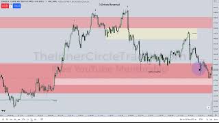
Date: 2023-05-18
URL: https://youtu.be/NeZlyG8FZLQ?si=usuPj5GaCR78fxiO Watched Date: May 19, 2023
This is what we saw today, and this is a weekly candlestick. So you can see that the weekly chart did, in fact, expand in the direction I was expecting. We did get the buy-side above the high here, and we did trade inside this volume imbalance.
I’m not using the continuous contract on TradingView because the continuous contract does not show the inefficiencies the way the actual individual delivery-month contracts do. For instance, if we trade above this high here, I like this SIBI, and I also like this volume imbalance. So it depends on how much continuation we get in price action, but we take it one step at a time.
One of the advantages of using a thinner, specific contract month is that it was trading well before it became the front month. Right now, we’re looking at the June contract on a weekly chart. If I were to use the continuous chart and compress it into a weekly candlestick chart, those inefficiencies would not be as obvious.
So this is one of the built-in advantages of using a time-based chart. There are a lot of people out there who claim that time-based charts are useless and that you need some other kind of analysis or some other type of bar. That’s nonsense. They don’t know what they’re talking about. Time-based charts are at the root of why price is going to go where it’s going to go, because the algorithm runs on time first. It is time-and-price theory.
Here is the daily chart I showed yesterday evening.
There’s the delivery into the buy-side I told you we would see, and we traded right into that weekly volume imbalance. It isn’t hard, and it isn’t complicated. I’m not trying to bring every ICT concept I’ve ever created into one single model. I’m looking for a simple idea: where is price likely to draw to next?
I outlined it. I showed you why. I built it from the weekly chart to the daily chart, to the hourly chart, to the 15-minute chart, to the 5-minute chart, and finally to the 1-minute chart. I can’t make it any easier than this.
All you’re looking for initially, while you’re learning under my wing, is the skill set of knowing where price is likely to draw to next. Is it going higher, or is it going lower? I’m lending you my experience as a mentor so you can study price action with that in mind.
I’m not trying to create some challenge that makes it impossible for you to succeed. I’m telling you that this is where the bulk of your work should be in the beginning. It’s not about hunting for entry patterns. It’s not about looking for the newest ICT gadget or concept. You should be focusing on journaling, going back through old data, and finding the repeating phenomena that I’m teaching you. Because once you see it, you can’t unsee it. Once you learn it, it can’t be unlearned. Then you’re initiated. That’s the cult of winning we have around here.
People like to say we’re a cult, and I’ve gladly accepted that—we’re the cult of winning.
And you can see here again, this is not hindsight. I can’t manipulate daily and weekly candlesticks after the fact when I told you beforehand what to expect. And here we have it.
So take a closer look at what we saw this week. Here’s the price action.
As I mentioned last night, the only things I removed were the gradient levels in here and those little arrows. Don’t let that fool you. All I’m showing you are the key turning points.
So when you’re journaling, logging your price data, and reviewing old moves, you want to place arrows at those spots because it trains your eye to see price that way. Then, when you begin practicing executions later on—not now—you’ll notice that you start entering around those kinds of levels, with the logic behind them.
Last night, I took you to this fair value gap here and said we would draw up into that, into the buy-side and the weekly volume imbalance — that shaded white area up here. We were consolidating here, and because we had not yet made this run off here, and it was still around midnight while we were trading in this small area, I said we were likely to draw down into this buy-side imbalance and then go higher. And that is exactly what we did here.
If price drops just inside that imbalance and we are expecting only a shallow pullback, then that run is likely going to be initiated by an Institutional Order Flow Entry Drill. It’s a bit of a tongue twister, which is why I abbreviate it as IOFED. It is a partial entry into a fair value gap, whether that fair value gap is a BISI or a SIBI.
A fair value gap can be broken down into different classifications. This one is a buy-side imbalance / sell-side inefficiency, because price is moving higher and only buy-side delivery was offered. It is imbalanced because it offered buy-side delivery through one single candle, so it is inefficient in the sense that it did not offer any sell-side.
But if the market is bullish, as I have been indicating that it is, then it should trade down into this area here and leave part of that gap open. And that is exactly what we saw. Price dropped down just slightly into that candle’s low and then rallied higher, creating another boxed imbalance / inefficiency with this candle here. This candle’s high and that candle’s low frame another buy-side imbalance / sell-side inefficiency.
We also have a breaker here. So the market trades down into that as well, along with the consequent encroachment of this gap. This is a daily fair value gap — this was the daily discount fair value gap.
Price trades down into the consequent encroachment of the daily SIBI, which is the classic optimal trade entry I’ve taught on this channel for many years. But at the same time, it is coming back to touch and reprice this BISI low. Once it hits that, price is then permitted to leave that range.
Once it trades above this high, that becomes a balanced price range. So we can trust that it is likely to go higher — higher to where? To the buy-side here, and then into that weekly volume imbalance, which is exactly what we see here.
Dropping down to a 15-minute candlestick chart, you can see that we had the Institutional Order Flow Entry Drill dropping down here during the morning session. This is a Judas swing. It rallies up — and what does a Judas swing do? It’s a fake move. So price rallies up and creates a three-drive pattern. I took two trades in here, and I shared that on Twitter because people are always asking whether I did anything. So yes, I did.
Then the market sold off, dropped into a fair value gap here, and rallied higher again. After that, I chose to engage the afternoon session, which was a PM-session Silver Bullet trade.
Now let’s take a closer look at that morning session first.
We have the three-drives pattern here — one, two, three — and the Institutional Order Flow Entry Drill down here after price took out sell-side and then rallied. Then we have the short-term reversal pattern here, which is a classic price action pattern. It is very good at indicating that we are likely to see some measure of retracement. It can become a full reversal, but because we still have unfinished business — specifically that weekly imbalance up here, that weekly volume imbalance —
NASDAQ performed exceptionally well to the upside, just as I mentioned. I’ve been coaching that NQ was the leader on the upside, and that it would pull ES higher in sympathy. So this is a Sick Sister concept — trading the market that has lagged.
I also traded NASDAQ today; you can look at that on Twitter where I showed the examples and executions. But I wanted to teach you using the Sick Sister concept because, as the flavor-of-the-month ICT idea, this market would want to catch up to what NASDAQ had already done. And we can see that here, really moving to the upside and running into that weekly volume imbalance, with an extrapolation that was really, really nice to be part of this afternoon.
We have a breaker here, so we get high, low, higher high, then a break down through that little retracement. It broke lower just enough to clear out the sell-side here. Then we entered into the New York PM session, which is from 2:00 to 4:00, and we had some very clear fair value gaps and similar setups, followed by the final-hour Market-on-Close macro that I’ve been teaching more loosely.
Here we have a closer look on the one-minute chart. The imbalance is refined into this fair value gap here. Price drops down and clears out the relatively equal lows before we get to that.
Now let’s look at the three-drives pattern. We have consequent encroachment of this imbalance(H1 SIBI), and then price runs above this short-term high.
The market broke down, and we had the breaker here. It made a really nice run into that breaker and the fair value gap right there. That, folks — right there — is a complete model.
We have a higher-structure breaker. Not higher timeframe, but higher structure. A breaker is a low that has a high to the left of it and a higher high to the right of it. So: high, low, higher high. Once that low is broken, like it is here, we’re going to have an imbalance — that little imbalance right there, that fair value gap that isn’t highlighted. Price trades up into that and then hits the breaker.
This is also an optimal trade entry. It’s also trading into a bearish order block, which is the down-close candle prior to this move lower. Then look at the delivery here — boom — speed right down into that old imbalance.
Then it creates a consolidation. Is that surprising? No — look at the time of day. It’s New York lunch. So what is price doing? It’s creating a lot of equal lows and then rallying. What does that entice traders to think? That support is holding.
So any long holders are going to chase that move. Price then runs back up into the breaker one more time, which is the mean threshold — the midpoint of this down-close candle right here, that big, beefy, longer-bodied candle. It reaches the midpoint of that, then shifts lower and attacks the sell-side, which is the classic New York lunch run. It’s a stop hunt. That is the macro for the lunch hour.
The algorithm is going to reprice to induce stops, and it is using time as the basis for doing it. What time basis is it using? The New York lunch hour. Look at the time — 12:15 to 1:00. So in that one-hour period between noon and 1:00 p.m. New York local time, we have the classic enticement for retail traders to read that level as support. That means that level is likely to accumulate a lot of sell-side liquidity. Then the market runs from the breaker down into that level, hits it, and trades into the imbalance right here, which also serves as an Institutional Order Flow Entry Drill.
This is also a fair value gap — a really nice little retracement back into it — and then price delivers sharply right into that fair value gap.
Moving into the afternoon, we can see the turn here. Price rallies, consolidates, and then starts to rip higher, attacking the buy-side here, then the full buy-side liquidity pool, and finally the weekly volume imbalance. So it’s a very quick run inside the PM session, which is from 2:00 p.m. to 4:00 p.m. New York local time. This is your PM Session Silver Bullet. You get two chances here — one, and then a second rally.
And in the final Market-on-Close macro — the last one, from 3:15 to 3:45 — you’ll get another opportunity to set up a run on liquidity that has not yet been reached or engaged for that particular day. The market then fills the numbers, runs higher, takes the buy-side, and tags the weekly volume imbalance as well. Just beautiful delivery — beautiful delivery.
You can see again that the Silver Bullet forms between 2:00 and 3:00. So within that 2:00 to 3:00 window, there is a Silver Bullet setup, and then a little extra opportunity after 3:00 that is still using the same setup.
So it is reclaiming that fair value gap right there, then it rallies up, trades back down, and if you look very closely, you’ll see this inefficiency here and that candle’s high. Notice how price runs through this shaded area. All of this area here gets repriced, all the way to that candle’s low, then trades up into here a little bit—slightly higher—and then trades back down. It stops right there.
Why is it stopping right there? Because it only needs to trade down into that fair value gap right there. And we had already traded up once: this candle went down, the next candle opened and traded up into here. So this-to-this is the only inefficient portion. It only needs to trade back to that level, and then it can rally and run at the buy-side liquidity pools I mentioned last night.
This is the Power of Three. This is what the daily candlestick looked like from the 9:30 open: a small move lower, then a rally up, trading to the high of the day. I’ll get into that high of the day in a second. Then it closes here.
So we have another classic buy day: open, decline, Judas swing, rally, and close on the high, working on that fair value gap(Daily SIBI). The 9:30 open was essentially near the low of that shaded fair value gap.
Here is the Opening Range Gap, using regular trading hours. You can see the difference between where we closed the previous day and where we opened at 9:30. That little shaded area hints at something we’ll talk more about in the book, because setups like this are just too good.
I talked about how you can take this imbalance, multiply it out, and project it higher—much like I taught with my Central Bank Dealers Range, and much like I taught with F.L.O.A.T. I took what everyone already knew about the Asian range and supercharged it, showing you how to use it more effectively.
I taught it in terms of standard deviations, but you can use the Opening Range Gap the same way. You can project it higher, and then we get an overlap at negative 11 standard deviations. That price comes in at 4214.75, which is the basis for why I took my exit right at that low—just a hair below this level here. And 4214.75 looks like this, and we traded just above it into the 4215s, which was the high of the day.
I’d encourage you to go look at Twitter, where you can see my executions and related examples on the PM session for ES and NASDAQ.
In the Market-on-Close macro, the algorithm will generally run for liquidity. If that liquidity has already been tapped — meaning a higher-timeframe liquidity pool or target has already been met — then it usually will not spool up and start running. There is no need for it to do anything further.
Then it’s done. In the last 15 minutes of trading, between 3:45 and 4:00, you’ll usually get some kind of smaller sputter move — maybe good for 5, 8, or even 10 handles — but nothing terribly explosive.
Hopefully, you can take this information and begin to see that none of this is random. None of it is conjecture. There is logic behind why price moves the way it does, why it behaves the way it does, and at what time it is expected to do so. That is what makes this such a powerful approach to trading: you do not have to rely on indicators. You are organizing your chart, staying structured, and trying to anticipate rather than react. You are trying to anticipate what price is likely to do next, and that always begins with the draw on liquidity. Liquidity is simply where price is most likely to go next.
If you do not have that information—if you have not determined that, or developed the skill set to determine it consistently—you are not going to be profitable, no matter what method you use. You have to be able to see where price needs to go next.
Who benefits the most if smart money benefits from price going higher? Retail traders get punished. What does that look like? Relative equal lows. Retail sees those as support, right? So what happens? Price trades down, takes out those stops, and why is that useful? Because those sell stops become liquidity. Smart money can buy into that selling. They become the counterparty to that flood of sell orders. That lets them accumulate long positions at a cheaper price.
Then price rallies and attacks the buy stops above old highs. Who has buy stops sitting above those highs? The traders who got temporarily lucky, didn’t take profits, didn’t take partials, and didn’t know how to get out of the market at the right time. Their stops are resting above those highs in the form of buy-side liquidity.
Why is it advantageous for price to trade there—or even above that level into a weekly volume imbalance? Because that gives smart money the opportunity to distribute the longs they accumulated lower. They buy into sell stops down here, then they sell into the breakout buyers above these highs, above here, above here, and above here. That is liquidation and distribution. Retail is the liquidity source. They are the ones buying the breakout while smart money is selling into them.
That is why I teach my students to scale out of long positions above old highs and to cover short positions below old lows. That is what smart money does. It does not trade retail patterns. It does not look at moving averages. It does not chase breakout strategies. It does not do that. The algorithm creates scenarios where traders with that mindset fall victim to it.
And you do not want to stay in that category forever. You do not want to remain a neophyte in trading, operating with retail logic, never coming into an understanding of what these markets are actually trying to do and how they truly book.
Keep learning with us.
Get new ICT lessons, study notes and updates as we build V2.